



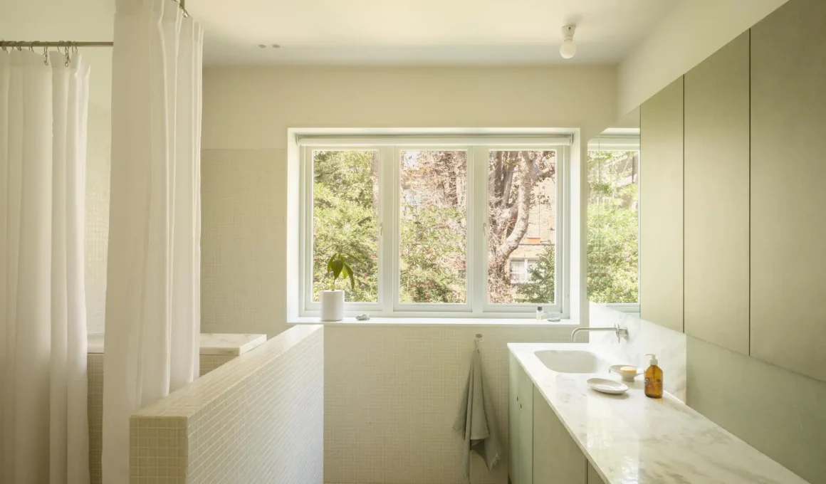
Of all the choices you can make in a bathroom — material, layout, fixture, scale — the decision to go green is the one that will behave most differently depending on conditions you cannot fully control: the orientation of your windows, the temperature of your artificial light, and the texture of the surface the color lands on.
There is a reason the green bathroom has outlasted every trend cycle of the past decade and shows no sign of retreat. It is not sentiment, and it is not Instagram. It is something more structural: green is the only color the human brain processes as inherently of the natural world, regardless of context. Put it in a narrow urban bathroom with no windows and it still triggers the same neurological calm as looking at foliage. It lowers perceived heart rate. It reduces the kind of low-level visual tension that white rooms — for all their clarity — can quietly amplify. The science behind biophilic design has made this case methodically, but any designer who has lived with a dark green bathroom already knew it intuitively.
What the science does not tell you — and what most coverage of the green bathroom gets completely wrong — is that green is not one thing. Sage and forest green are not interchangeable variations on the same mood. They are functionally different colors that belong in functionally different spaces, respond to light in opposite ways, and demand entirely different material partners. Getting this wrong does not produce a slightly-off bathroom. It produces a room that feels, inexplicably, wrong every morning.
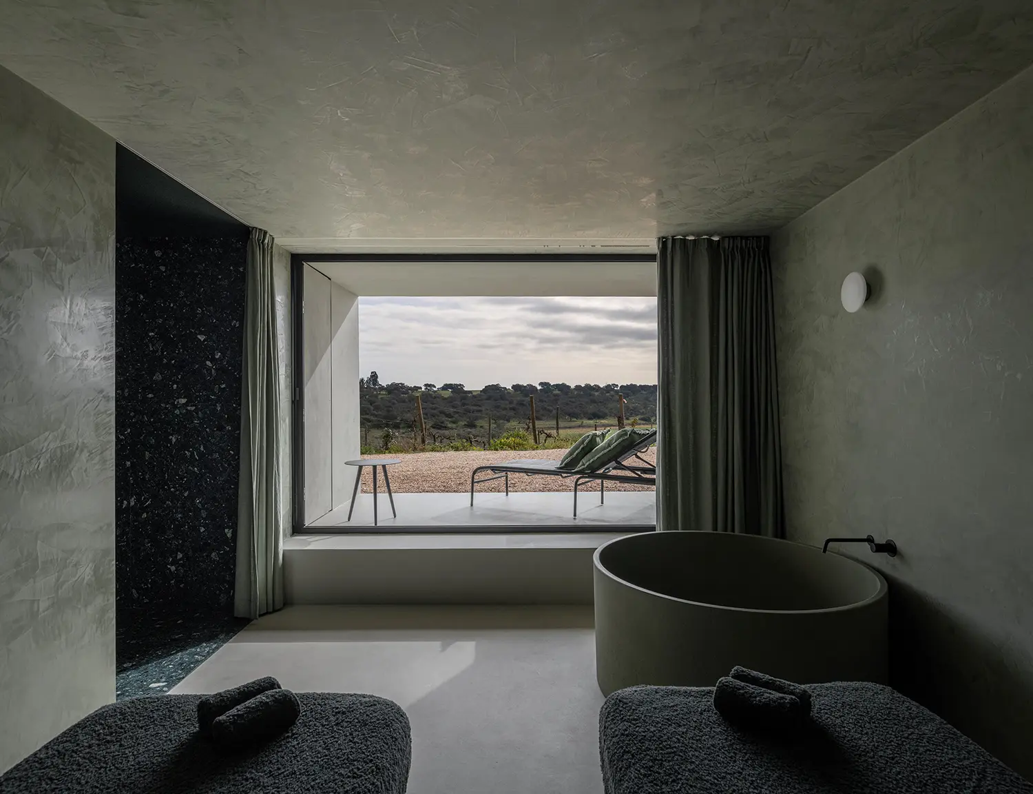
Shade as spatial logic. Sage green — that muted, grey-inflected tone that has dominated Anglo-American bathroom searches for the past three years — works precisely because it sits at the intersection of green and neutral. It holds light rather than absorbing it. In a north-facing bathroom, in a compact en-suite, in a space where natural light arrives indirectly and briefly, sage green stays present without becoming oppressive. It reads as soft in warm artificial light and as crisp in cool daylight. Its restraint is the point: sage green bathrooms feel considered because the color never competes for attention. Forest green and dark green bathrooms are a different proposition entirely. These are colors that absorb rather than reflect — they pull light into the surface rather than bouncing it back into the room. In a small bathroom with poor light, this creates a compression effect that most people will find uncomfortable within weeks. But in the right conditions — a larger footprint, good natural light, a surface with enough sheen to create internal reflection — dark green bathrooms achieve something sage cannot: they make a room feel like a destination. Forest green, the highest-momentum term in current search data, occupies an interesting middle position. Warmer than hunter or bottle green, it carries botanical associations that make it unusually forgiving for interiors. Unlike emerald, which is aggressive and cold, forest green reads as living. It ages well on walls and even better on cabinetry, where its warmth prevents it from reading as heavy.
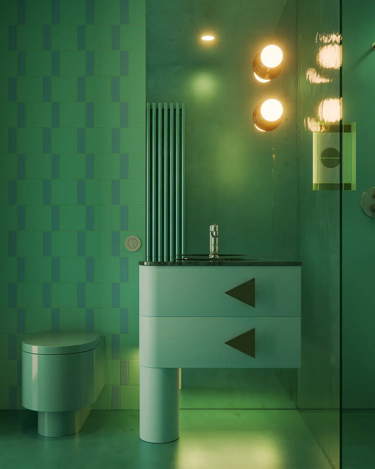
The material is the message. The same forest green applied to a glazed ceramic tile, a marble slab, a microcement wall, and a resin floor will produce four experiences so different they might as well be four different colors. This is the variable most guides skip entirely, but it is where the real decisions live.
Tiles — the dominant material in green bathroom tiles searches and the highest-volume keyword by a significant margin — offer the most range within a single color. A glossy tile reflects light actively: a dark emerald subway tile in a well-lit shower reads as jewel-like, shifting between deep green and near-black depending on angle. A matte tile of the same color absorbs light and reads as quieter, more mineral, more resolved. Zellige — the Moroccan handmade ceramic with its irregular surface and luminous glaze — does something neither can: it catches and redistributes light in constant micro-variation, so a sage green zellige wall appears to breathe. As we noted in our 8 Tile Trends for 2026, the subtle shifts in color and uneven, light-reflecting surface of zellige create a living texture that mass production cannot replicate. Large-format tiles eliminate grout lines and produce a reading closer to a slab than a tile grid; the color becomes continuous, immersive, more architectural. The grout line in a standard tile format is not a neutral decision — a contrasting grout reads as a graphic grid and actively fragments the green; a matching grout lets the color breathe as a field.
Marble brings movement. Green marble bathroom surfaces — Verde Guatemala, Verde Alpi, Ming Green — are not uniform. They are fields of color crossed by white, grey, or gold veining depending on the quarry, and the same tile under different lighting reveals entirely different characters. Green marble reads as warm in incandescent light and cool in daylight; its natural variation prevents any single reading from becoming dominant. This is also its risk: in a small bathroom, the visual complexity of heavily veined green marble can become exhausting. The strongest contemporary specifications use green marble selectively — a vanity top, a feature wall, a shower floor — rather than wrapping an entire space in it.
Microcement changes the spatial equation most dramatically. Applied continuously across walls, floor, and ceiling without interruption or grout line, it transforms a green bathroom from a tiled room with green walls into a monochrome environment. The color becomes total. In sage or muted olive tones, this produces a spa-like enclosure that has become strongly associated with high-end residential projects and boutique hotels. The material’s slight surface variation — its mineral texture — prevents it from reading as painted, giving the color a depth that flat paint cannot achieve. A recent project by Yaro Bureau in Lviv demonstrated this precisely: their monolithic microcement bathroom prioritizes the sensory experience of water and steam above all other considerations — a quality that green microcement amplifies rather than competes with. Resin floors in dark or mid-tone green used beneath lighter wall surfaces create a grounding effect — the room feels anchored. Resin’s reflectivity introduces a horizontal plane of light that bounces back up, partially counteracting the absorptive quality of dark greens on vertical surfaces.
Brass is not a styling choice. It is a structural one. The affinity between green and brass is not decorative — it is optical. Brass introduces a warm yellow-gold tone that sits at the precise opposite of green’s cool-blue undertones on the color wheel, creating a contrast that feels resolved rather than forced. More practically, the warm reflectivity of unlacquered or brushed brass fixtures — taps, showerheads, towel rails, cabinet hardware — introduces a light source within the room itself. Green surfaces absorb light; brass returns it. This is why the combination photographs so consistently well and, more importantly, why it works in daily use. The same instinct drives the best specifications in architectural outdoor showers, where raw brass and copper are chosen precisely because they patinate into deep, warm oxides that hold their visual warmth over time — the same quality that makes them ideal partners for green in any wet environment. The alternative — matte black against dark green — produces a different reading: graphic, taut, modern, less warm. It works, but it requires more natural light to prevent the combination from reading as heavy.
Coloured sanitaryware — basins, baths, WC pans in tonal or matching greens — has moved from bespoke specification to catalogue reality in the past two years. Brands including Duravit and Villeroy & Boch now offer bathroom furniture in sage and deep green finishes, and freestanding baths in mineral tones are increasingly available outside the luxury tier. The risk of the full-green approach is not excess but monotony: without material variation, a single color at every surface becomes uniform rather than immersive. The strongest examples introduce variation through finish — matte wall, gloss basin, brushed floor — rather than through color.
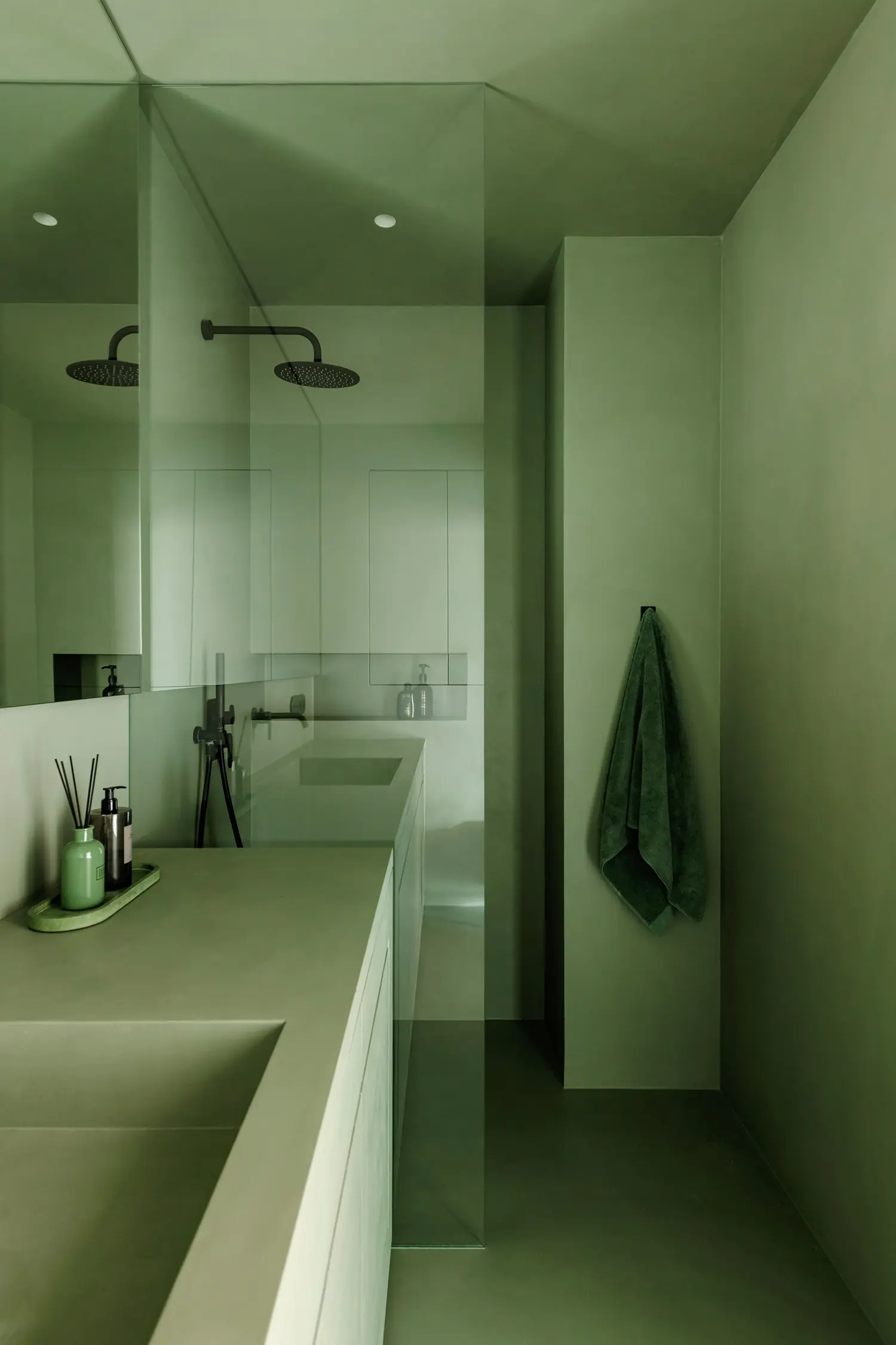
Style is context, not category. The green bathroom works across stylistic registers in ways that most single-color palettes do not. In Japandi interiors — that fusion of Japanese minimalism and Scandinavian warmth that continues to dominate bathroom specifications — sage and muted eucalyptus greens are nearly canonical. The palette of sage, natural oak, linen, and unlacquered brass has become a visual shorthand for considered restraint. The connection between this aesthetic and the natural world is not incidental: Japandi’s core logic is the same biophilic impulse that makes green the most psychologically effective color choice for enclosed spaces in the first place. In darker, more atmospheric interpretations of the contemporary bathroom — what some practices are calling the shelter aesthetic — forest and hunter greens used with microcement, dark-stained timber, and aged brass produce rooms that feel deliberately withdrawn from the pace of the rest of the house. The Victorian and Arts and Crafts revival currently active in UK and Northern European residential work has found in deep bottle green and sage its most natural contemporary partner: original period tile patterns in green glazes, Victorian metro tiles in sage, encaustic floors paired with sage panelling below the dado. In compact urban bathrooms — the kind documented in our Courtyard Revivals piece, where spatial efficiency demands absolute material intelligence — sage green microcement or large-format green tile can make a restricted footprint read as deliberately minimal rather than simply small. Each of these applications uses green differently, but all depend on the same underlying logic: green is light-dependent, and the room must be designed with that dependency built in from the start.
The green bathroom will not date in the way trend-driven choices date, because it is not a trend. It is a response to something consistent about how human beings relate to color in enclosed spaces. What will date — quickly — are green bathrooms chosen without understanding what their particular shade does under their particular light, applied to surfaces chosen for appearance in photographs rather than behavior over time. The difference between a green bathroom that feels inevitable and one that feels effortful is almost always in these decisions: shade, material, finish, light. Get them right and the room becomes one of those spaces that is inexplicably easy to be in. Get them wrong and you will repaint within three years — and already know exactly why.