Combining the worlds of food and sneakers, Knock Kitchen & Kicks makes its mark on the Bangkok landscape. Located in the trendy Thonglor district, this new hybrid space has been conceived by architecture firm Onion.
Central to Onion’s design was the idea of the “street”. “By the street, we neither meant the art of graffiti nor the literal translation of any street practices. Rather, the street was meant as a space for showcasing KNOCK’s everyday life items. What the KNOCK founders perceived as the sneakers was, to us, the objects of desire. The chosen pair of sneakers directed the accompanying outfits, and not the opposite.” explain the designers.

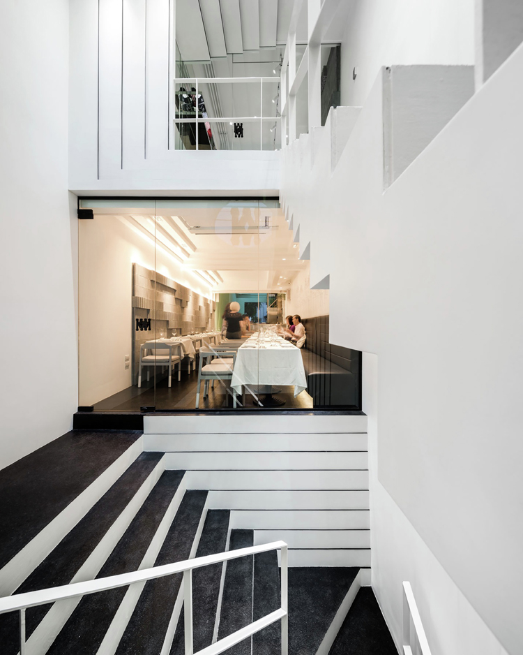
Onion drawings of KNOCK were based on the economy of the project. The shop front of KNOCK was 3.8 meters wide facing the footpath of Sukhumvit 55 Road, one of the busiest streets in Bangkok, days and nights. The architects decided to design a set of stairs next to the entry, occupying the first bay or 4 meters out of 23 meters of the shop house’s depth. The stairs tucked the service area away from sight and led Knock’s customers, right away, from the street level to the bistro on the second floor and later on to the retail space on the third floor.

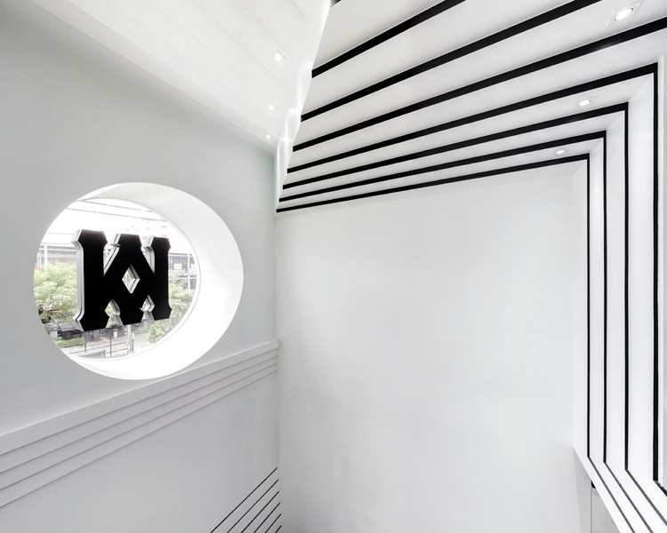
In terms of visual effects, they created the continuity between the steps and the diagonal linear patterns on the walls that were made of cement boards painted in black and white colours. Their intention was to invite KNOCK’s customers to observe the stairs from various directions, looking upwards, downwards, inwards and outwards. The design team repeated the same idea at the rose window containing KNOCK’s logo, a mirrored image of the alphabet K. The points of viewing this logo were the interior of the retail space on the third floor where the street view became a background for the framed image and the footpath of Sukhumvit 55 Road opposite KNOCK, where the building itself could sharpen the silhouette of the K alphabets.
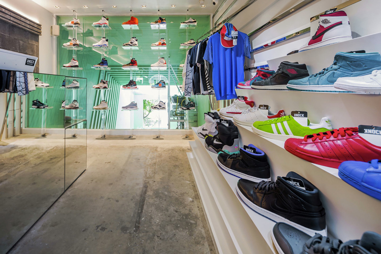
The chosen colour pastel green as the envelope of the semi-outdoor space came from the only existing tree in the project. At the day time, and this was only through the camera eyes, the colour green could reflect itself on the whole surfaces of white colour. Designers have applied two colours of light to differentiate the functions within KNOCK. Warm white was for the bistro and the bar whereas cool white was for the staircase and the retail space. When customers stood at the bar area, they could look up to the sneakers’soles displayed on the acrylic shelves in the third floor.




all images © Wison Tungthunya & W Workspace


