



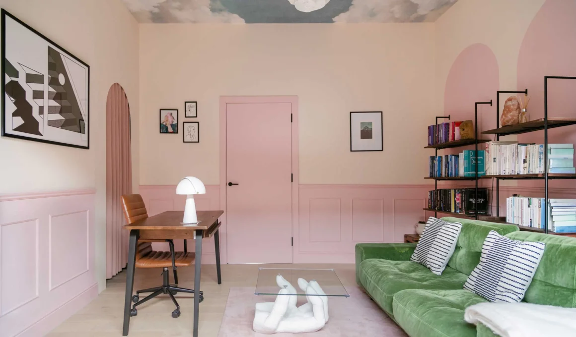
The strategic selection of ceiling colors represents a sophisticated tool for manipulating spatial perception and cognitive response, moving beyond the conventional white plane to address specific architectural challenges such as low volumes or expansive, detached heights. By integrating neuroarchitectural insights and precise chromatic palettes, we can transform the overhead surface into a functional element that actively dictates the emotional and physical experience of a room.
The Geometry of Color: Solving Spatial Constraints
The “fifth wall” is the most influential surface for correcting room proportions. Choosing the right pigment requires an understanding of how light interacts with horizontal planes to either compress or expand the viewer’s field of vision.
Low-Ceilinged Rooms: The Receding Horizon
To counteract the oppressive feel of a low ceiling, one must utilize colors that “recede.” Soft, cool tones with a high light reflectance value (LRV) are most effective.
Recommended Hues: Farrow & Ball’s Skylight or Benjamin Moore’s Cloud White.
The Logic: These “ethereal” blues and crisp whites mimic the sky, drawing the eye upward and creating a sense of weightless expansion.
High-Ceilinged Rooms: Anchoring the Volume
Vast, double-height spaces can often feel cold and impersonal. To bring the room back to a human scale, a darker, warmer palette is required to “drop” the ceiling visually.
Recommended Hues: Sherwin Williams’ Iron Ore or a deep terracotta like Red Earth.
The Logic: Darker colors absorb more light, creating a perceived “weight” that grounds the room, making it feel more intimate and curated.
Small or Narrow Rooms: The Fluid Boundary
In compact spaces, the goal is to eliminate visual breaks. A monochromatic wrap—painting the walls and ceiling the same color—disguises the corners where surfaces meet.
Recommended Hues: Muted sages like Saybrook Sage or soft greys like Ammonite.
The Logic: This technique prevents the brain from easily mapping the room’s limits, making a small room feel significantly larger and more cohesive.
Neuroarchitecture: Hues for the Mind
Recent studies in environmental psychology suggest that our brains respond to overhead colors with specific chemical triggers. This is particularly vital when addressing Seasonal Affective Disorder (SAD) or chronic stress.
Applying neuroarchitecture to our living spaces, as explored in our guide on how interiors boost serotonin and combat SAD, allows us to choose ceiling hues that regulate mood and energy levels through the sensory experience of the environment.
For Focus: Mid-tone greens are linked to improved concentration and reduced eye strain, making them ideal for home offices.
For Vitality: Soft yellows can stimulate the release of serotonin, mimicking the psychological benefits of natural sunlight in windowless rooms.
As noted by the Academy of Neuroscience for Architecture (ANFA), the way a space is enclosed directly impacts hippocampal activity, which governs our spatial memory and stress responses.
Wisdom from the Masters
Famous practitioners have long understood that color is not merely a finish, but a structural component.
“Color is an incredibly powerful instrument… it is a factor of our existence.” — Le Corbusier
Le Corbusier’s Polychromie Architecturale often utilized bold ceiling colors to define different “emotional zones” within a single open plan. Similarly, Frank Lloyd Wright often advocated for colors that mirrored the natural landscape, famously stating:
“The color of the ceiling is the color of the room’s sky; it should belong to the atmosphere of the house.”
For more on how industry leaders utilize these principles, Architectural Digest frequently showcases how contemporary firms use bold ceilings to define luxury and intent.
Technical Integration and Finishes
Beyond the hue, the finish—be it matte, eggshell, or high-gloss—dictates how the color is perceived. A high-gloss finish on a dark ceiling can create a “liquid” effect, reflecting the room below and doubling the perceived height, while a matte finish provides a velvety, “solid” presence that absorbs distractions.
By referencing the Pantone Color Institute for light-to-surface interaction, designers can ensure that their chosen ceiling colors remain true to their intent regardless of the time of day or artificial light source.