




Creating a visually appealing and harmonious space can feel daunting, but the 60-30-10 rule offers a simple yet powerful framework for achieving perfect color balance. This guide, tailored for architecture and design enthusiasts, delves into the intricacies of this rule, offering practical tips and inspiring examples to help you master color coordination.
What is the 60-30-10 Rule?
The 60-30-10 rule is a classic interior design guideline that suggests using three colors in a specific proportion to create a balanced and visually pleasing aesthetic. It breaks down as follows:
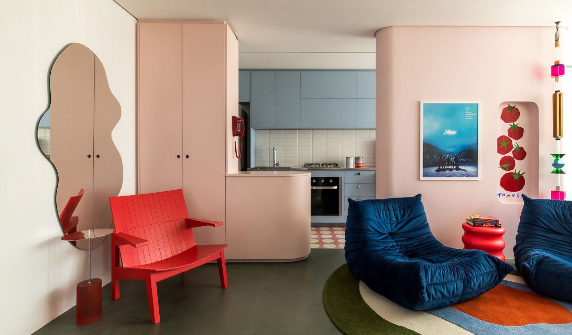
60% Dominant Color: This color forms the foundation of your space and covers the largest area. Think of your walls, large furniture pieces, and major flooring. It sets the overall tone and mood.
30% Secondary Color: This color supports the dominant color and adds visual interest. It’s often used for upholstered furniture, curtains, rugs, and accent walls. It should complement the dominant color but offer enough contrast to stand out.
10% Accent Color: This is the “pop” of color that adds personality and energy to the space. It’s used sparingly for decorative accessories like cushions, artwork, lamps, and small furniture pieces. This color should contrast significantly with the dominant and secondary colors.
Why Does the 60-30-10 Rule Work?
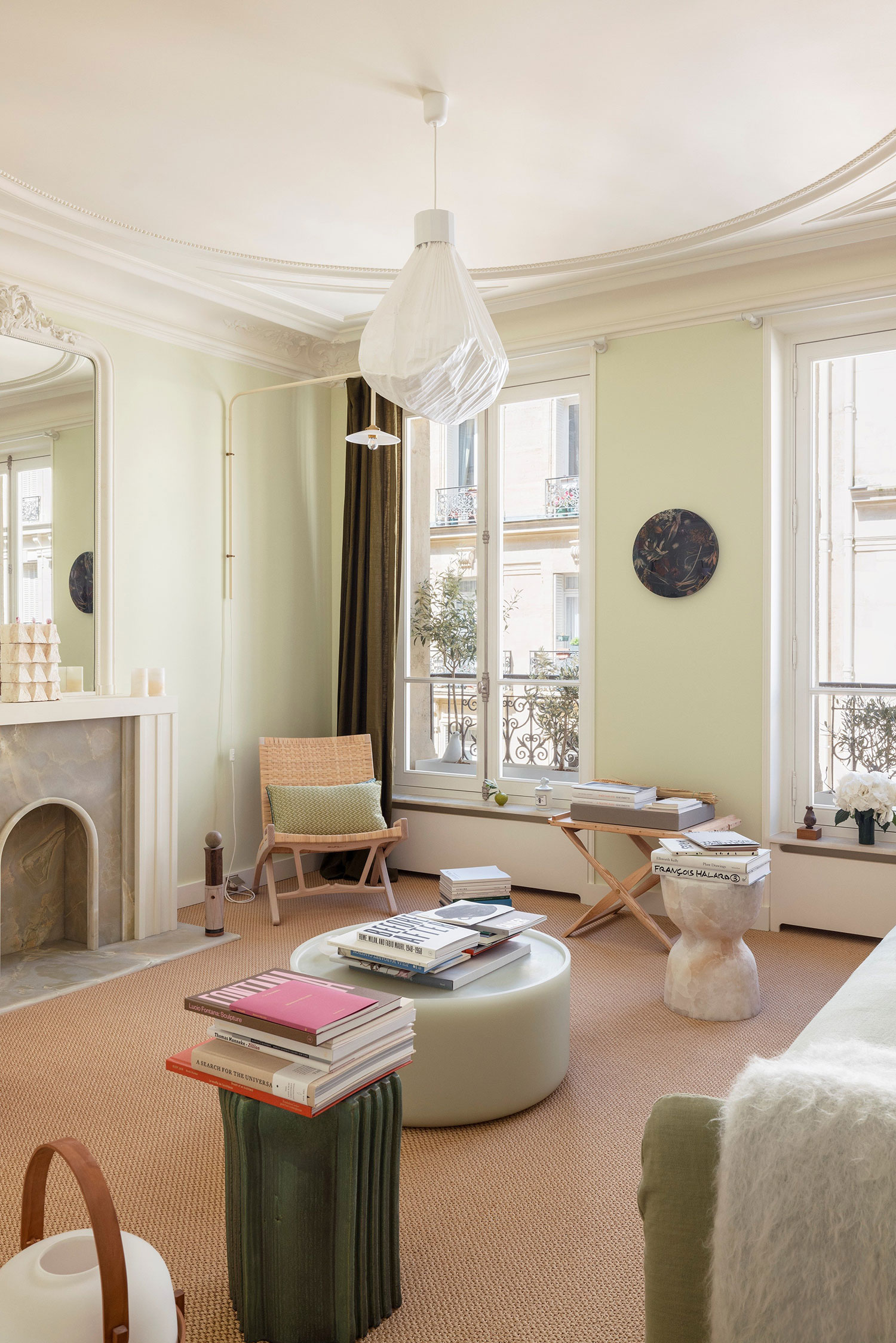
This rule works because it mimics the natural world. We often see a dominant color (like the sky or a field of grass), a secondary color (like trees or flowers), and small pops of accent color (like a bird or a butterfly). This familiar balance is inherently pleasing to the human eye. It creates a sense of order and prevents the space from feeling overwhelming or chaotic.
How to Apply the 60-30-10 Rule in Your Design Projects:
Choose Your Color Palette: Start by selecting three colors that you love and that work well together. Consider the mood you want to create (e.g., calming, energetic, sophisticated). Think about using a color wheel or online color palette generators for inspiration.
Select Your Dominant Color (60%): This color will be the backdrop for your design. Choose a color that you find calming and that creates the desired atmosphere. Neutrals like white, beige, and gray are popular choices, but don’t be afraid to use bolder colors as well.
Choose Your Secondary Color (30%): This color should complement your dominant color and add visual interest. It should be distinct enough to stand out but not so overpowering that it clashes. Consider using a slightly darker or lighter shade of your dominant color, or a color that sits next to it on the color wheel.
Choose Your Accent Color (10%): This is your chance to add a touch of personality and drama. Choose a color that contrasts significantly with your dominant and secondary colors. This color should be used sparingly but strategically to draw the eye and create focal points.
Distribute the Colors: Apply the 60-30-10 ratio throughout the space. Think about the different surfaces and elements in the room and how you can incorporate each color.
Tips and Tricks for Using the 60-30-10 Rule:
Don’t be afraid to break the rules (slightly): While the 60-30-10 rule is a great guideline, it’s not set in stone. You can adjust the percentages slightly to suit your specific needs and preferences.
Consider the room’s function: The function of the room should influence your color choices. For example, a bedroom might benefit from calming blues and greens, while a living room might be more suited to warmer and more vibrant colors.
Think about the lighting: Natural and artificial light can significantly impact how colors appear. Test your chosen colors in the room before committing to them.
Use textures to add depth: Incorporating different textures can enhance the visual interest of your space, even if you’re using a limited color palette.
Start with a mood board: Creating a mood board can help you visualize your color scheme and ensure that all the elements work together harmoniously.
Examples of 60-30-10 Color Schemes:
- Classic & Calm: 60% Beige (walls), 30% Light Blue (sofa), 10% Yellow (cushions and artwork)
- Modern & Bold: 60% Gray (walls), 30% White (furniture), 10% Teal (accent pieces)
- Warm & Inviting: 60% Cream (walls), 30% Terracotta (rug), 10% Olive Green (plants and accessories)
Beyond the Basics
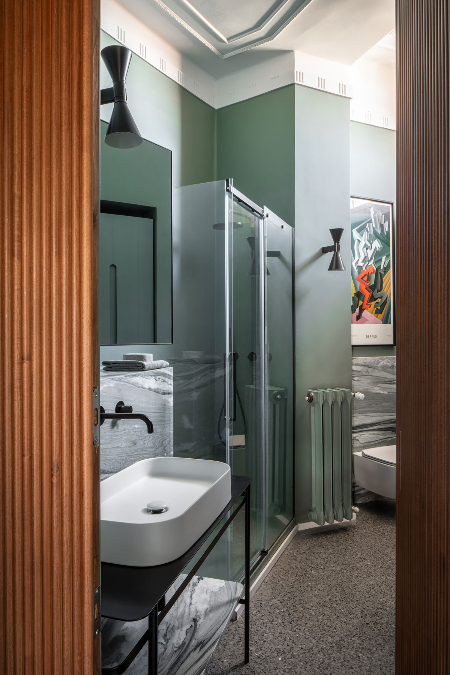
For architecture and design professionals, understanding the nuances of color psychology and the impact of color on mood and perception is crucial. Experimenting with different color temperatures, saturation levels, and undertones can help you create truly unique and impactful spaces. Consider incorporating sustainable and eco-friendly paint options and exploring the use of color in architectural elements like facades and building materials.
Conclusion
The 60-30-10 rule is a valuable tool for anyone looking to create a harmonious and visually appealing space. By understanding the principles behind this rule and applying it thoughtfully, you can transform any room into a stylish and inviting haven. Remember to experiment, have fun, and let your personal style shine through!