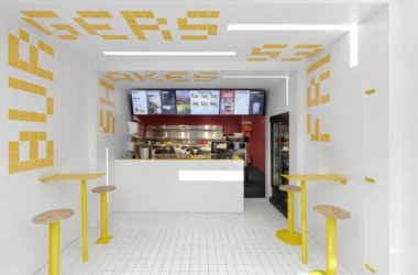

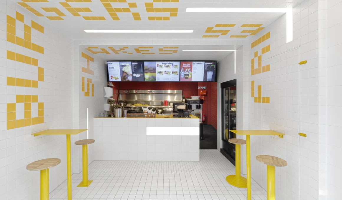
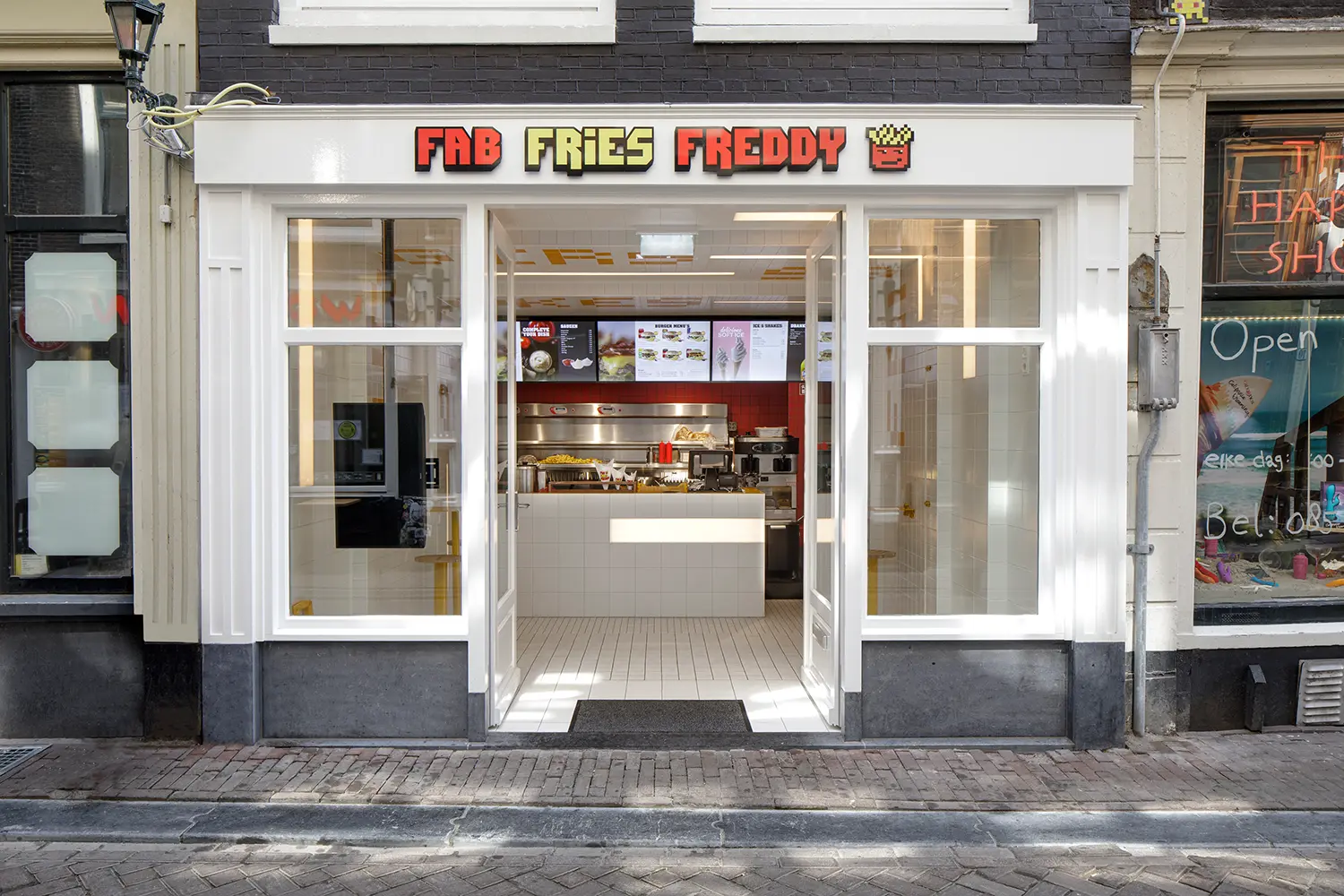
Ninetynine‘s Fab Fries Freddy squeezes a full snack-bar identity into 35 sqm (377 sq ft) near Amsterdam’s Red Light District by shrinking its tile grid from 20 cm squares to 5 cm ones as customers walk toward the counter. The interior sits on Oudebrugsteeg, a narrow, high-traffic tourist street where a fast-food concept has seconds, not minutes, to explain itself to someone walking past. Ninetynine’s response was to turn the room itself into a forced-perspective sign, one that pulls passersby toward the counter before they’ve read a single word of the menu.
Amsterdam’s Red Light District draws a constant flow of tourists who rarely stop to read signage; Oudebrugsteeg sits inside that flow, a narrow high-traffic street where most people passing Fab Fries Freddy’s door have already decided what they want before they arrive. Ninetynine’s brief wasn’t to make the space memorable in isolation — it was to make its function legible at a glance, in a language that didn’t require reading English.
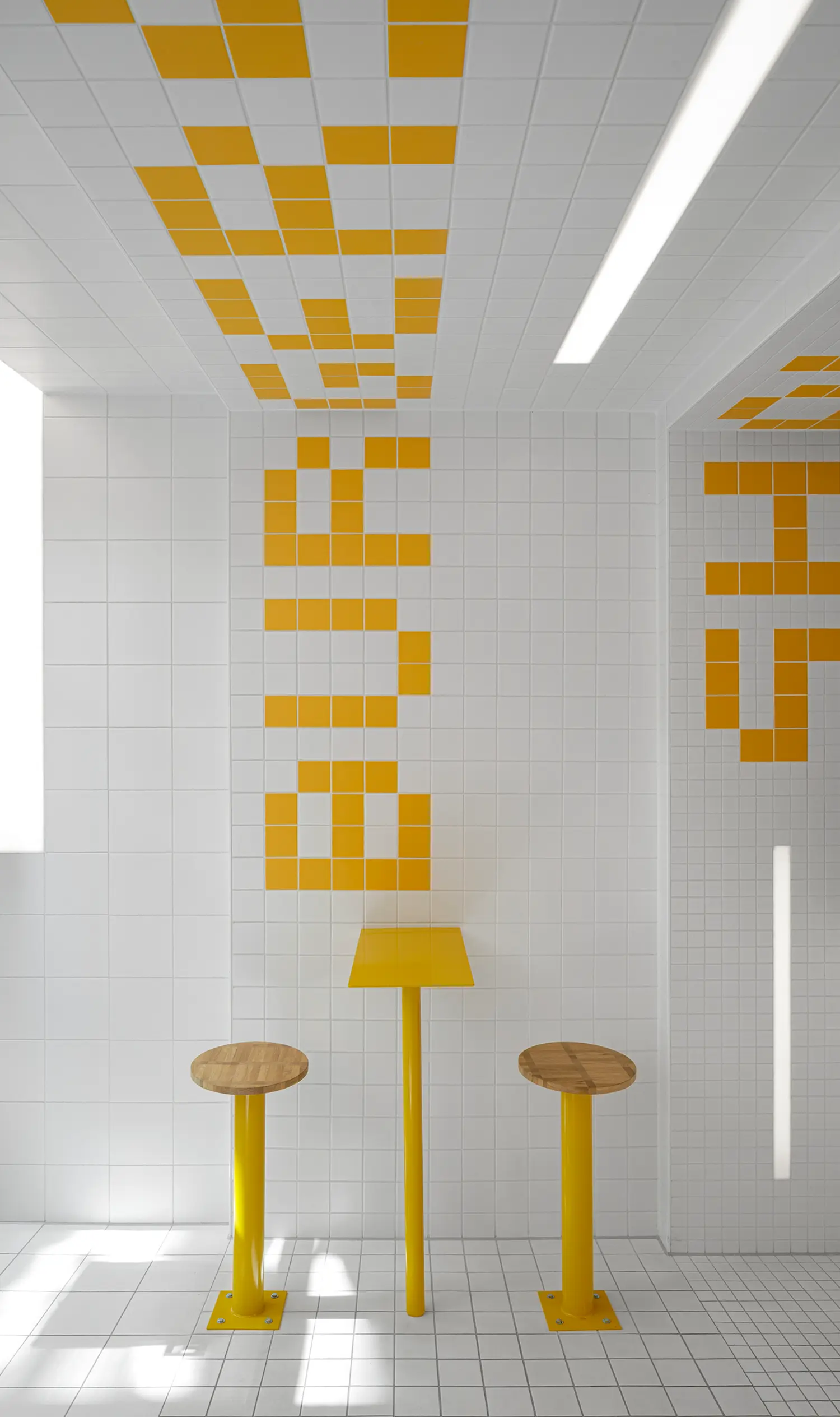
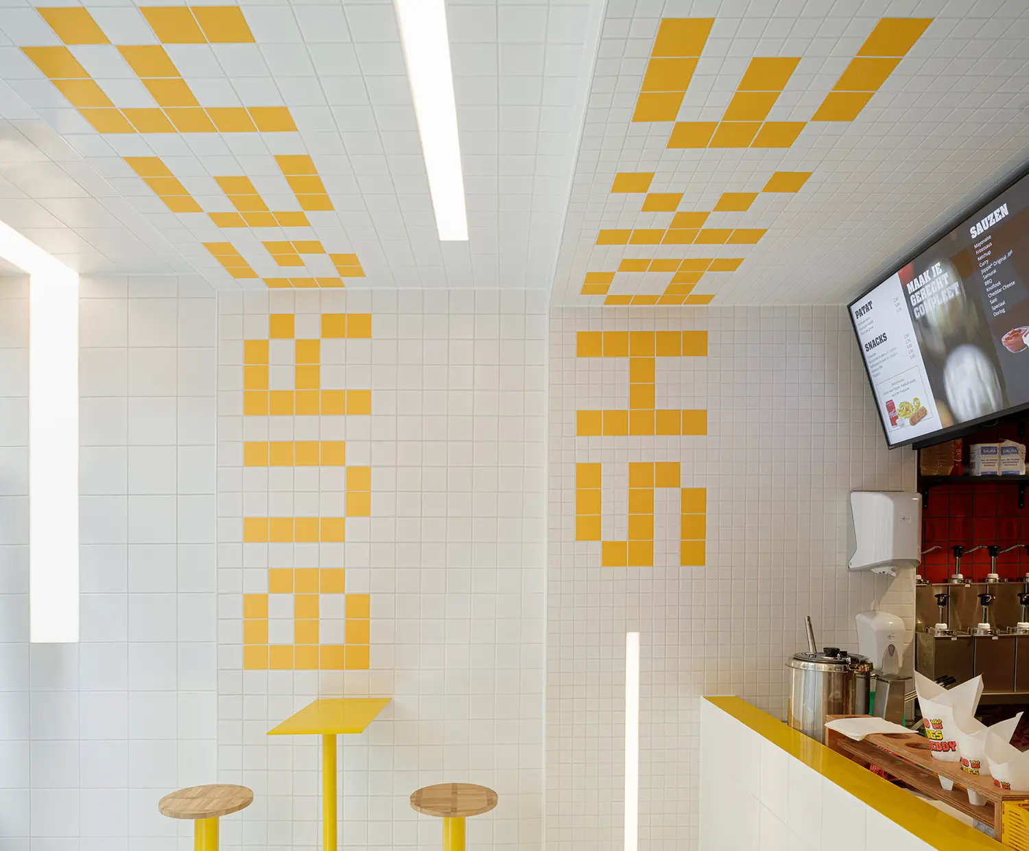
The “snack bar temple” idea gave the interior its material logic: fresh white tiles across floor, walls, and ceiling, broken only by accents of signal yellow and red. Ninetynine treated color the way a traffic sign treats color — as information before it’s decoration — so a fast-food interior design built entirely from tile could still read as fast-food from across the street.
The counter sits deep inside the 35 sqm (377 sq ft) space, and Ninetynine used that depth rather than fighting it. The white tiling steps inward every 1.5 meters (4.9 ft), shrinking from 20×20 cm panels (7.9 x 7.9 in) near the entrance to 10×10 cm (3.9 x 3.9 in) at the midpoint and 5×5 cm (2 x 2 in) by the order counter, exaggerating the room’s actual perspective until the tunnel effect reads as intentional rather than incidental. The forced perspective tiling does the job a sign above the door usually does — it pulls the eye, and the body, toward the till.
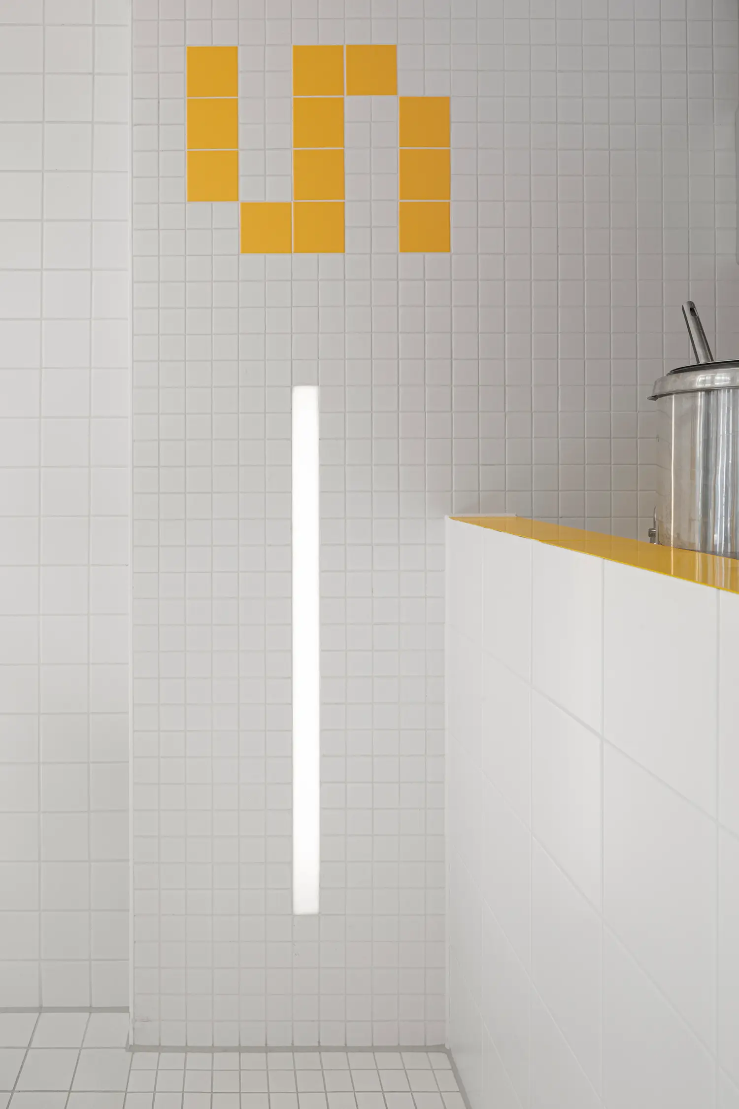
Behind the counter, the prep area breaks from white entirely: walls and ceiling switch to signal red, positioned as the visual payoff at the end of the tile-tunnel effect Ninetynine built out of shrinking grids. The shift reads less like a design flourish and more like punctuation — the point where the sequence the customer has been walking through finally resolves.
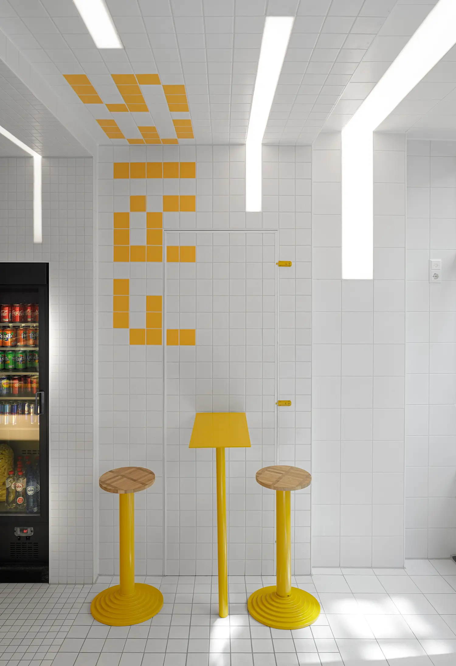
Burger, fries, and shakes — the three words that matter most on the menu — are spelled out directly onto the walls and ceiling in yellow tile, oversized enough to double as both signage and surface. It’s a literal solution to a familiar hospitality problem: instead of hanging a menu board inside a tiled tunnel, Ninetynine turned the wall itself into a typographic tile wall, legible before a customer has fully stepped through the door.
Recessed LED lines run through the tiling as continuous, irregularly placed stripes rather than a uniform grid, which keeps the lighting scheme from reading as generic track lighting. The tiles themselves come from a single supplier, CE.SI’s Colori range, in matte white, Vermiglio red, and Vanadio yellow — three specific, named finishes rather than a generic red-yellow-white fast-food palette assembled from whatever was on hand. Even the fixed furniture repeats the logic: the counter is clad in the same white tile as the walls, topped in powder-coated yellow steel with its own incorporated LED line, and the stools pair yellow steel frames with wood seating.
Ninetynine’s design team, Jeroen Vester and Giulia Cosenza, built Fab Fries Freddy around a constraint most fast-food restaurant design treats as a problem: almost no floor area to work with. The same young, graphic language shows up elsewhere in Europe’s smash-burger wave — Street Smash Burgers in Almada leans on bold signage and saturated color in a similarly tight footprint, while Pluto Smash Burger in Wrocław uses graphic wall treatments to do comparable communicative work. Fab Fries Freddy predates both by several years, and its tile-built typography still holds up against interiors designed with a full digital signage budget.
Four years on, Fab Fries Freddy’s real achievement isn’t the tiling trick itself — plenty of interiors use forced perspective — but that the trick still does its job without a screen, an app, or a single piece of digital signage involved. In a category that increasingly solves communication problems with QR codes and screens, a shrinking grid of ceramic tile is a stranger, and arguably more durable, answer.
Fab Fries Freddy by Ninetynine | Location: Oudebrugsteeg 3, Amsterdam, Netherlands — Year: 2021 — Key materials: matte ceramic tile (CE.SI Colori range), powder-coated steel, recessed LED lighting