


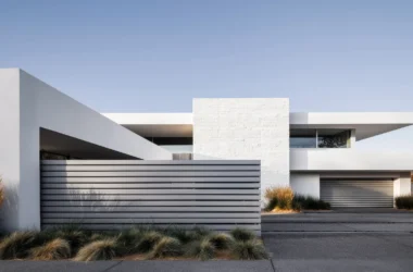

If you’ve ever walked into a room and immediately felt either on edge or totally relaxed, the colors in the space likely played a key role in your emotional reaction. For instance, if you noticed a mishmash of shades on the walls and the furniture was a variety of patterns, you might have wanted to run out of the room. However, if the space featured one central hue with some accent shades, you probably felt more at ease. (image above © Roberto Ruiz / Colombo and Serboli)
This example illustrates how powerful color can be when designing a room to be aesthetically pleasing. This is also the case when selecting colors for a room that will be the focus — pun intended — of an interior design photo shoot.
In order to select colors for the walls and furniture that will look beautiful instead of jarring, it’s important to understand color theory and how it works inside the home. With this in mind, consider the following tips:
Warm Versus Cool
In general, color theory involves using the various hues and knowing how to use them in a harmonious way. Now, most hues fall into two different temperature tones — warm and cool. Warm tones include pinks, oranges and yellows, while cool shades are in the blue, green and purple families.
If you blend these two temperatures, you’ll wind up with versatile shades like plum or chartreuse. One of the easiest ways to select items for your interior photo shoot is to choose a warm or cool palette and use colors only from one scheme.
The 60-30-10 Rule
To style a room for a photo shoot, experts suggest learning the 60-30-10 rule. In a nutshell, 60 percent of the room will be one main color. So, if you’re setting up a stylish living room, the walls, larger pieces of furniture and perhaps a rug should all be the same color. Think of this primary color as the overall anchor for the room.
Next, 30 percent should be a secondary color that you use half as often as the main tone. You can use it for the window coverings, an accent wall or smaller pieces of furniture. This shade should help visually support the primary color while also providing visual interest.
Lastly, the remaining 10 percent should be an accent color that’s used on things like throw pillows and other accessories like candles and photo frames. To choose the three colors, try finding inspiration from a fabric print or piece of artwork you like and already has colors that complement one another.

Monochromatic Options
If you prefer, skip the warm/cool and 60-30-10 ideas for a monochromatic approach. For this type of interior design scheme, the primary, secondary and accent colors will all be varying shades of the same color, like shades of gray or white.
Start with a darker gray couch like the Albany Pewter sofa from Jerome’s Furniture, which also features accent pillows in darker gray and a patterned light gray and white. For the walls and accent rugs, choose medium shades of gray and then add touches of super light gray for the accessories.
Ultimately, the room will look sleek and stylish and well put together. Not to mention, the different shades of gray will also look great in photos.
Choose Colors Wisely and Your Photo Shoot Will be a Success
Clearly, when it comes to decorating rooms, color matters. By understanding your different options when selecting various color schemes for a space, your upcoming photo shoot will result in incredible photos that will look sharp and visually pleasing.