


With the GLOO series designed for Japanese stationery company KOKUYO, Japanese studio nendo tries to unify various products such as glues and tapes which have been produced under different brands. Nendo has developed all products to solve subtle stresses that have been extracted from examining users of current products, with questions like “ where is the cap placed when it’s off from the product?” or “is the current shape really easy to hold and carry?”
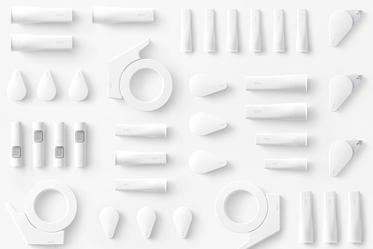
The main body of the products were finished in matte white and the logo and other information were printed in small font with medium contrast so that it won’t be unnecessarily informative on the desk. Moreover, as a rule across all the products, colors used as an accent represent their functions, such as “grey = standard”, “red = strong adhesion” and “light blue = re-stickable”.
The package design also deployed these colors, along with pictograms with brief explanatory texts, as a simple yet careful communication method and avoided excessively stimulating expressions in previous packages. Wishing to share joy and excitement of smooth and convenient pasting activity, symbols representing the “pasting process” was placed on the top right of the logo and the package.

Packed in a limited edition GLOO box that includes a bird-shaped paper mobile object to be crafted using the products within, the collection includes: a square-shaped glue stick that can be easily applied to the corner edges of paper; a tape glue with compact head that can be swung into the body when being carried; an instant glue with red color that clarifies pasted area and fades after 15 minutes; and a tape dispenser whose body was made as light as possible to carry, and to prevent injury and damage from dropping.


