Designed by Projekt Prague, Syrena Irena bistro, which serves traditional pierogi dumplings, is a restaurant that blends modern and mid-century details in of Warsaw. The building that houses this new bistro was raised in the early ’50s, and originally served as the cafe of what was then a hotel. With this in mind, the creators chose Warsaw’s symbol as the patron of the new place – a mermaid (syrena in Polish) with a groovy name, Irena.
Along with talented illustrator Ola Sadownik, graphic design studio Mamastudio created outstanding and eclectic branding. “We were influenced by the aesthetics of jazzy Warsaw of the ’60s, when this part of town was a vibrant destination for night owls and barflies. There were bright neon signs, music everywhere, colorful artsy types, and thrilling energy. With that, we decided that the mermaid logo should bear resemblance to a retro cut-out. The typography is expressive and slightly clumsy on purpose,” say designers, who were inspired by the Polish School of Posters. Thanks to their idea, Syrena Irena has become a witty goddess of the day (when pierogi are served), and the night (when vodka flows like water).
“Despite this duality in the bistro’s persona, varied details like neon signs, lettering, and murals, all come together harmoniously,” Mamastudio concludes. Their idea to use “Ulysses and the Sirens,” the painting by Herbert James Draper, was embodied as a wallpaper covering two walls.

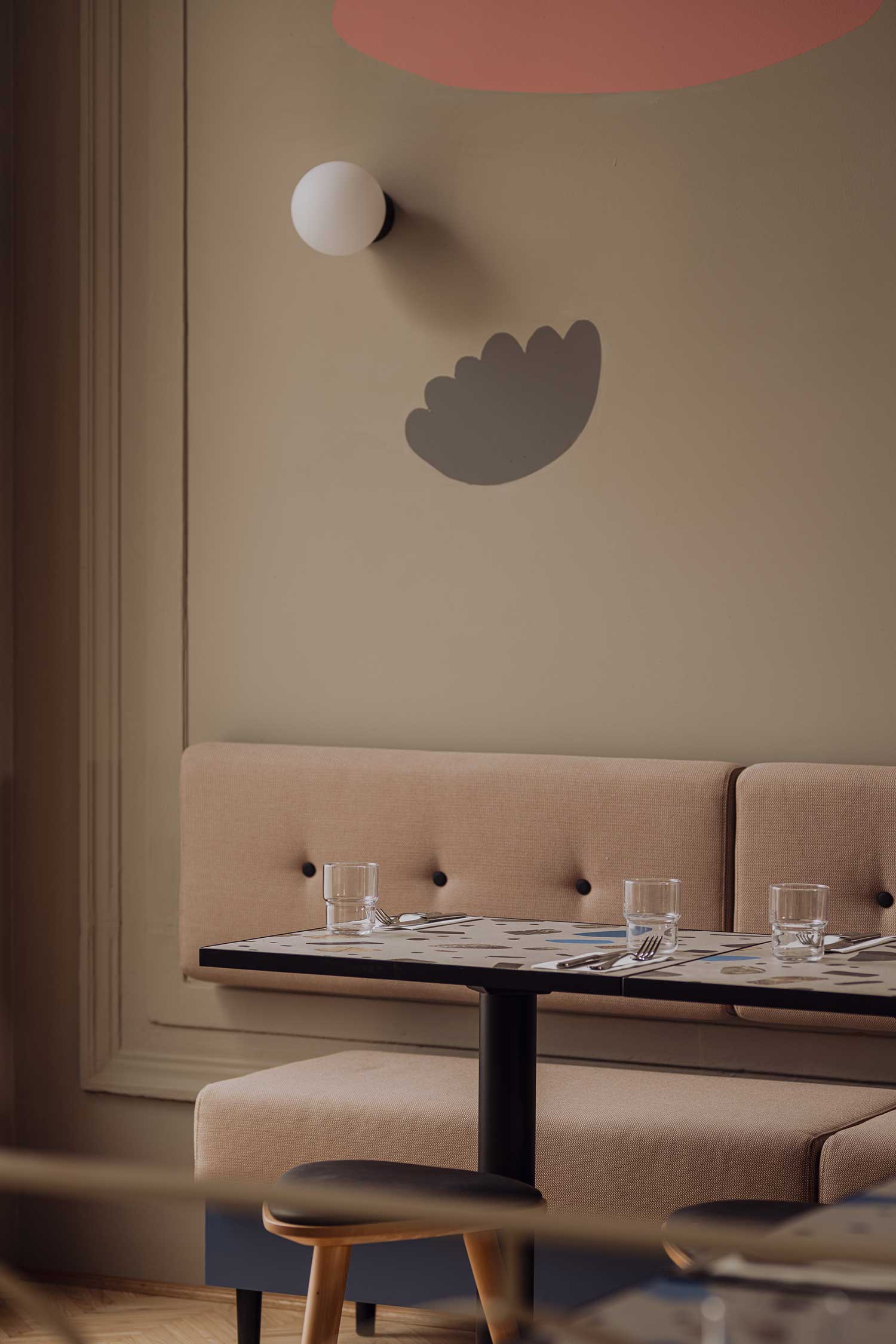
Hand in hand with the designers, Projekt Praga architects focused on merging old and new. They drew the color inspiration from the branding. “We wanted to incorporate the brand’s boldness into the interior while maintaining both the simplicity of the culinary concept, and the airy space.” Powder-coated bar counters in bold colors complement the existing wall moldings and arches from the original ’50s interior. Vivid hues of blue reference the aquatic nature of a mermaid, while pink, peach, and coral tones emphasize her flirty character. The black and the beigy-grey balance this zeitgeisty space.
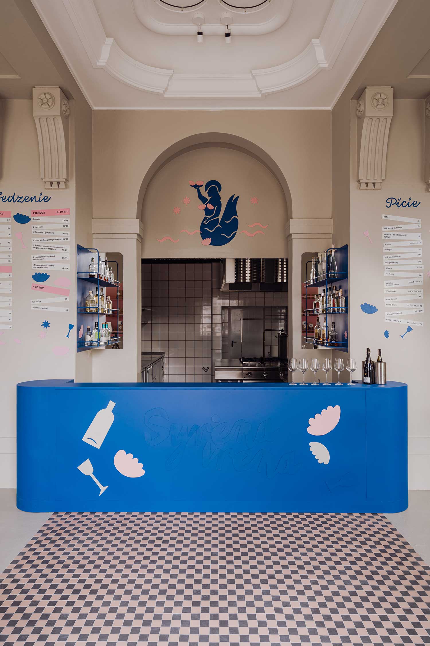
“The alternating personality of Syrena Irena gave us a chance to use geometrical forms and colors. The classical aesthetic of the existing space was balanced by less profound features like wall drawings, railings imitating a mermaid scale pattern, and distinctive neon signs,” explain architects who worked with Jacek Hanak, the gifted artisan responsible for reviving many old neon signs in the capital.

Projekt Praga intentionally chose details, shapes, and materials which are still associated with the prudent design of the communist era in Poland. Terrazzo- like tabletops with simple black bases were custom-made, as well as most of the metal objects. Triangular-shaped Finn stools designed by Buck.Studio, milky glass sconces from Aqform’s Modern Ball collection, and mosaic tiles at the entrance give a pinch of mid-century feel.

In the afternoon, sun glares through big windows and illuminates the dining room, giving guests the sense of being in a retro movie scene. When the sky goes dark, neon lights make their way through the dimmed bistro filled with music. Syrena Irena’s contrastive design has certainly met the city’s need for a cutting-edge pierogi place.


