
In a 1970s first-floor flat in Prato’s Pietà district, bucci quentin organizes a 168-square-metre renovation around a single chromatic decision: lobster red, applied consistently but never dominantly, becomes the connective tissue that holds the project together. The flat occupied the first floor and attic of a multi-family villa clad in exposed stone, with clear proportions and good views of the surrounding greenery; what it had lost through decades of piecemeal use was spatial coherence and domestic identity. The studio’s response — subtraction, bespoke joinery, and a color that travels through the section rather than covering any single surface — produces a home that is immediately recognizable without ever being decorative.
The entrance establishes the project’s spatial logic before a room opens. Floor-to-ceiling olive green millwork lines the arrival zone, organizing storage and directing movement without adding walls. The color choice is not incidental: green reads as neutral here, a contained backdrop against which the lobster red, introduced later, registers with precision. The herringbone oak parquet begins at the threshold and runs continuously through the flat, providing the warm, tactile continuity that the studio identifies as the project’s primary material narrative. In an earlier Florentine villa renovation, bucci quentin’s Arcipressi project deployed a similar discipline around material continuity and color as spatial signal rather than decoration.
The plan was reorganized around fluidity and light in a flat renovation in Prato, Tuscany that treats subtraction as its primary tool. Partitions were lightened, spaces opened toward each other, and the living room was set on a slightly raised platform to create a visual separation from the dining area without introducing a physical division. The sequence — living, dining, kitchen — unfolds toward the surrounding greenery, with windows distributed on all sides framing the garden views as a continuous series of landscaped apertures. This relationship between interior and exterior was treated as a programmatic condition: the flat’s position within the early twentieth-century villa meant the Tuscan garden views were always present, and bucci quentin consistently worked with them rather than against them.
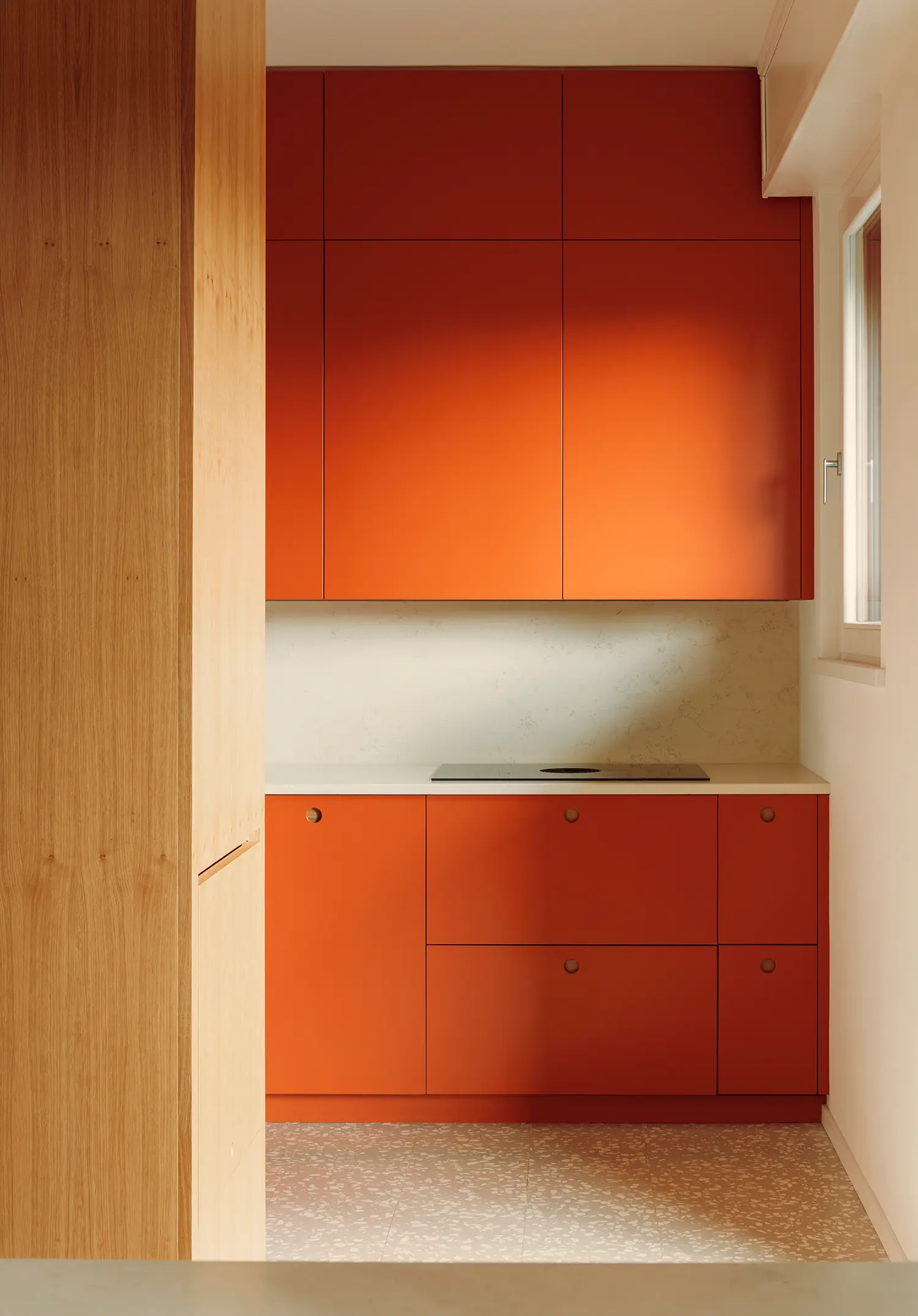
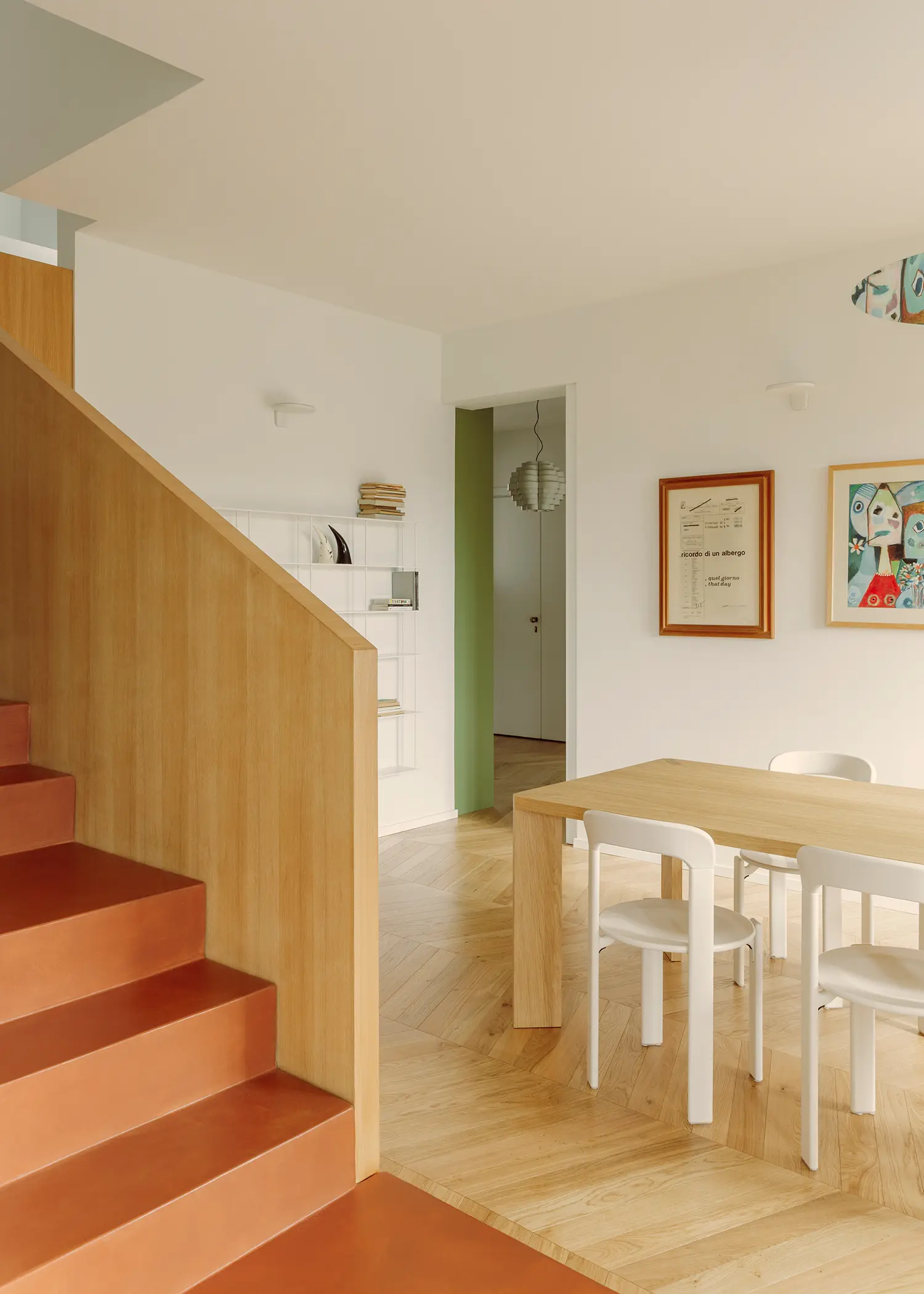
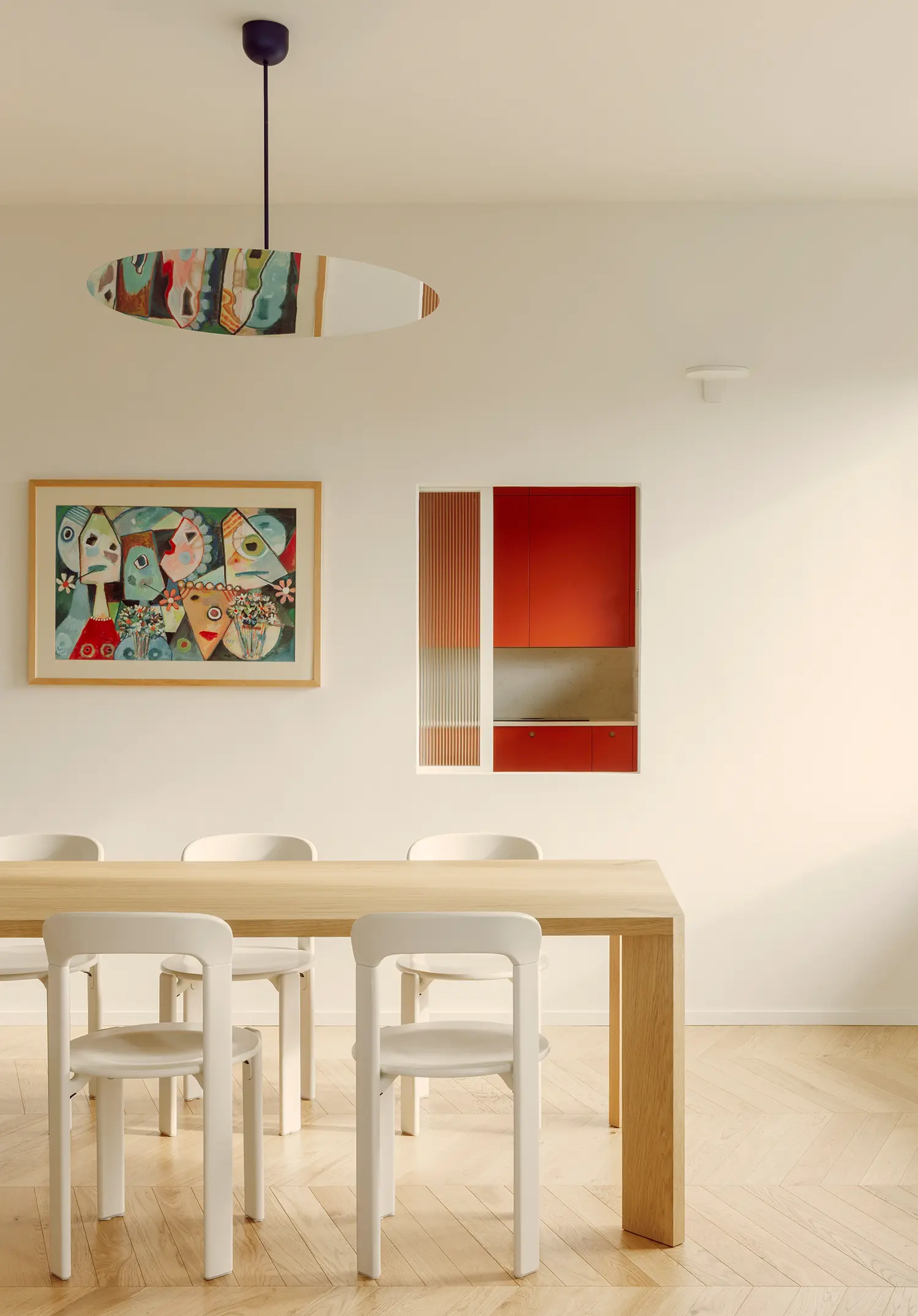
The kitchen is where lobster red announces itself most completely. A fully custom-made kitchen in lobster-red lacquered joinery — designed by the studio and executed by aj interiors design — occupies the kitchen zone as a single chromatic mass, contained within its room rather than bleeding into the living areas. The floor shifts here from oak parquet to MIPA Seeds terrazzo, a speckled multicolored stone that picks up traces of the red in its aggregate and carries the color logic into the horizontal plane. The resin staircase, in the same lobster tone, performs the same function vertically: it anchors the color in structure rather than surface.
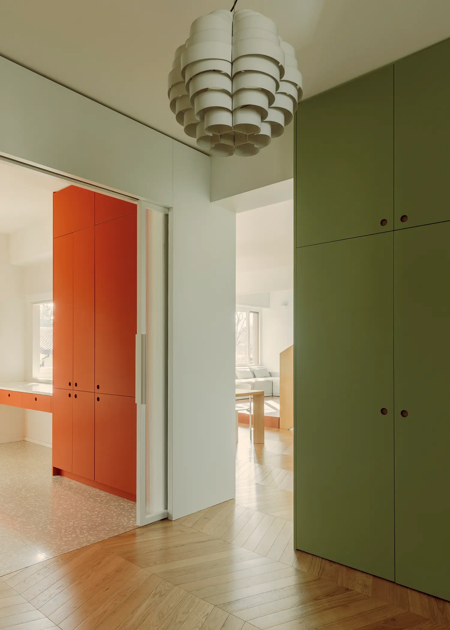
Bespoke joinery functions as architecture throughout. The fitted corridor leading to the three bedrooms and two bathrooms operates as a domestic backdrop — a continuous wooden element that organizes the sleeping wing without subdividing it into a sequence of closed doors. Built-in cupboards, carefully measured passageways, and new openings create the sensation of a single extended spatial sequence. The studio’s approach to joinery — designed in-house, executed on site by local craftsmen — is consistent with a practice that treats bespoke furniture and architecture as continuous rather than separate design acts.
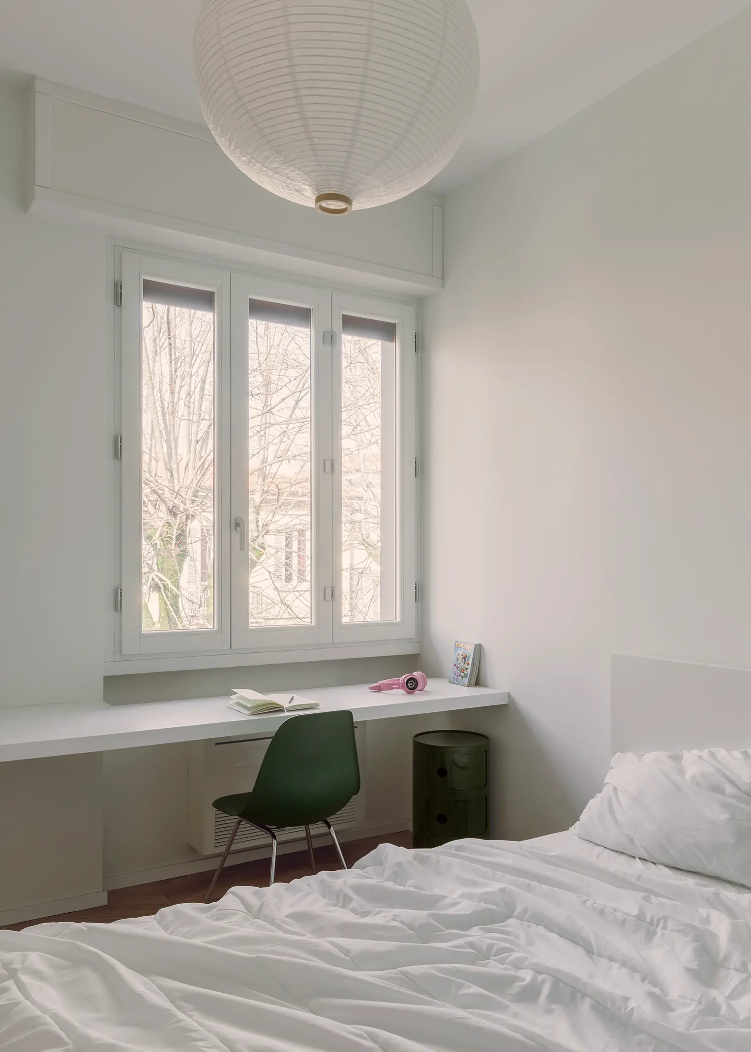
The staircase to the attic floor is the section’s most precise move. The resin staircase treads in lobster red rise between a full-height oak panel on one side and a white plaster wall on the other, framing the ascent as a chromatic and material transition. The attic level — conceived as a hybrid flexible space combining a screening room, a study area, a laundry-bathroom, and a pocket terrace — operates at a different register from the floor below: lower ceilings, softer light, arched windows framing views of the Tuscan roofscape. The division between the two levels is spatial and programmatic rather than stylistic.
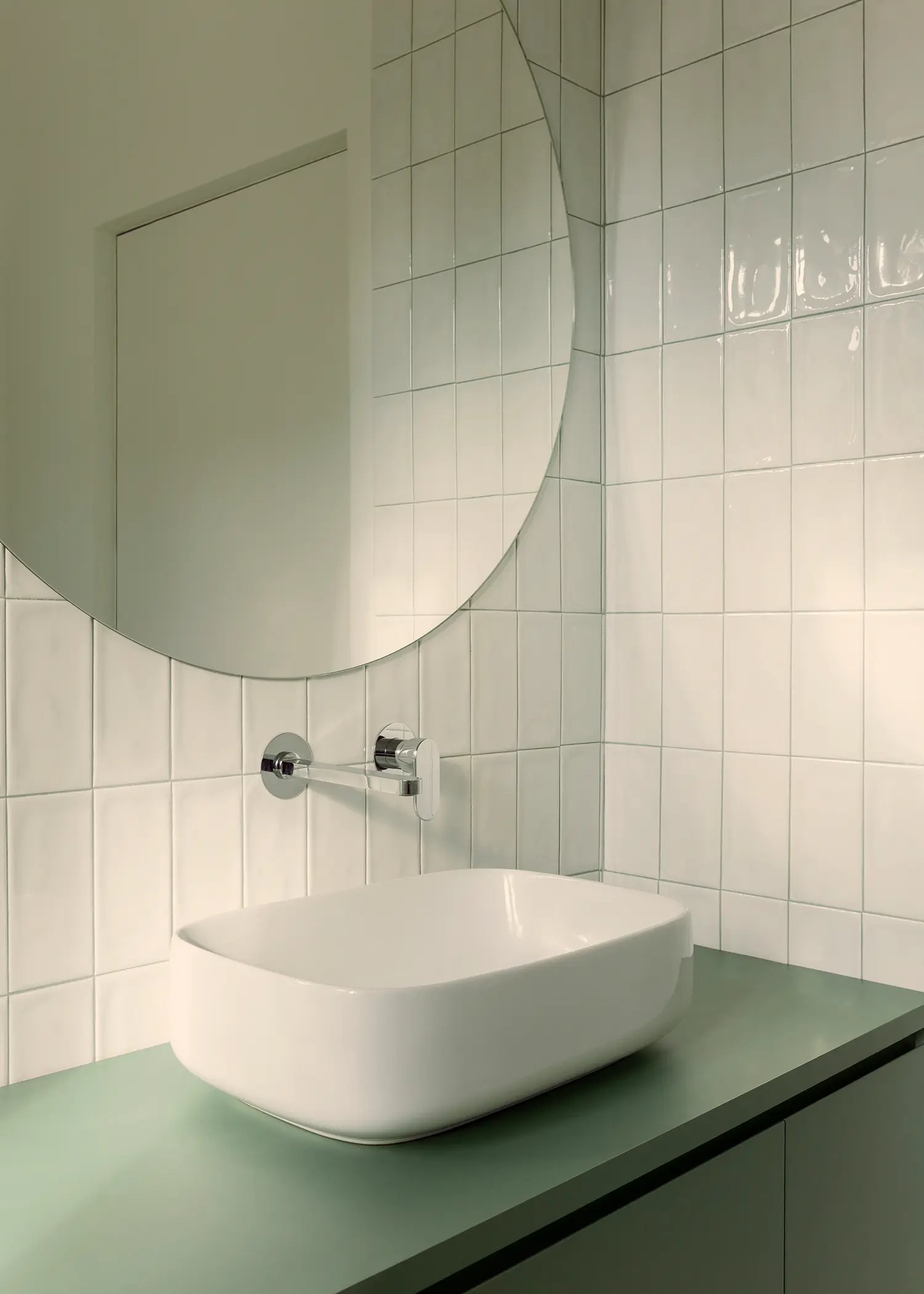
The bathrooms carry the color argument to its most condensed expression in this lobster red interior design project. Three bathrooms, each resolved differently: one with sage green ceramic wall tiles and a lobster-red vanity unit in Egger U335 ST9 panels; a second with deep forest green tiles and the same red vanity; a third with white tiles and a green vanity in Egger U604 ST9 panels. The chromatic strategy is consistent — each bathroom pairs one field color with lobster red as accent — but the individual combinations produce three distinct atmospheres within a unified logic. The Vogue Materia 10×20 handmade ceramic tiles, with their surface variation, prevent the color from reading as flat or industrial.
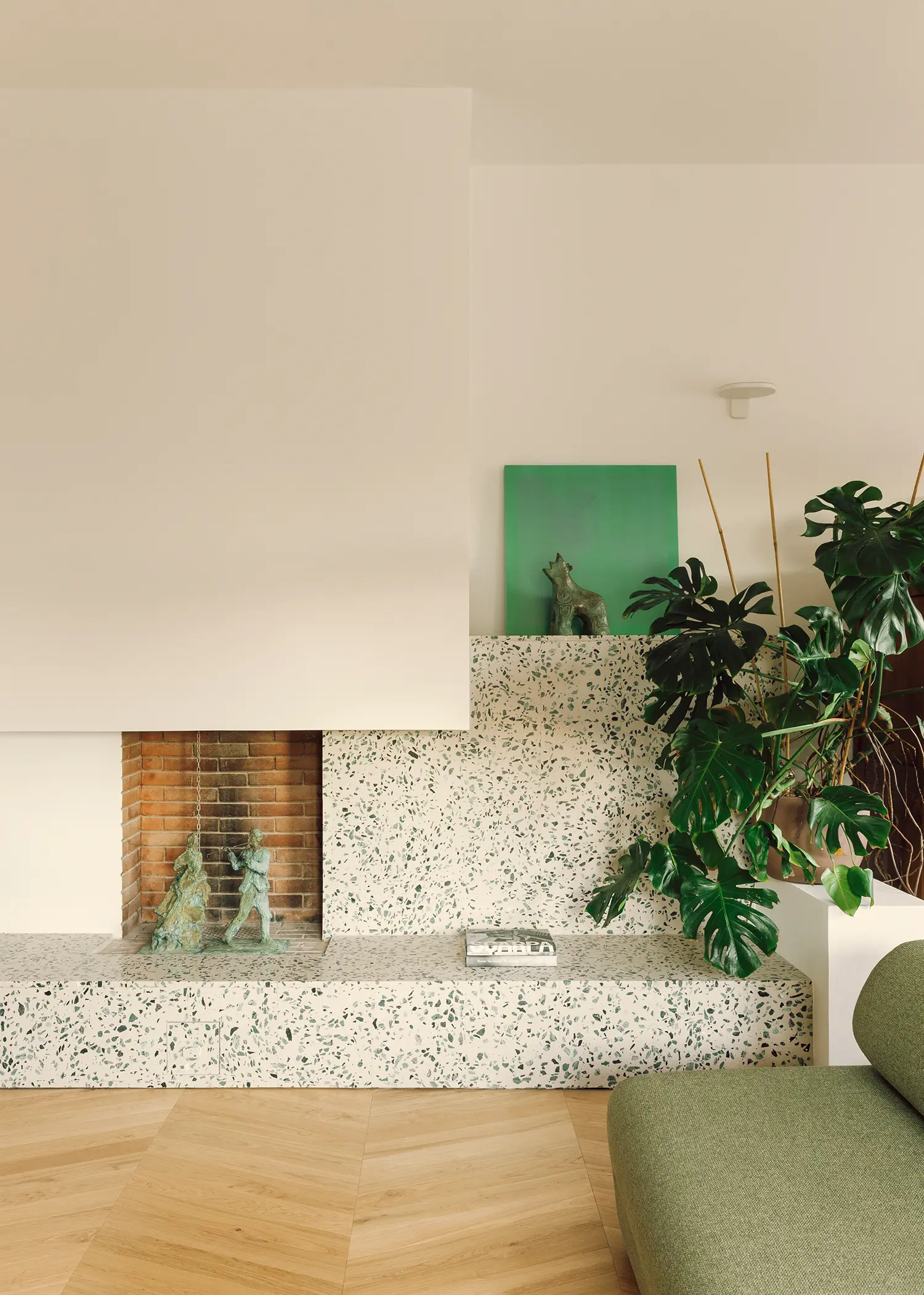
The terrazzo fireplace surround in the living room is the project’s most unexpected material decision. A stepped plinth in speckled multicolored terrazzo frames the existing fireplace, extending horizontally into the room as both hearth and low shelf. The aggregate carries traces of green, white, and terracotta — a compressed material echo of the project’s broader palette. It is the only surface that doesn’t belong to either the wood or the resin family, and its presence prevents the interior from resolving into pure graphic simplicity. The fireplace surround is also the one element that reads as permanent in a project otherwise defined by its joinery — built, not fitted.
The Lobster is a coherent project, but its title reveals a risk that the design narrowly avoids. Naming a residential renovation after its accent color invites the expectation that the color will be the protagonist — a trap that defines much of contemporary Italian interior design. Here it never is: the red functions precisely because it is restrained to specific surfaces — resin staircase, kitchen joinery, bathroom vanities, door details. Had it extended to walls or floors, the project would have become illustration. The discipline of keeping lobster red as signal rather than atmosphere is what makes it legible as an architectural decision rather than a styling choice, and what distinguishes bucci quentin from the broader trend of color-forward Tuscan residential interiors that announce everything and commit to nothing.
The Lobster by bucci quentin | Location: Pietà district, Prato, Tuscany, Italy — Year: 2026 — Key materials: oak herringbone parquet, lobster-red resin finishes, bespoke lacquered joinery, multicoloured speckled terrazzo, ceramic wall tiles