
In Barcelona’s Sarrià, Rocco Bibbiani of Not a Studio renovated a 36-square-metre ground-floor flat without adding a single centimetre of floor area — and produced something that reads as larger than apartments twice its size. The building dates to 1919; the flat had belonged to the same family for generations, subdivided across four rooms, a kitchen, a dining area, and a bathroom located on the terrace. The project’s central argument is that the correct response to a constrained footprint is not cleverness but clarity.
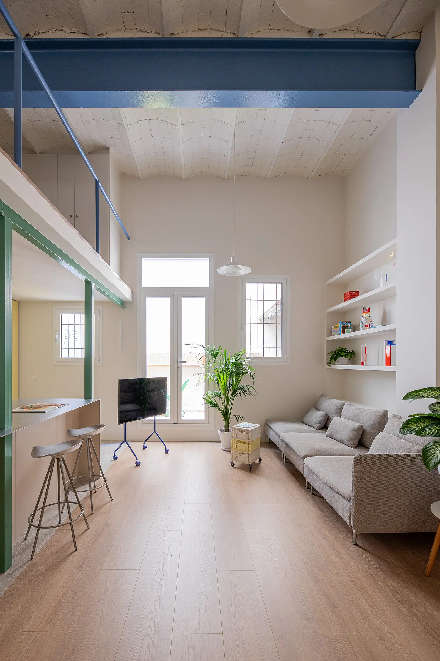
The condition Bibbiani inherited was not simply small — it was actively hostile to light. The original brick vault had been varnished in dark tones, the nearly five-metre ceilings were interrupted by partition walls, and a previous renovation two decades earlier had introduced a mezzanine that captured the height without releasing it. The flat had volume it could not use.
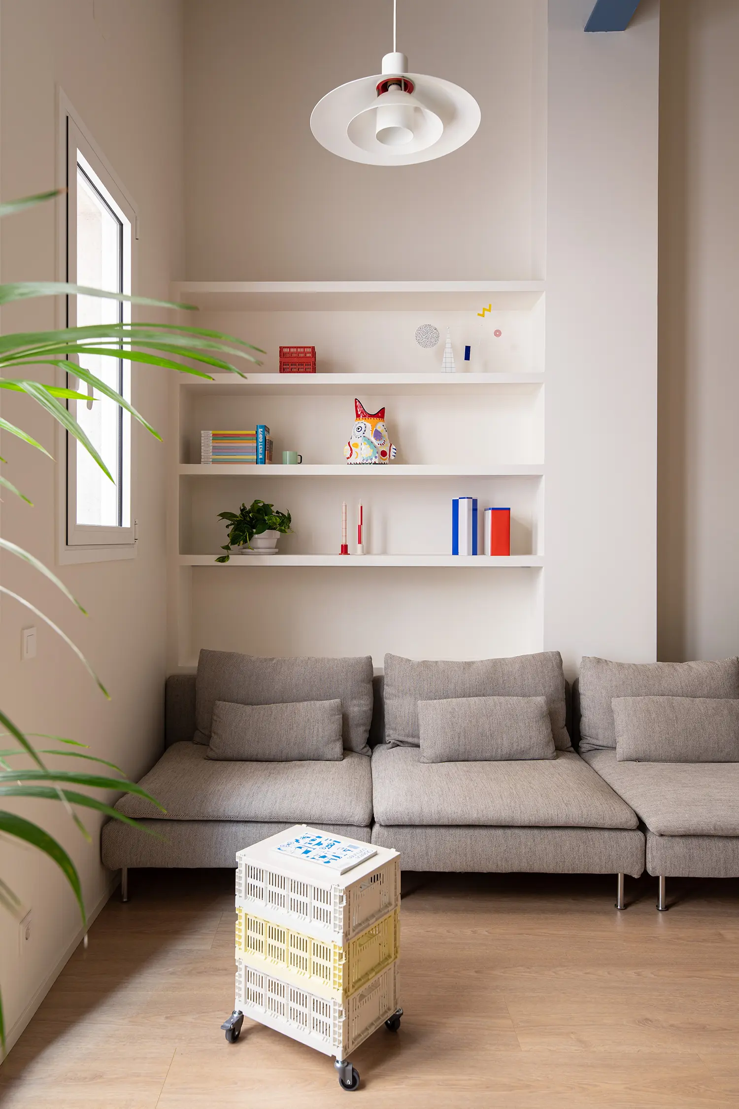
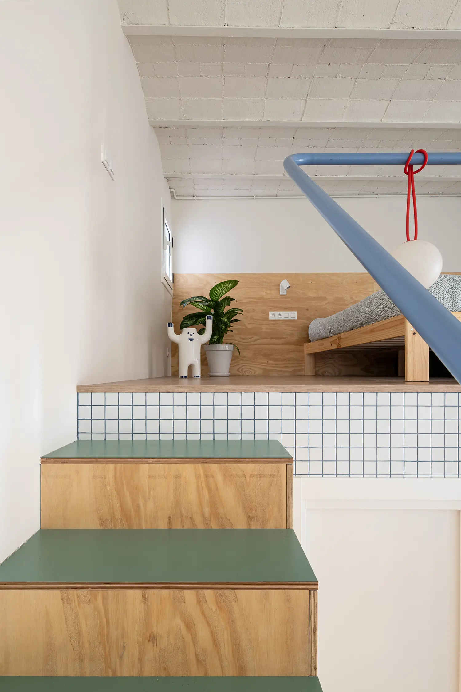
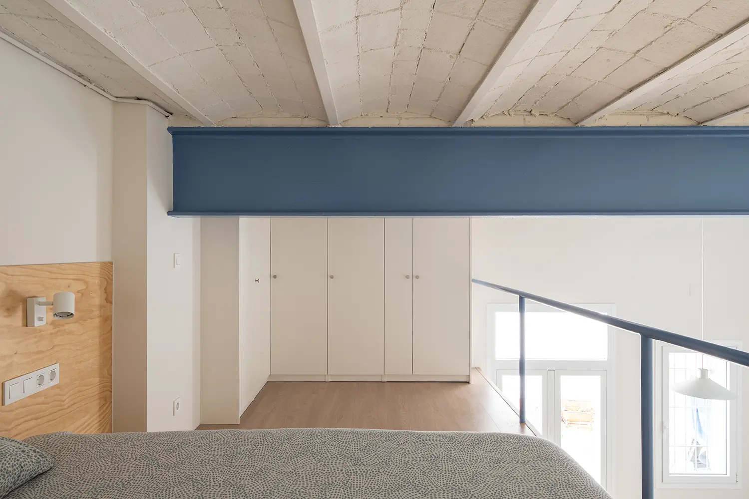
Subtraction was the first structural move. Every partition wall came down to produce a single continuous volume, the mezzanine retained but now read from below as part of the same spatial event rather than as a separate room imposed upon it. The monumental ceiling height — previously obscured — became the primary architectural element, and the plan resolved itself once the vertical dimension was allowed to operate freely.
Color entered not as decoration but as ballast. Blue, green, and yellow were applied directly to beams, pillars, and the large iron structural beam set perpendicular to the Catalan vault — not to signal their function but to calibrate their visual weight against the whitened walls and pale laminate flooring below. “There was no rigid hierarchy in assigning the blue, green or yellow to specific structural elements, but a search for total harmony,” Bibbiani tells urdesign. “Each colour has its own visual weight — the distribution emerged intuitively during construction, with the aim of balancing the whole rather than spotlighting any single element.”
The references Bibbiani draws on are neither historical nor northern European. He names the contemporary Spanish scene — studios including BURR and Plutarco alongside H3O and AMOO — as the generation that has given him a working model for colour as a structural proposition rather than a surface treatment. His own background in advertising sharpens that instinct toward composition. “I imagine every home I renovate as a canvas to paint on,” he tells urdesign. The result is a palette that feels resolved rather than applied — each element assigned its hue the way a painter assigns mass, not the way a contractor assigns a finish.
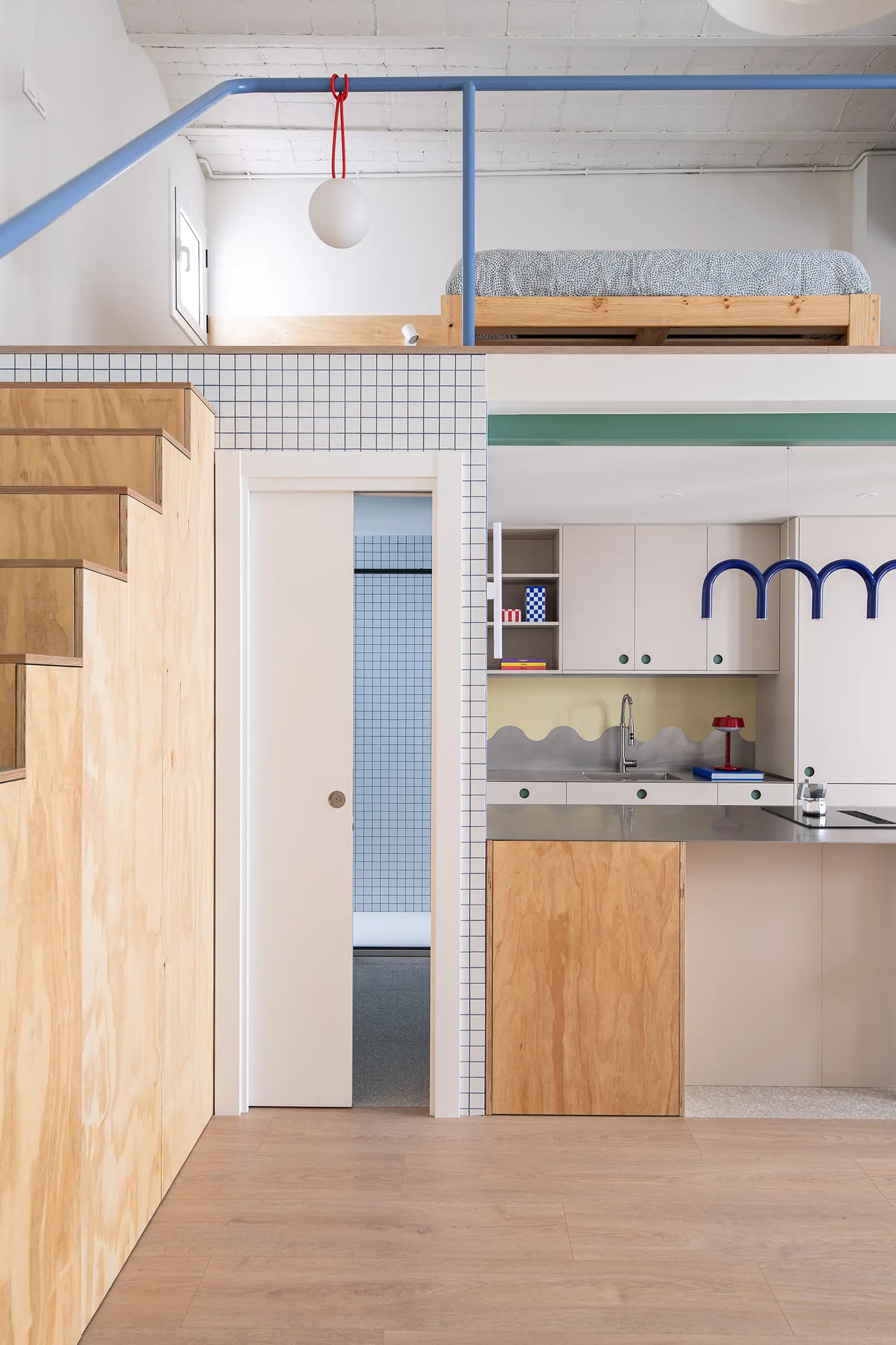
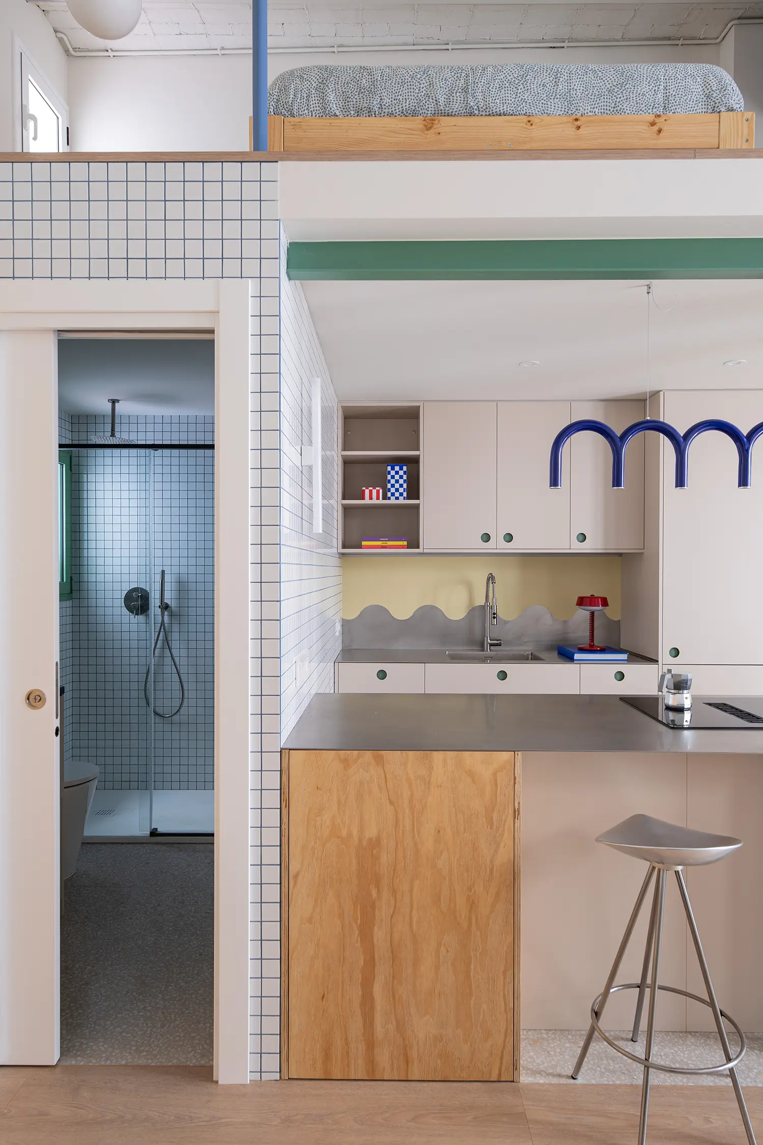
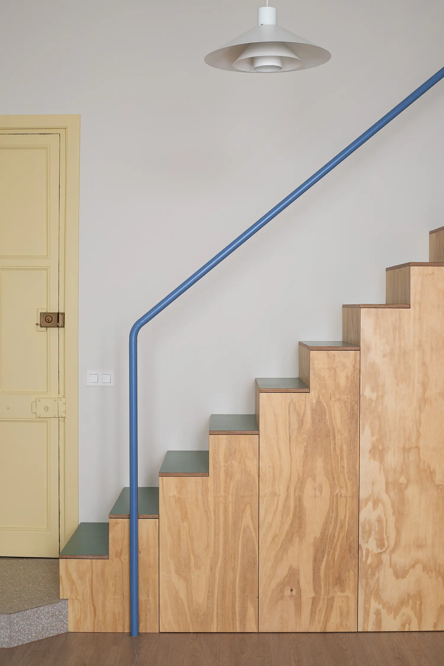
The mezzanine and the level below are, in Bibbiani’s reading, one volume rather than two. The staircase — designed and fabricated by the studio in phenolic pine plywood, with storage integrated under every tread — was kept deliberately open, its handrail detailed to minimum section so as not to interrupt the sightline between the two levels. The iron beam above was painted sky blue to reinforce the same vertical axis chromatically: a single element doing the work of a section drawing, connecting floor zone to sleeping platform without a wall.
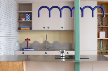
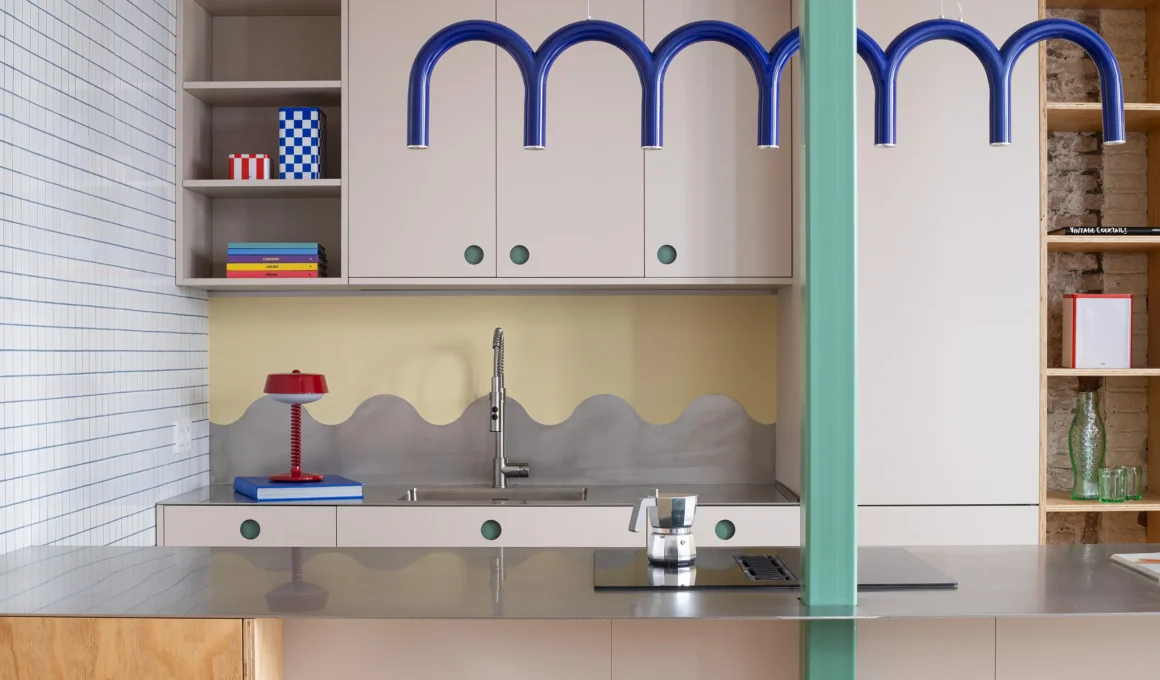
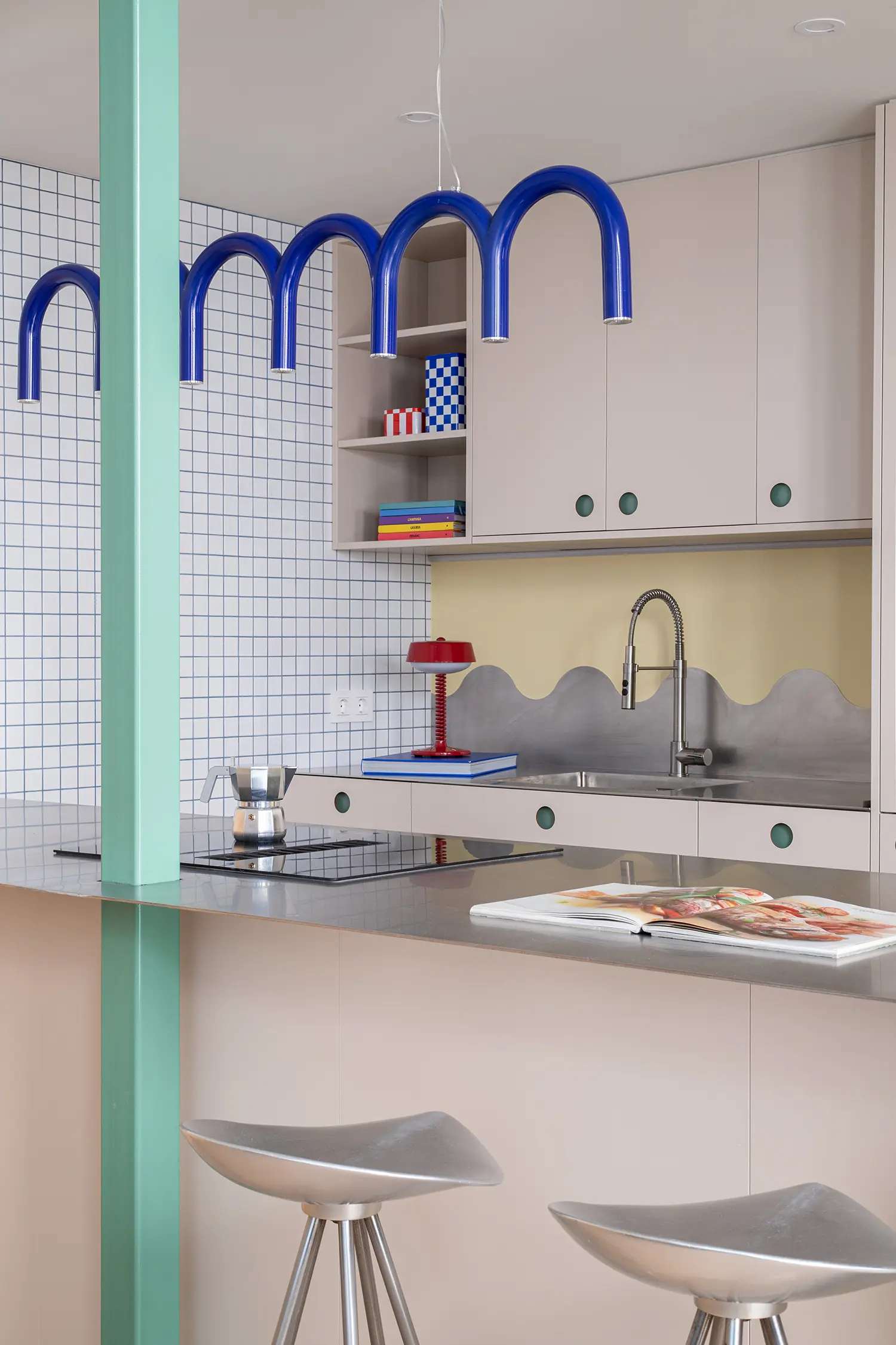
The kitchen anchors the chromatic logic of the plan. A METOD framework from IKEA is fronted with panels from Madrid-based CUBRO; the custom steel countertop terminates in a WAVES backsplash fabricated by Plecoart, its undulating profile holding the wave geometry that appears as a recurring motif across the kitchen joinery. Square white mosaic tiles from CE.SI. line the wet zone, their grid answering the circular drawer pulls in a deliberate geometric dialogue that Bibbiani has made a signature of his practice.
The bathroom sits below the mezzanine, using the same square tile as the kitchen to maintain material continuity across the two wet areas — a decision that makes the flat read as a single considered object rather than a sequence of rooms dressed independently. Storage runs throughout: under the stairs, inside the PAX wardrobe system with CUBRO fronts, along the shelving built into the living wall. Nothing is added for its own sake; every fixed element resolves a spatial problem while contributing to the surface register of the whole.
What Monterols demonstrates is that the discipline of the small-space renovation does not live in its tricks — the motorized beds, the fold-down surfaces, the furniture that becomes another thing after dark. It lives in the quality of the subtraction: what the designer agrees to remove, expose, and leave unresolved. A flat this compressed can absorb a sky-blue structural beam painted for visual axis rather than architectural drama precisely because nothing else is competing for attention. The restraint is what makes the colour possible — and that sequence, not the palette itself, is the decision worth studying.
Monterols by Not a Studio | Location: Monterols Street, Sarrià, Barcelona, Spain — Year: 2026 — Key materials: phenolic pine plywood, CE.SI. glazed white mosaic tile, VIVES porcelain tile (Portofino), laminate flooring, stainless steel countertop, IKEA METOD and PAX systems with CUBRO fronts