Design studio Phenomena has recently completed Torta da Vila, a family restaurant in Vila Nova Conceição, Brazil. The design team was tasked with expanding the space into a new site and developing a new identity both visual and spatial, that could be easily replicated and recognizable. “From the existing logo we extracted only the essential,” explains the studio. “The colors, green and gray, and the pie symbol became the foundation of a new visual, spatial and brand identity.”
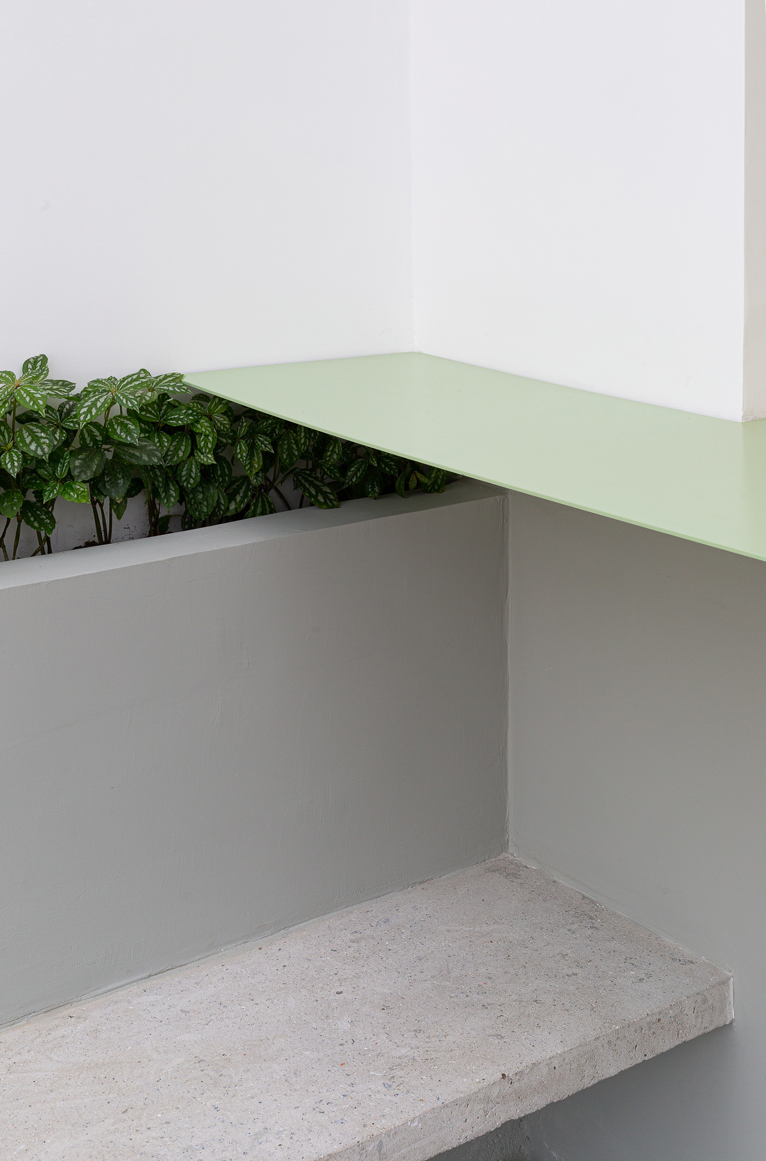
Applying green and gray both in the walls and floors allowed for the distinction between exterior and interior spaces. This color scheme maintains unity in space, even if there are physical interruptions as the stairs.

Painting only the bottom half of the walls creates a linearity that conducts the eye across different spaces, providing dialog and fluidity between public and private, inside and out. These are connected by the architectural elements like the hollow concrete blocks in the facade, the thin green steel counter, and the elongated light fixtures.

The flow is reinforced with the big openings that not only integrate spaces, but also improves lighting and airflow. The new logo was painted with the same green tones on the facade, following the premise of what is essential, as cement, concrete and wood are used in their raw form.


