



A green kitchen never fails on the shade — it fails on the volume. Search “green kitchen” and the results arrange themselves into a color chart: sage, olive, forest, emerald, lined up like paint chips, as if the only decision left is which one to point at. That sorting is the mistake. Across five recent projects — a concrete house in Quebec, a 20-square-meter cabin in the Dutch woods, a pastel London extension, a dog-first house near Warsaw, and a folk-maximalist flat in Brussels — the shade is almost never what decides whether the room works. What decides it is how loud the green is allowed to be, and whether the rest of the room can carry that loudness — the same claim the green bathroom made about light, moved one room over.
Green behaves differently from every other saturated color, and the reason is closer to botany than to taste. A green kitchen reads as material where a pink or yellow one reads as a decision. The color’s full range — moss, sage, olive, pine, bottle, emerald — maps onto things that already exist at scale outdoors: lichen on stone, a wet leaf, malachite, the underside of a fern. The eye files it as found rather than picked. That single perceptual fact is why green holds on cabinetry long after other saturated colors begin to date, and why it now behaves less like an accent than like a neutral that happens to carry a hue.
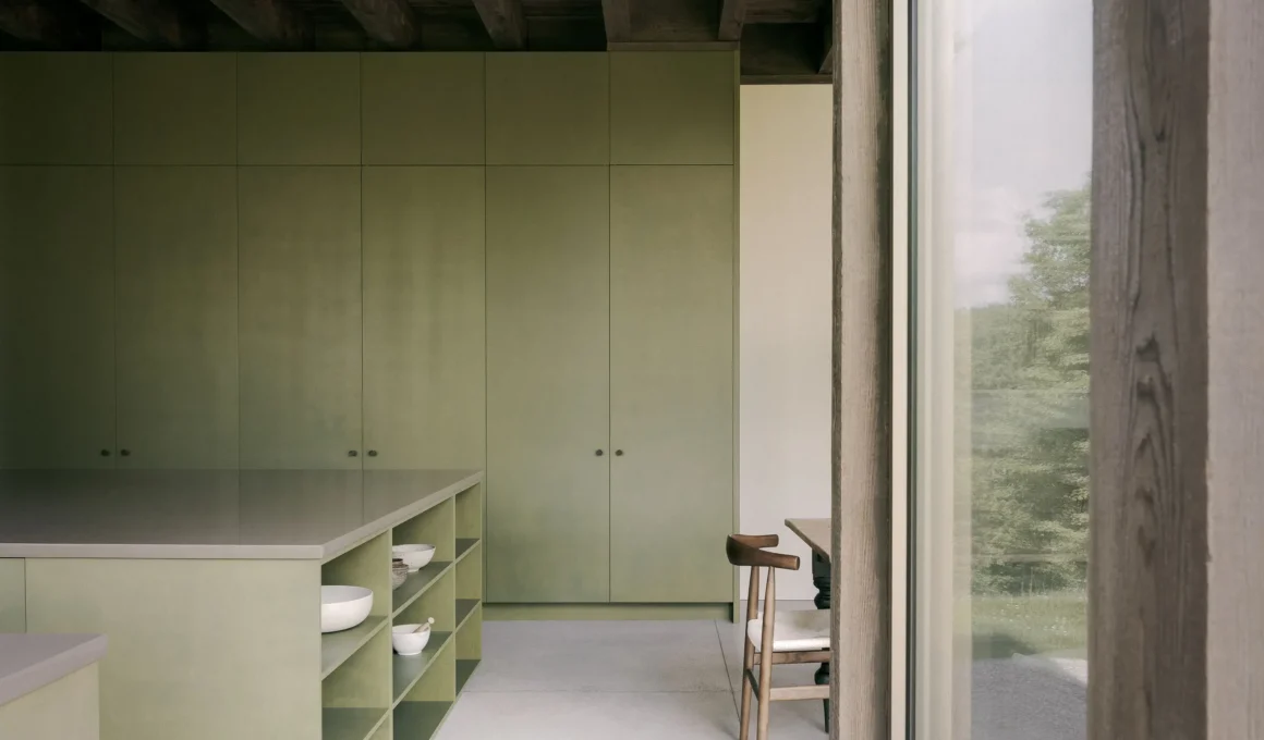
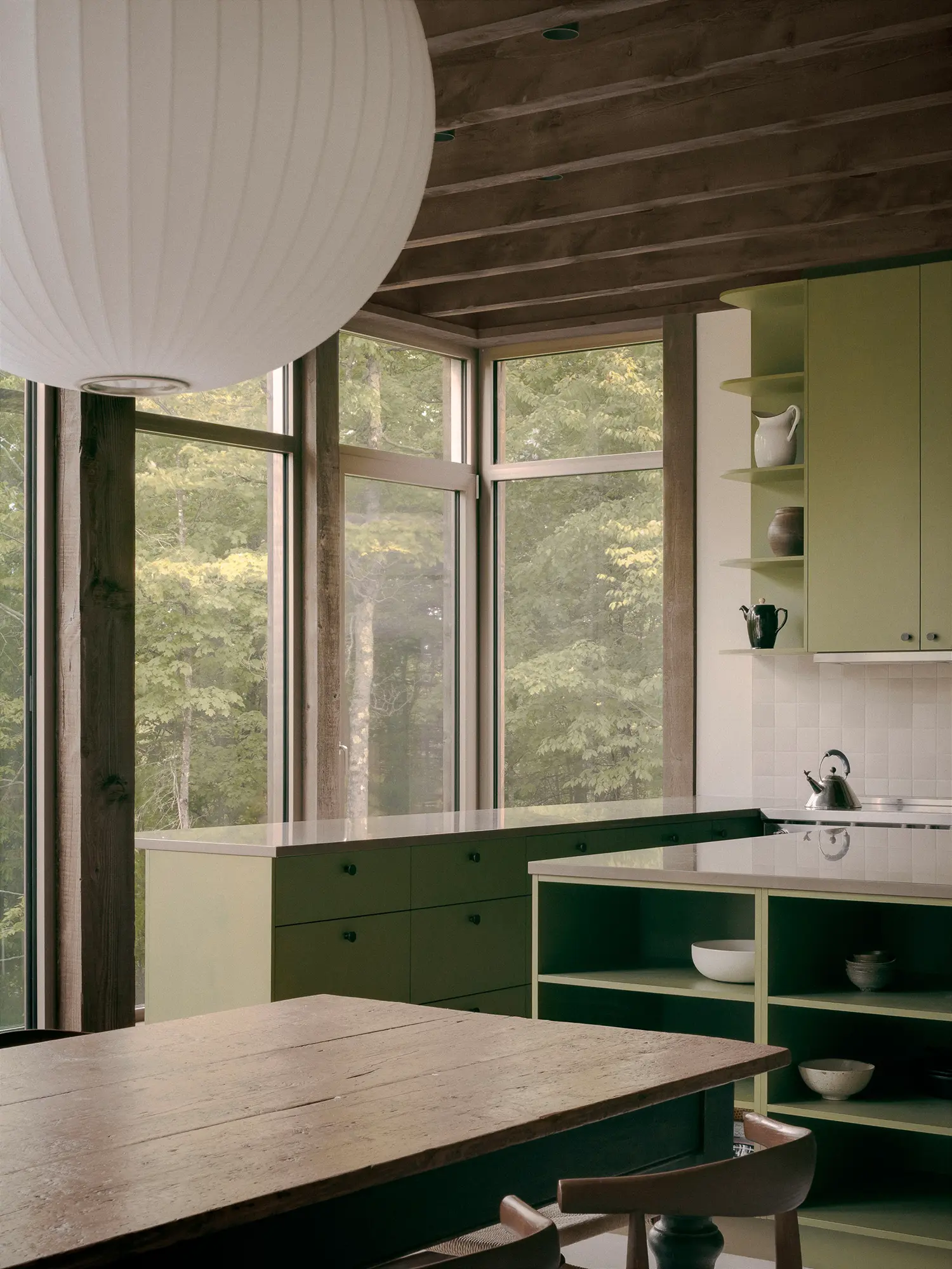
At the quiet end sits the matte, muted green built to recede. In Atelier Carle‘s SONO Residence, a 214-square-meter (2,303-square-foot) house in Wentworth-North, Quebec, the kitchen sits a shade warmer than the sage green kitchen that leads the searches — closer to a true olive green kitchen, so low in saturation it barely registers as color against the raw concrete and reclaimed timber around it. The studio faced the volumes north on purpose, trading solar gain for the stable, shadowless light that renders a surface identically all day. The kitchen is the one moment of total openness in an otherwise withheld house — “a gathering place, both for the couple and their guests, and metaphorically, with the surrounding natural environment,” Atelier Carle said. Under that northern light the green never shifts or flares; it holds one note while the room opens completely onto the forest.
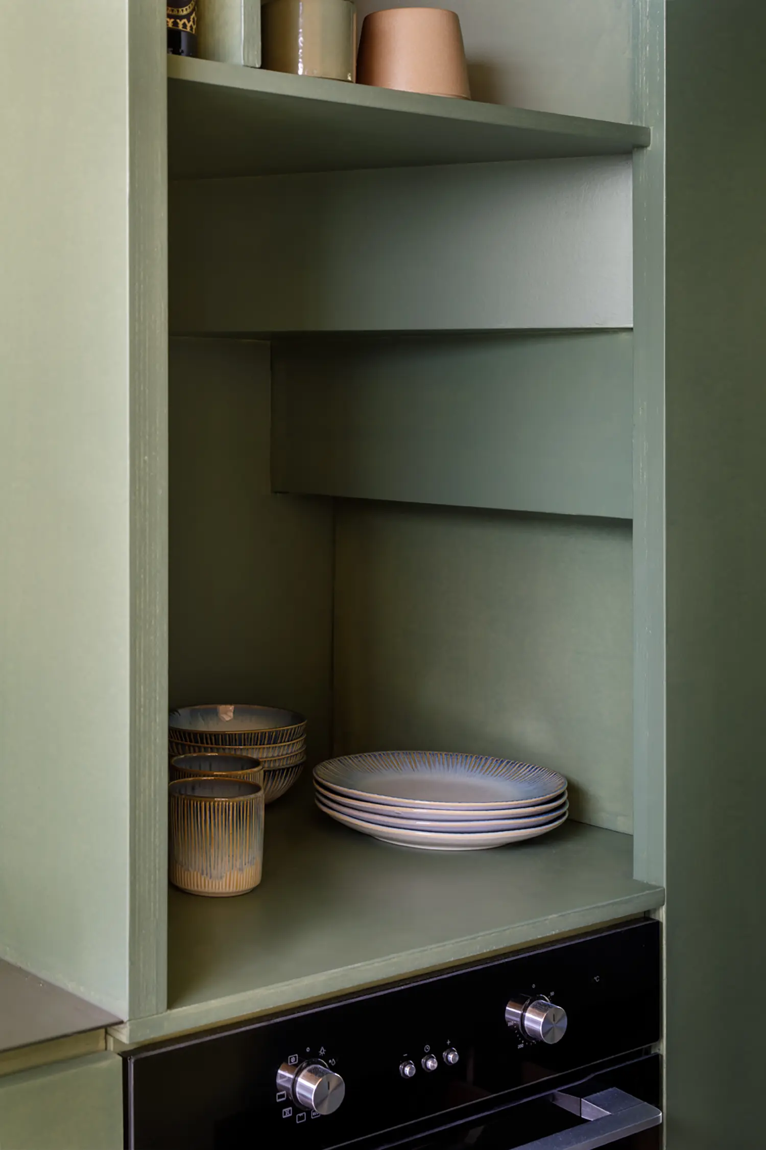
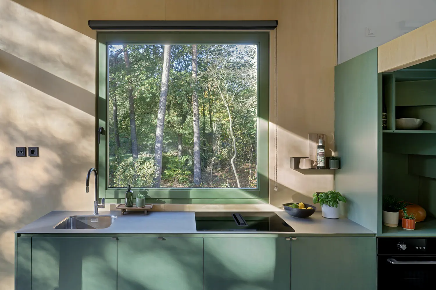
Finish is its own variable, independent of shade. i29‘s Lounge Lodge, a 20-square-meter (215-square-foot) cabin inside a Dutch holiday park, uses a forest green kitchen at a similarly low volume — but in gloss rather than matte, set against pale birch. Where SONO’s olive absorbs the northern light, the lodge’s lacquered green throws the surrounding trees back into the room; the chosen tone of the cladding functions as camouflage, letting the structure blend into the Drenthe landscape. Same family, opposite behavior — matte greens step back, glossy greens answer the window.
The cabinet is where it lives. Search traffic keeps landing on green kitchen cabinets rather than green walls or green floors, because the cabinet run is the surface that commits the room. And a cabinet’s green is only as good as what sits against it — the counter, the metal, the wood. A green and wood kitchen softens; the identical green against black or cold stone hardens. SONO’s olive works because reclaimed timber warms it; the lodge’s forest green works because birch keeps it from going heavy. Anyone specifying bespoke cabinetry is choosing a neighbor as much as a color, and the neighbor decides what the shade ends up meaning.
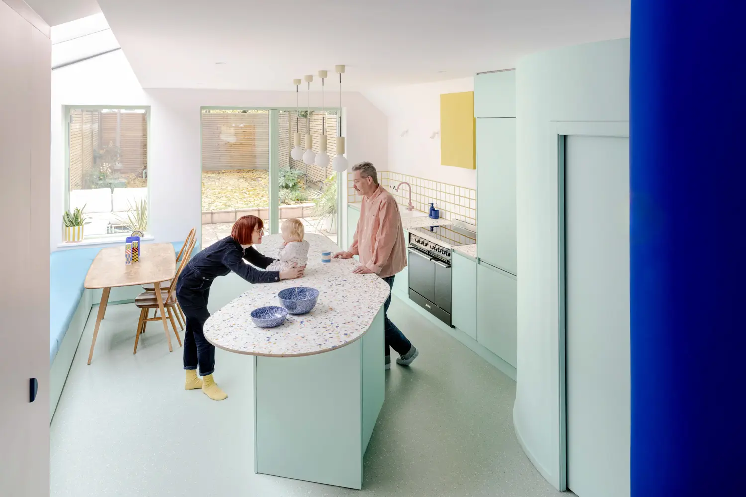
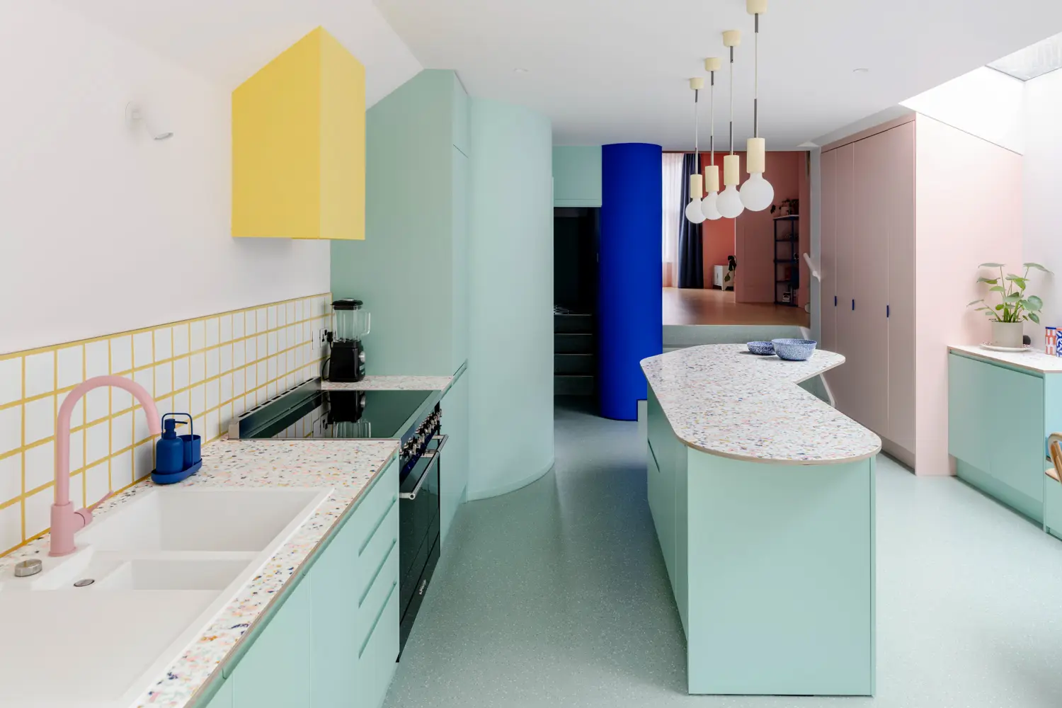
The pale team player is mint, and its job is not to lead. Office S&M‘s Beacon House in North London sets a mint-green kitchen under a yellow extractor, a pink tap, a cobalt column, and a terrazzo counter flecked with all of them. In that polychrome, green is the one surface that keeps the open-plan kitchen from tipping over — pale enough to hold the others, saturated enough to belong. The bespoke curved island does the spatial work; the mint does the chromatic peacekeeping. Turn that green up and the balance collapses. It is a volume tuned precisely to a loud room.
Green as ground is the move in one desk‘s Hornówek House near Warsaw, a home built around two rescue dogs and a demand for calm. The entrance is wrapped in feldgrau — a grey-green the studio’s color specialist, Olka Barczak, ties to “moss, lichen, and organic forest matter” — chosen to shade and settle you before the house’s reds, gingers, and Prussian blues arrive further in. A bottle-green glazed fireplace by Mutina closes the lounge; a grass-green bench closes the home office. Here green is neither accent nor envelope but ballast: the low, organic tone that lets a genuinely loud interior read as composed instead of frantic.
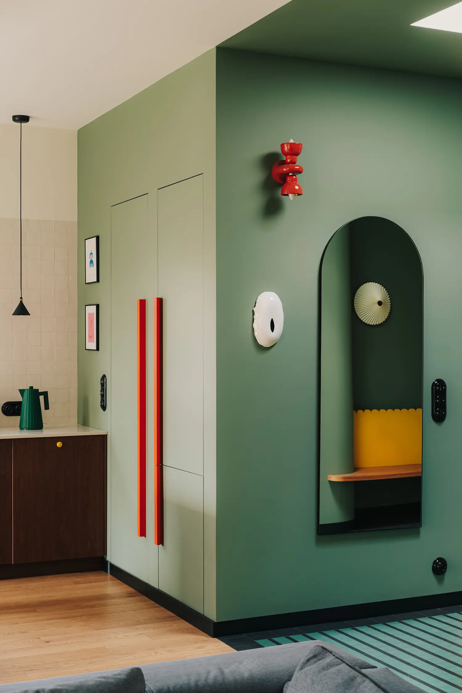
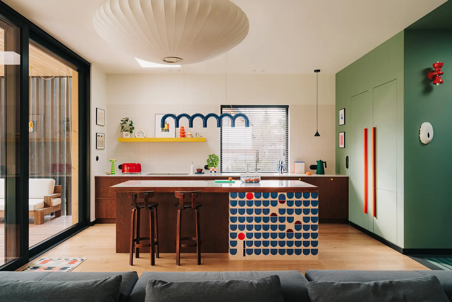
At the loud end is the full drench, and it works only because of that botany logic. Tine Loncin‘s Where East Meets West apartment in Brussels runs a deep emerald green kitchen across cabinetry, walls, and shelving, then hangs the ceiling with a Romanian-Belgian couple’s collection of folk plates. A pink room at that intensity would read as a stunt; the emerald reads as a field — a stable, material backdrop the maximalism can sit on. The studio chose the hue specifically to “reflect and amplify the space’s natural brightness,” and the drench holds because green at full volume still looks like a place, not a decision.
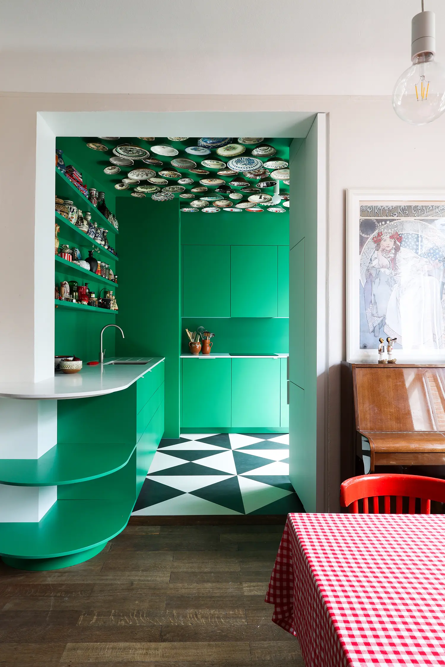
What the shade menus miss is exactly this. The lookbooks and the green kitchen ideas listicles sort the color into sage-versus-forest-versus-emerald and stop there, as if the outcome lived in the swatch. These five kitchens span nearly the entire green spectrum, yet the ones that succeed are not the ones that found the “right” green — they are the ones that matched the green’s volume to the room holding it: matte olive in a silent concrete house, emerald drench in a maximalist flat, feldgrau ballast under a riot of color. The searchable phrase is the shade; the actual variable is the volume.
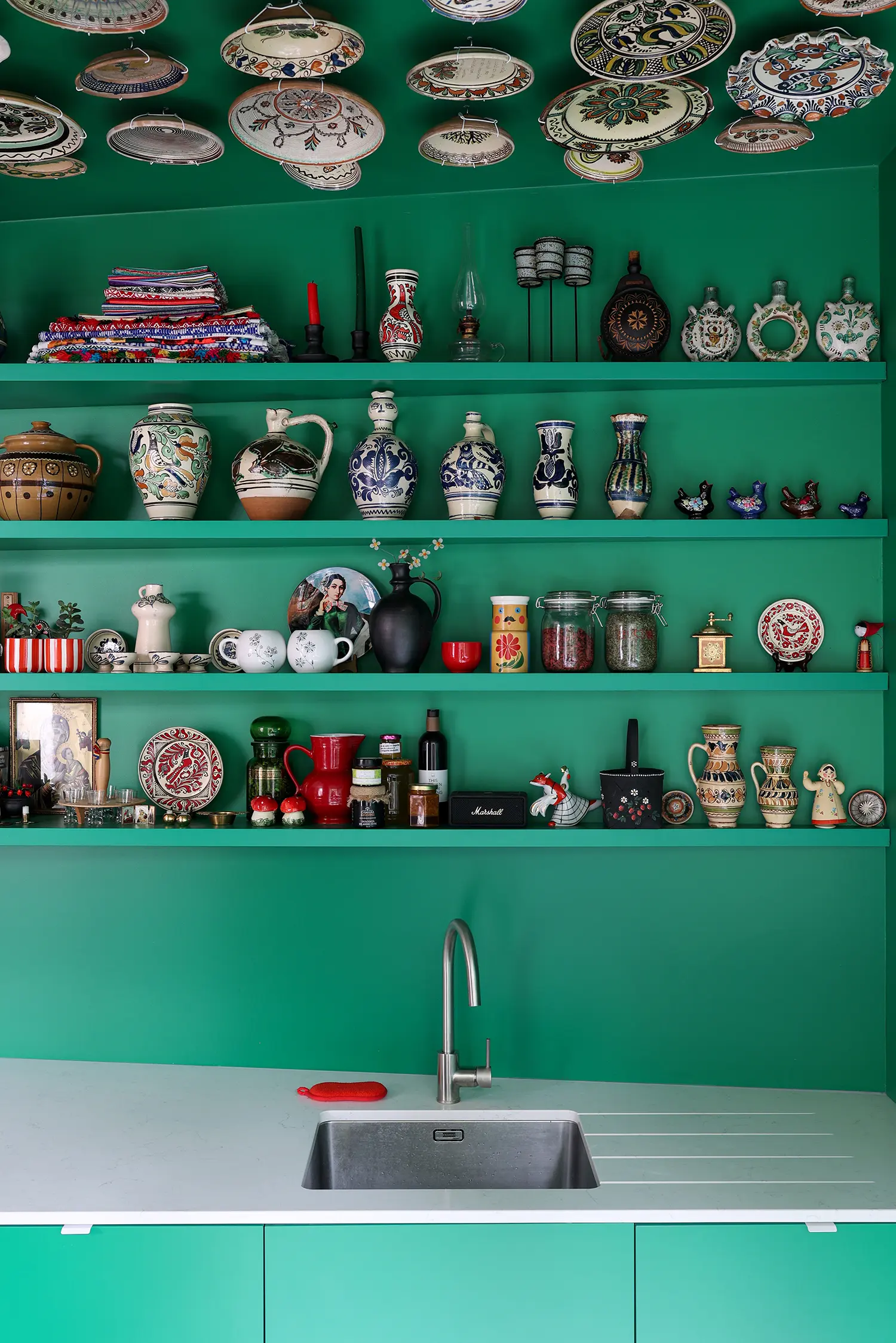
Green stopped being bold somewhere in the last few years and started being a neutral, and the shift looks permanent rather than seasonal — no one reads a leaf as a trend. What stays hard is not the decision to use green but the decision about how much of it a room can hold. Which means the green kitchens that fail from here will not be the ones that chose the wrong shade. They will be the ones that chose the right shade at the wrong volume.