
In order to fulfill the need for additional work space for their increasing number of office members, Bangkok-based design firm Apostrophy’s has recently extended and refurbished their Thailand office. Vivid primary color have been used as a core of design, consisting of 3 pure colors red, blue and yellow have been mark in each level link by a spectrum staircase as well as free hand Typographic and playful Pictogram which illustrate about design philosophy has been placed on the wall.

The retro neon sign has been placed on a hot red wall at the entrance. Then, entering to the first floor area has been design to be a reception hall and cafe for whether officer or guest. There are chairs and long desk along the wall beneath a loft steel cabinet. Red is the most powerful warm tone color so, it has been use to energized, and stimulated a guest to be excite and staff to express their enthusiasm at the first step.

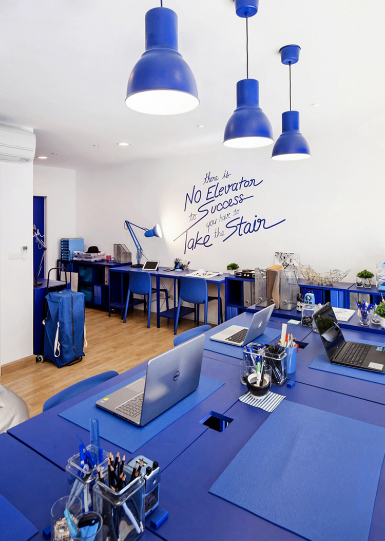
The second floor has been designed for working area called “Aposer Room”, marked by a blue, to make this space is calm, tranquility and stable. It is a open plan office, all working desk have been placed facing each others to allow them to have some discuss. A huge typographic phase “There is no “I” in TEAM but there is in WIN” have been place on the wall dominantly to remind all staff to cut down their self-esteem, then collaborated or have discussion to solve the problem or any conflict.

The third floor is the last level but is not the last of work, this floor has been realized for “Brain Storming Room” and executive room. It marked by a bright yellow to light up the space and may be spark the creative thinking as well as the typographic phase about working development to inform both beginner staff and executive officers.


all images © KETSIREE WONGWAN, courtesy of APOSTROPHY’S