


Berlin-based creative agency Cee Cee Creative designed the Monochrome by Oatly pop-up on Ku’damm so that a single range of green, rather than a logo, told visitors whose space they had walked into. Dedicated to Oatly Oatdrink Matcha, the temporary store covered walls, furniture, products and collected objects in one tightly curated palette. The brand’s visibility was handed over almost entirely to color.
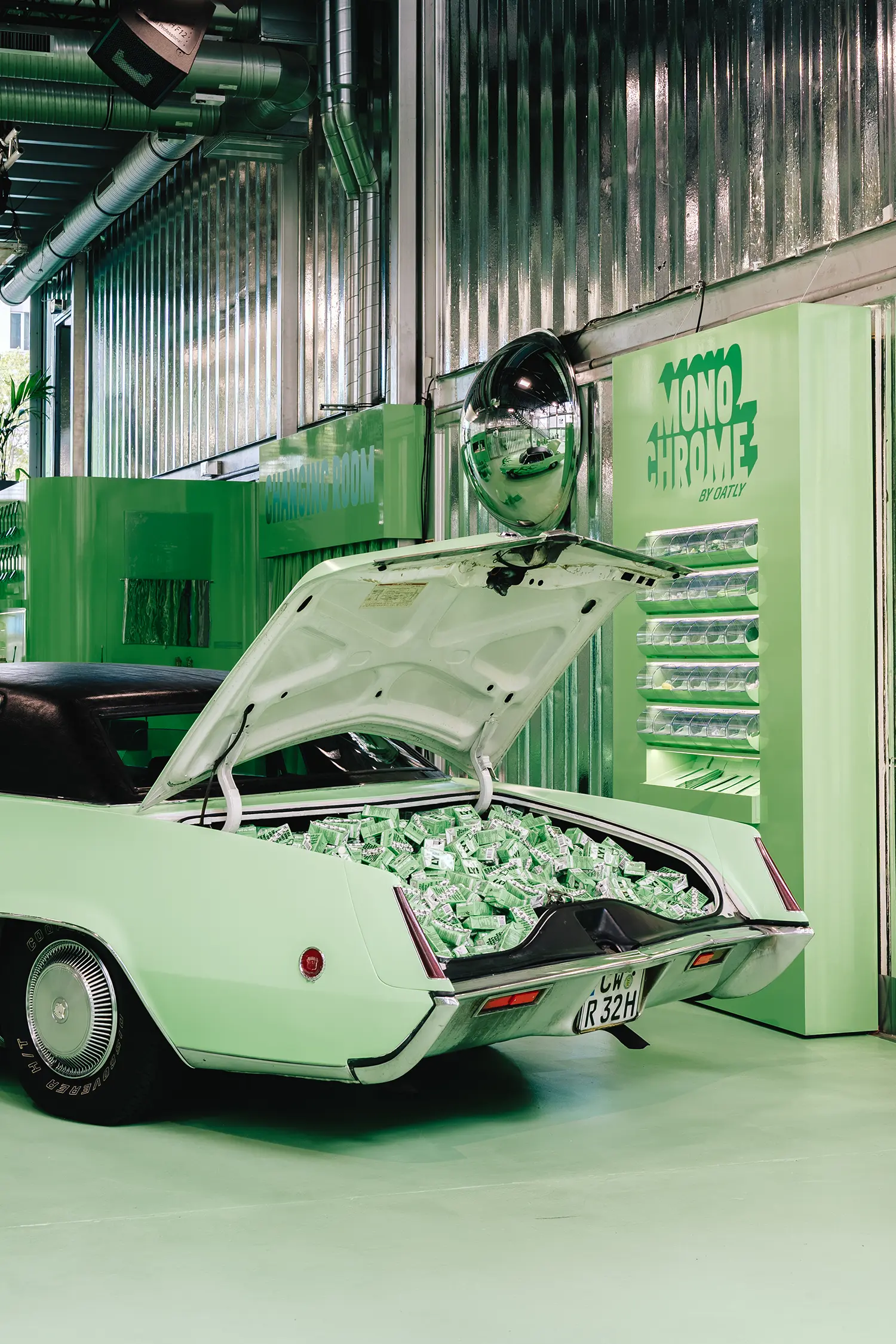
The brief began with a question the agency posed to itself: how could a drink become an experience that extends beyond the glass, and how could that experience take the form of a space capable of generating its own content. The answer at Cee Cee Creative was to make the signature green of Oatly Matcha the visual language of the entire pop-up. Every subsequent decision, from surfaces to props, was measured against that one chromatic rule.
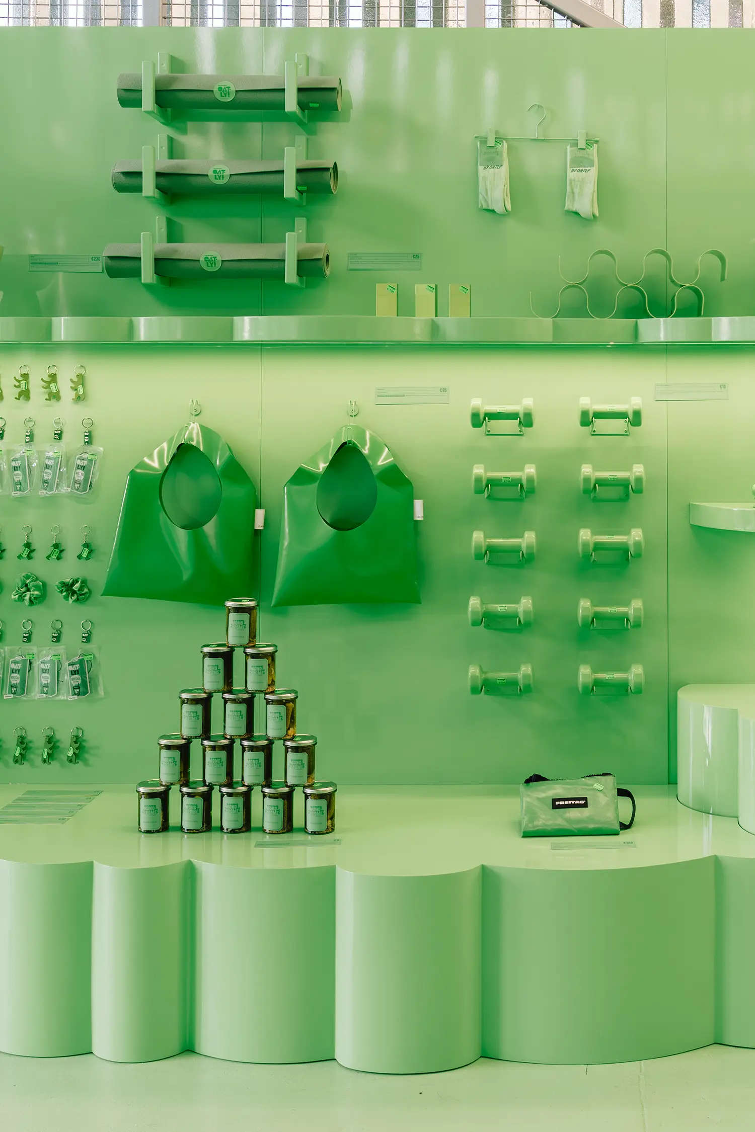
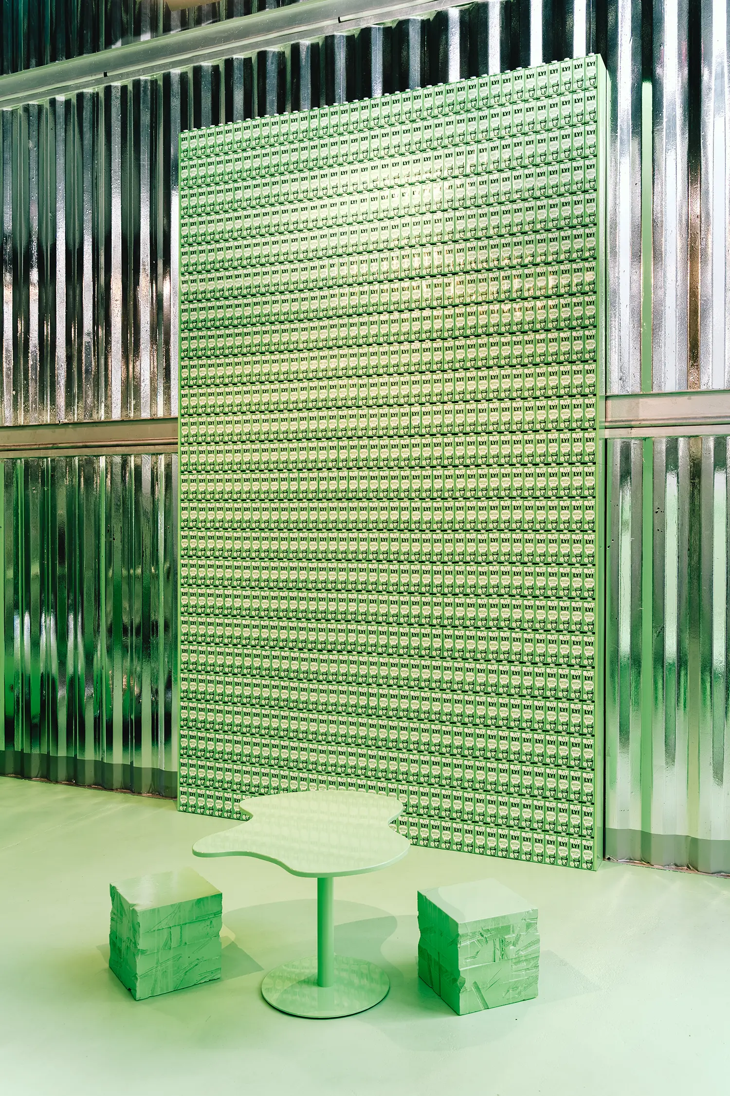
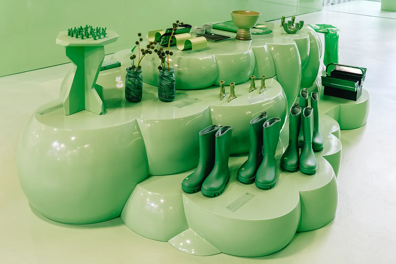
Rather than one flat paint color, the team developed a curated palette of green tones and carried it consistently through the space. Walls and furniture became part of the same color story as the products, design objects, handpicked finds and collectible pieces on display. Scalloped plinths, a wall display hung with rolled mats, dumbbells and bags, and a stacked pyramid of glass jars all sit within the same defined shades, so the green monochrome interior reads as one landscape rather than a series of branded displays.
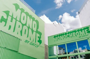
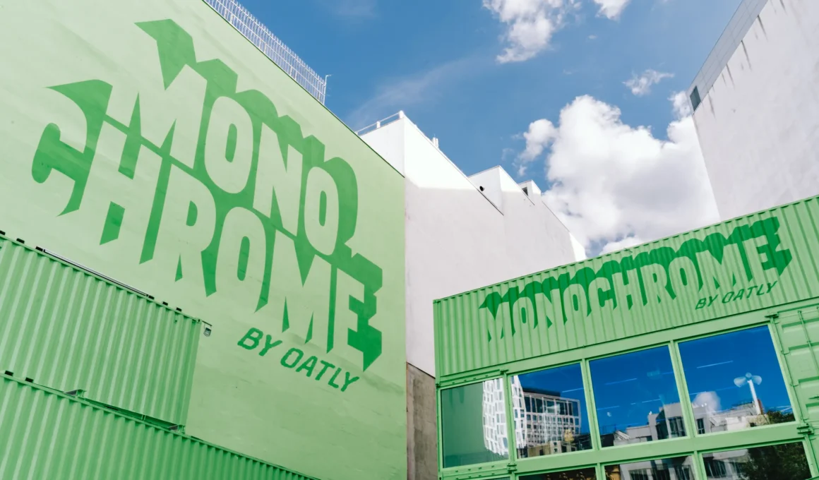
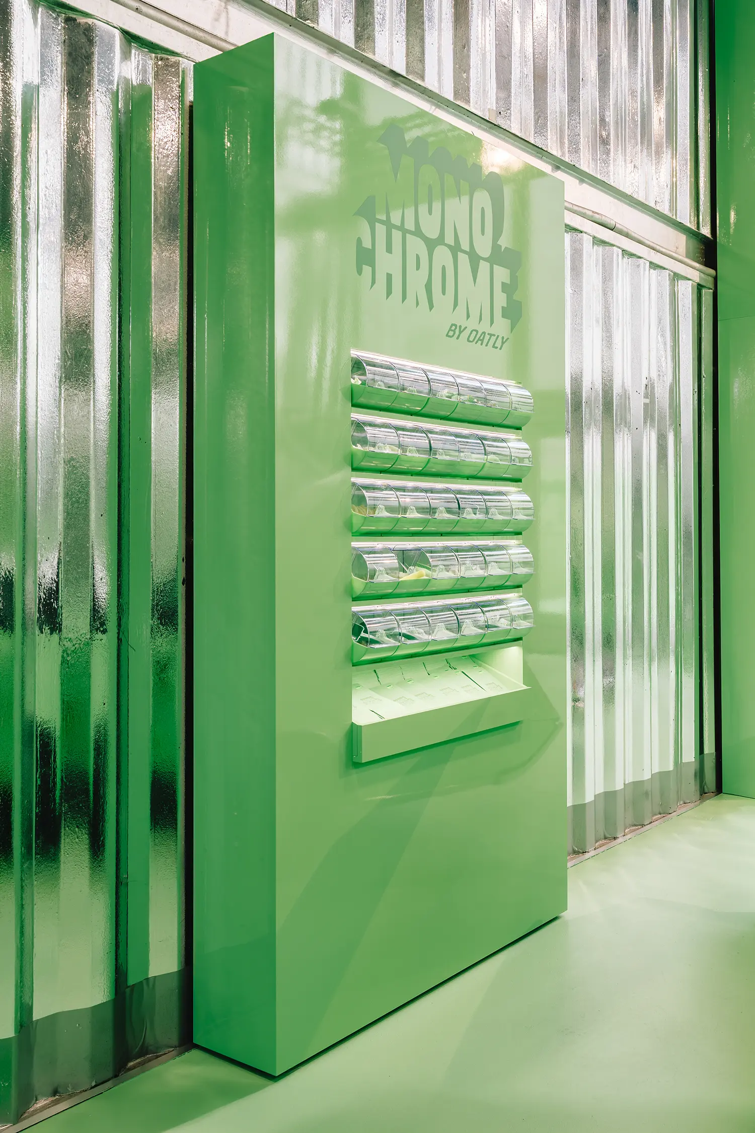
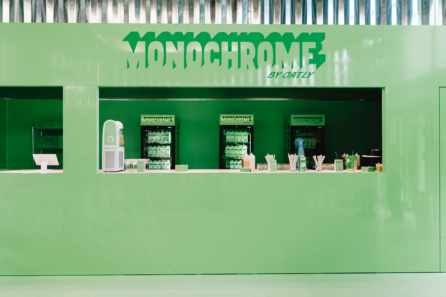
Pushing the logo aside was a deliberate move. At Monochrome by Oatly, the brand name still appears on the facade and on a freestanding totem inside, but identity is carried primarily by the environment itself. “You can recognise an Oatly Matcha before the logo even comes into play,” the studio said. The premise shifts recognition from the wordmark to the retina, trusting a product color to function as signage.
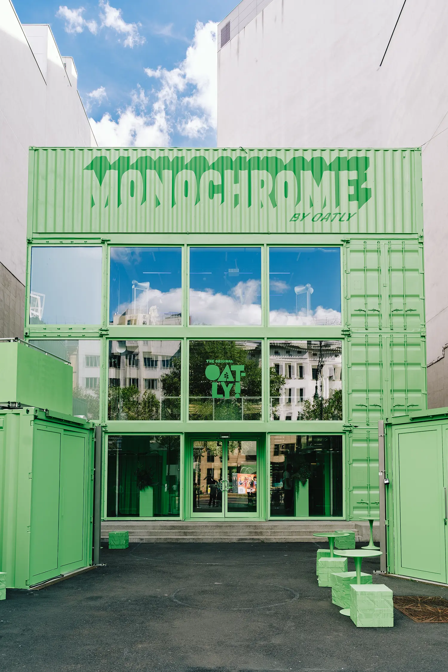
The starting point was a grey container structure on Kurfürstendamm, which hosted the five-day Oatly pop-up store in Berlin at THE SPACE Kudamm in late August. Stacked shipping containers, painted green and fitted with glazing, formed the entrance, with green cube stools and small tables set out on the forecourt. Inside, the transformation turned a neutral shell into a fully monochrome volume, where the only real contrast came from light and reflection.
A selection rooted in Berlin shaped the object curation. The space brought together exclusively green items, with a particular focus on work by Berlin-based designers and creatives alongside objects closely tied to the city’s visual identity, from rubber boots and vases to bags and everyday accessories. According to the studio, the mix of contemporary design, local references and everyday culture was meant to produce a distinct reading of Berlin, a city whose retail scene recently welcomed Tylko’s cloud showroom.
Turning retail into stage, the project repositioned the traditional shop as a spatial brand activation, complete with a drinks counter serving Jasmine Matcha, Earl Grey Matcha and Lemongrass Matcha soda, and a changing room for trying on green apparel. Nearly everything was available to buy, including the vintage car parked inside, its trunk filled with Oatly Matcha cartons and a for-sale sign propped on the dashboard. The approach places the space within experiential retail, where the merchandise carries the concept, a logic also at work in CJ Hendry’s permanent plush flower shop in SoHo.
Designed with the camera in mind from the outset, the pop-up store design followed a social-first approach, composing perspectives, objects and moments intended to be photographed, filmed and shared. A convex mirror mounted on the wall, the lettered totem and a full wall built from stacked Oatly Matcha cartons were placed as ready-made frames. “Social media isn’t added to the design afterwards – the space itself becomes the content,” the team said.
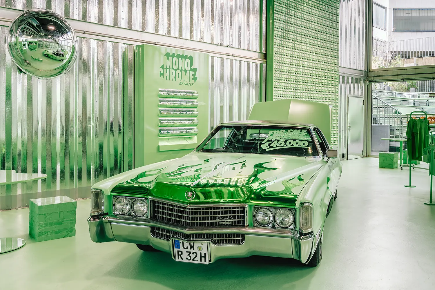
Even the flames painted on the vintage car were rendered in green, laid over green bodywork. Flames are a motif of hot-rod customization that usually comes in reds and oranges. Here they belonged to the matcha palette like everything else in the room, down to the rubber boots standing on a cloud-shaped plinth.
Monochrome by Oatly by Cee Cee Creative | Location: THE SPACE Kudamm, Kurfürstendamm 229, 10719 Berlin, Germany — Year: 2026 — Key materials: shipping