
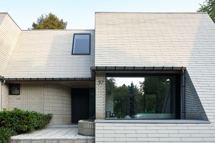
Architects Edouard Brunet and François Martens teamed up to renovate and extend a Flemish villa located few kilometers away from Brussels. With its rather old-fashioned architecture, the house is characterized by a visually heavy slate roof. Over the years, the artificial black slates gradually took a pink hue which is not in harmony with the bricks of the ground floor. The eaves, the size of the windows and the materials make for a particularly dark interior which lacks opening on the large tree-filled garden.
The intention of the architects was naturally to build large windows facing the garden on the back of the house, as well as on the side façades. The new extension on the back is largely glazed and opens on the long garden. The large side windows that have been opened allow to track the sun’s path and to take advantage on the natural light throughout the day.

In order to respect the existing architecture, the architects deliberately chose to make sure their works would be clearly identifiable. To achieve this, each new opening was highlighted by a black frame that extends from the inside to the outside. They acts ad frame for the environment of the house.
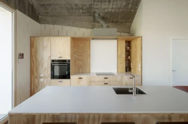
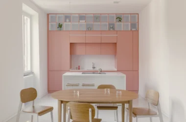
Slates and the roof insulation have been replaced while maintaining the shape of the distinctive roof. The interior set up was modified with a kitchen in contact with the terrace and a room made available in the basement via new staircase on the rear of the house.

The spaces enlarged thanks to the extension appear even larger as the continuity between the inside and the outside has been thought in the smallest details. Thus, in order to minimize as much as possible the visual presence of the poles and sliding frames of the extension , these have been aligned. This allows that each pole hides another in a simple and rhythmic architectural expression.
This also reinforces the great visual axes that accentuate the feeling of open space through new perspectives, including that going from the front door to the garden. Thanks to a specific technical detail, the sliding frames of the extension go up beyond the ceiling, allowing to see the sky and the treetops from the living rooms.

Following with the idea of renewing a link with the house environment, details of the newly windows opened in the brick walls was worked so that the inner and outer black frames would only be interrupted by a glass slide. The indoor / outdoor continuity is striking and reduced to its bare minimum. The frames thus formed are like animated pictures conversing with the artworks set up by the residents.

The façade being rather closed, the lobby and upstairs hallway were relatively dark. To overcome this, the architects suggested to set up a new roof window above the lobby. This allows to open a view from the upstairs hallway but also to bring light to the lobby through the glazed ground. This also creates a fun visual link between the two levels and divide them both in terms of acoustics and temperatures.
The level of details into which the architects went to set up the new roof window make it look like it was gently placed on the roof.
The choice of a matte and textured black for the new openings is also part of the reflexion of the architects on materiality. In contrast with the sand-coloured bricks and slates, the overall is harmonious and elegant. The owners’ choice for interior materials with similar colours to those of the facades give a coherence to the inside as well as the outside.


all images © Denis De Smet