

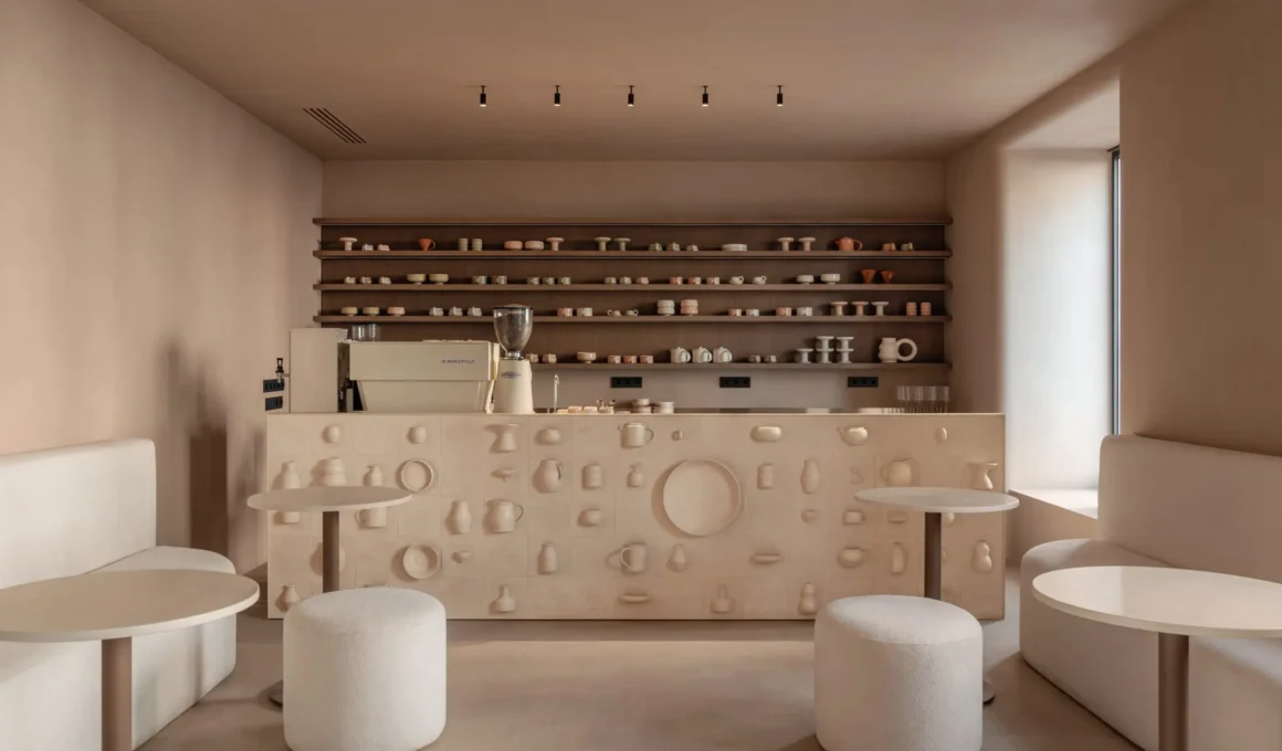
Dmitriy Sivak, founder of Sivak Partners, designed the SHOLOMITSKA ceramic shop interior in Kyiv around a single disciplinary provocation: a retail space in which the objects for sale and the surfaces that hold them are made of the same material, by the same hands, with the same logic. The bar counter — the first thing a visitor encounters — is clad in custom ceramic tile produced by the studio itself, fragments of vessels appearing to emerge from raw clay as though caught mid-formation. It is not a display surface. It is a continuation of the collection by other means.
The café arrives before the store does, which is to say the smell of coffee reaches the visitor before any object does. This sequencing is deliberate: guests choose their own cup before ordering, testing the SHOLOMITSKA ceramics the only honest way — by using it. The gesture collapses the distance between retail and experience that most ceramics stores maintain out of institutional habit. Here, the product earns its place not on a shelf but in the hand, at temperature, with the weight of a drink inside it.

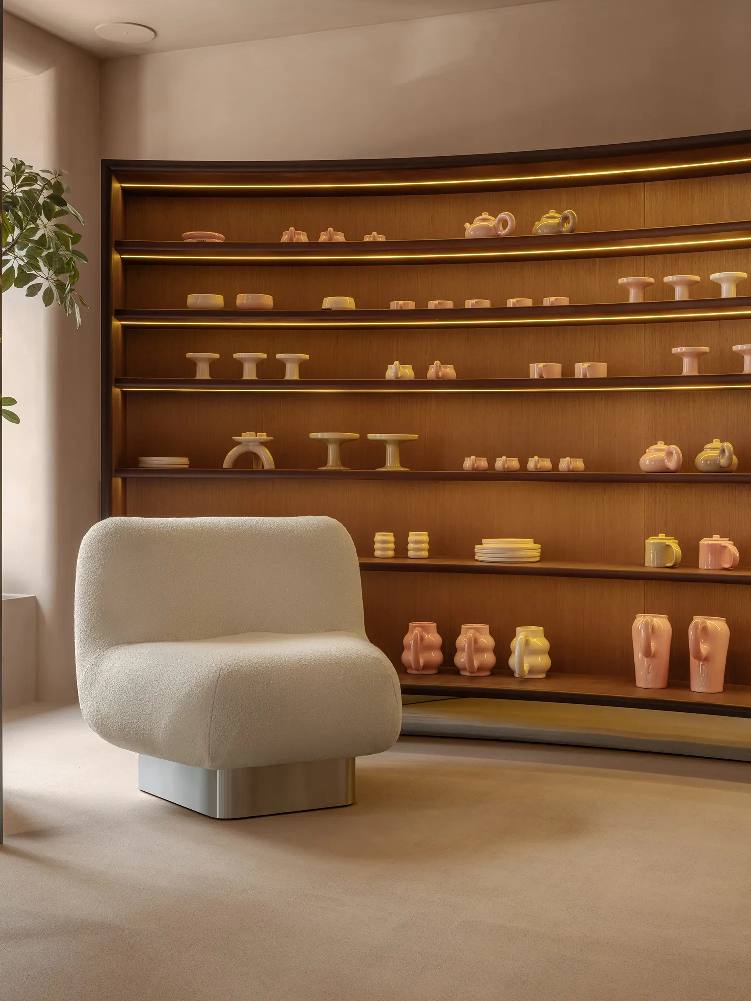
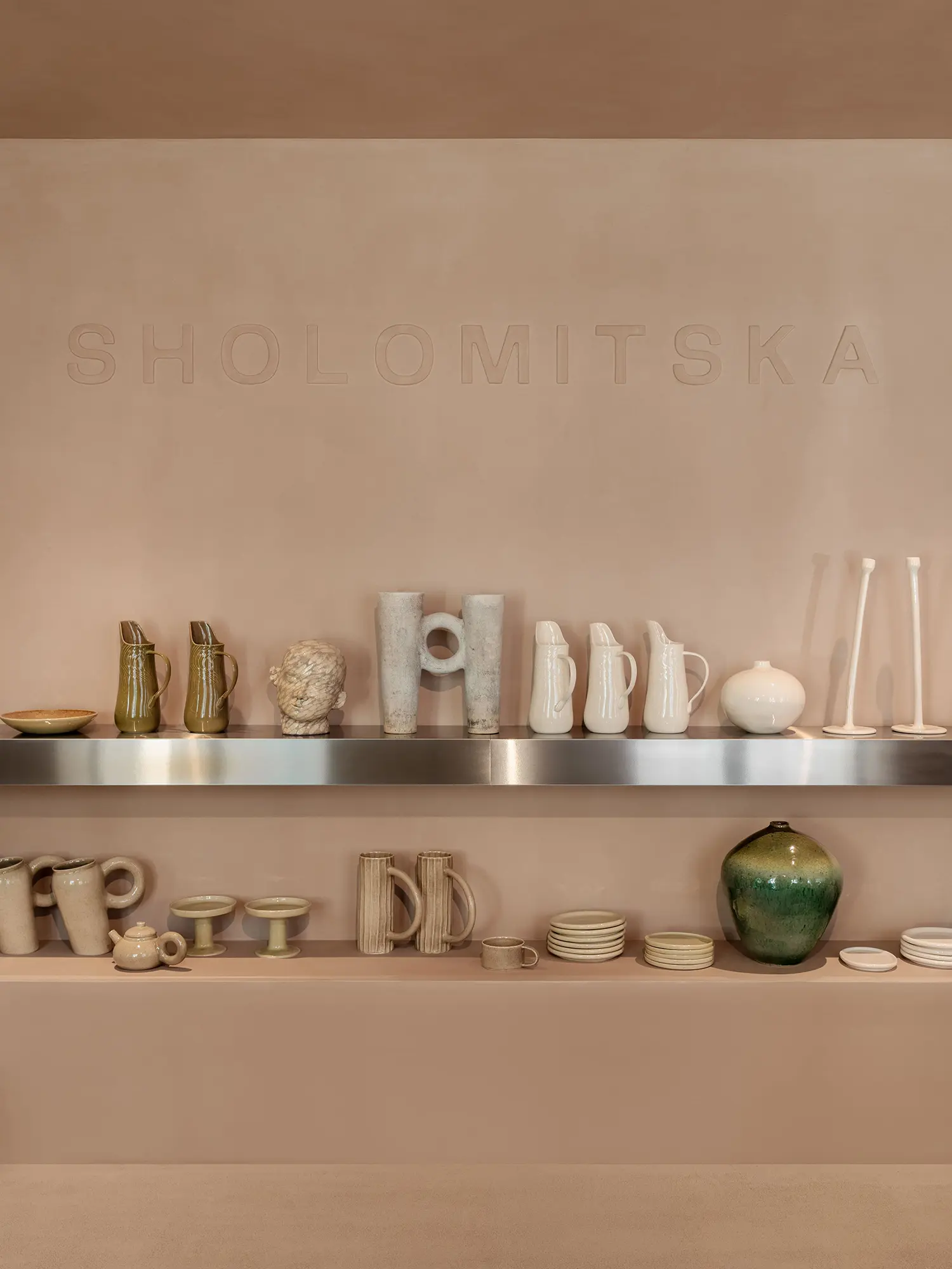
Walls, floor, and ceiling share nearly the same warm tone, separated only by texture and the subtlest shift in hue. Sivak describes this as operating on the same logic as the ceramics themselves: alike at first glance, distinct on closer inspection. The monochromatic warm interior — neither stark white nor aggressively pigmented — functions as a neutral field that neither competes with the objects nor disappears entirely. It is the spatial equivalent of a gallery’s silence: a condition, not an absence.

Rounded openings punctuate the space throughout, echoing the brand’s signature loops and rings. The move transforms the architectural envelope into an extension of the product language — another object in the collection rather than a container for it. This is a formally coherent position that few ceramics store interior design projects actually execute: most shops treat the walls as neutral infrastructure and the objects as protagonists. SHOLOMITSKA treats both as the same sentence, spoken in the same register. A mirrored arch marks the threshold between visitor and owner — the one moment of tonal contrast in an otherwise continuous interior.
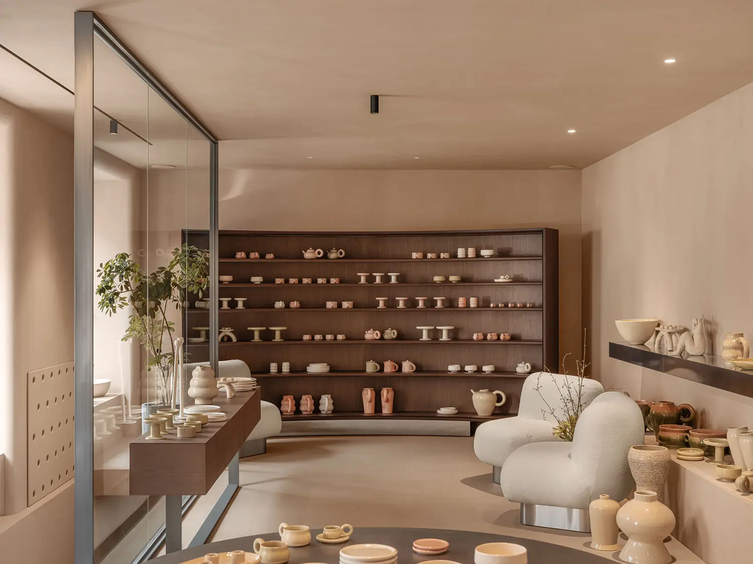
Shelves sit at living-room height, never climbing the walls, so that every piece is immediately imaginable at home. The decision is as much psychological as spatial: objects displayed at eye level or above acquire an institutional distance, the logic of a museum vitrine. Objects displayed at the height of a domestic shelf invite projection. Sivak has structured the entire retail interior design around the possibility of ownership rather than the spectacle of display — a space organized around desire rather than admiration.

At the far end, a large wooden cabinet curves into a quiet arc, the one material departure from the ceramic-dominant palette. Its familiar form resolves into an unexpected geometry — proof that known shapes can still surprise, just as the brand’s modernist pieces reveal themselves differently depending on how light falls across them at a given hour. The wood reads as warmth rather than contrast, a material that shares the handmade register of fired clay without competing with it. The custom joinery is the room’s punctuation mark: where the ceramic argument reaches its spatial conclusion.
Outside, the building is historic Kyiv stone. Sivak matched the entrance — steps, ramp, all surfaces — in crushed granite chosen to disappear into the facade. The decision refuses the common retail instinct to signal itself from the street. From outside, the eye passes straight through the glass to the objects inside, and in the evening to the warm light that holds them. Nothing competes for attention before the ceramics do. In a city navigating the psychological register of wartime, this piece of Kyiv interior design asks nothing of the passerby except curiosity — a position as much as an aesthetic. For another reading of how Kyiv café culture produces interiors that negotiate material memory and contemporary identity, the glass block counter at Frank — designed by Yana Molodykh — makes an instructive parallel.
What SHOLOMITSKA demonstrates is that the most rigorous retail interiors are those in which the shop’s product and the shop’s space share an authorial origin. Sivak’s decision to have the studio produce the ceramic tile for its own counter is not a decorative gesture — it is a statement about the indivisibility of making and selling that most handmade ceramics retail projects never risk. The space doesn’t frame the objects. It is made of them.