

dark mode light mode Search
Search

With iOS 27, Apple Stops Insisting on Liquid Glass — and That Changes What Apple Design Means

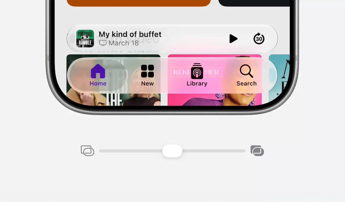
iOS 27 Liquid Glass slider Settings Apple iPhone translucent tab bar Podcasts app mid-position

Apple Inc.

The most significant design announcement at WWDC26 was not Siri AI, not the performance gains, and not the parental controls — it was a slider. Buried in the iOS 27 release notes between app launch speeds and AirDrop improvements, Apple confirmed that users will be able to adjust Liquid Glass — the translucent, refractive visual language introduced with iOS 26 — from ultra-clear to fully tinted, effectively making the system’s most controversial design decision optional. That a company which imposed flat design in 2013 and held firm through years of user hostility has now given its interface a transparency dial is not a minor UX accommodation. It is a precise indicator of where Apple’s design confidence currently stands.

iOS 27 Liquid Glass icon anatomy layer structure Maps app exploded view Apple design system
The icon is built in layers — glass, color, shadow, symbol — each contributing to a visual logic the slider now makes optional
Liquid Glass arrived with iOS 26 as Apple’s most radical visual language shift in over a decade — a system-wide application of translucent, refractive surfaces inspired by visionOS’s spatial computing aesthetic. Bars, menus, icons, and system elements acquired a glass-like quality that referenced the physical properties of the materials Apple builds its hardware from. The design logic was coherent: if the hardware is aluminium and glass, the software should feel like aluminium and glass. The execution was polarizing. Users found elements hard to read in certain lighting conditions, visually busy at small scales, and stylistically inconsistent with the legibility standards that had defined Apple’s mobile interface since iOS 7.

iOS 27 Siri AI home screen overlay Photos search Liquid Glass dock iPhone 17 Pro Apple Intelligence
The Liquid Glass dock at the bottom — the design language the slider is now making negotiable
The precedent Apple set with iOS 7 makes the iOS 27 slider worth examining carefully. When Jony Ive stripped the skeuomorphic interface and replaced it with flat, minimal, icon-driven design in 2013, the response was immediate and divided. The felt textures, the wood panels, the realistic stitching of the previous system disappeared overnight, and a significant portion of Apple’s user base objected loudly. Apple did not give them a slider. Apple shipped the redesign, defended it, and let adoption catch up to intention. The design was non-negotiable because Apple believed that design, at sufficient quality, eventually persuades.

iOS 27 Liquid Glass slider animated transition ultra-clear to fully tinted Apple iPhone Settings
The full range of the slider poses the question: if fully opaque is acceptable, why was ultra-clear the default?
iOS 27 operates on a different premise. The slider — which Apple describes as letting users adjust Liquid Glass “anywhere from ultra-clear to fully tinted to match their preference” — is the first time in the post-Ive era that Apple has built a preference dial directly into a fundamental design decision. Not a dark mode toggle, not an accessibility override. A personalization tool for the visual language of the operating system itself. What this communicates, precisely, is that Apple no longer believes all its users will arrive at the same aesthetic conclusion — and has decided to accommodate the divergence rather than wait it out.

iOS 27 Photos iCloud Shared Albums Aegean Adventure Liquid Glass tab bar Library Collections iPhone
The Liquid Glass tab bar — subtle, persistent, and now subject to user preference for the first time
The macOS 27 announcement deepens the reading. Alongside the Liquid Glass slider, Apple is reintroducing what it describes as “cornerstones of the macOS design that users have always loved” — a uniform toolbar across apps, edge-to-edge sidebars, colored sidebar icons. These are not new features. They are restorations of design elements that existed before macOS took its own minimalist turn in recent years. Apple is, simultaneously, softening its most forward-looking visual language and restoring its most familiar one. The word “loved” in the press release is doing significant work: it is the language of audience research, not of design conviction. According to the company, Craig Federighi said at WWDC26 that the goal is making software “faster, more reliable, and more delightful than ever before” — and delightful, in 2026, apparently means recognizable.

macOS 27 Safari Notify Me notification Messages app restored sidebar colored icons Mac design language
The Mac Messages sidebar restored to the colorful, defined design language users had always loved
What does it mean to make a design language optional? A design system that can be turned up or down is no longer a design system — it is a palette. The distinction matters because a palette is chosen by the user, while a design system is chosen by the designer and experienced by the user whether they consciously agree or not. Every great interface Apple has shipped has been a system, not a palette. The moment a slider appears, the visual coherence of the platform becomes statistically distributed across user preference — which means no two iPhones will look exactly the same, and the interface Apple ships is no longer the interface Apple controls. For a company whose design identity has always been inseparable from its insistence on that control, the slider is a structural concession, not a feature addition.

macOS 27 Mail uniform toolbar restored edge-to-edge sidebar colored icons design restoration animation
The toolbar reinstated — familiar elements brought back after users rejected their removal
The parallel to other design disciplines is not incidental. Architecture has faced the same tension whenever a radical formal language — Brutalism, Deconstructivism, parametric form-finding — has outpaced the cultural readiness of its users. The standard resolution, in building, is the contextual compromise: a contemporary interior behind a traditional facade, a parametric structure wrapped in familiar materials. Apple’s iOS 27 slider is the digital equivalent of that move — the Liquid Glass stays in the system as a possibility, but the user can choose how much of it to inhabit. Whether that is sophisticated design thinking or a failure of nerve depends entirely on whether you believe design should lead taste or respond to it.

iOS 27 Siri AI onscreen awareness Messages conversation context suggestions iPhone Apple Intelligence
Siri AI reads the conversation and contributes — the intelligence layer sits above the interface, not inside it
Siri AI is the real technological story of iOS 27 — a complete rebuild of Apple’s voice assistant with on-screen awareness, cross-app intelligence, personal context understanding, and a dedicated app that syncs conversational history across devices via iCloud. The engineering ambition is considerable, and the privacy architecture behind it — running on-device models with selective server processing — is genuinely original. But Siri AI is a capability announcement, not a design statement. The user interface design decisions in iOS 27 — the slider, the macOS restorations, the sharper app icons — are where Apple’s design philosophy is being renegotiated in real time, and that negotiation is more revealing than any feature list.

iPadOS 27 Image Playground AI image generation astronauts Mars photorealistic prompt history sidebar iPad
Image Playground’s dark minimal sidebar — deliberately outside the Liquid Glass debate
The iOS 27 Liquid Glass slider will be read by most commentators as a user-friendly accommodation — a sign that Apple is listening, responsive, mature. That reading is not wrong. But it is incomplete. What the slider also marks is the first moment since iOS 7 when Apple has publicly acknowledged that a design decision it made was not universally accepted — and responded not by persuading the holdouts but by handing them a dial. Whether that represents design leadership adapting to a more fragmented audience, or design leadership quietly retreating from a position it couldn’t defend, is the question iOS 27 leaves open. The slider is set to ultra-clear by default. Apple still wants you to use Liquid Glass. It just no longer insists.

Image courtesy of Apple Inc.

Sign up to our newsletters and we’ll keep you in the loop with everything good going on in the creative world.

"*" indicates required fields

This field is for validation purposes and should be left unchanged.
Name*