



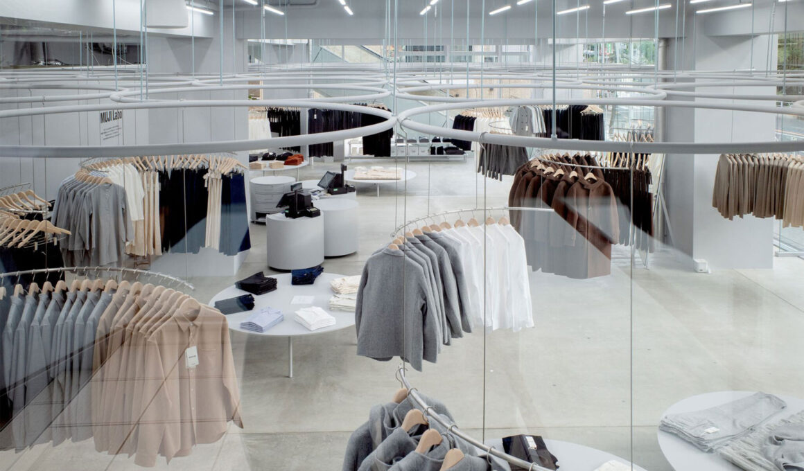
The MUJI Labo flagship store in Tokyo, conceived by SANAA, does not ask to be noticed — it asks to be read. Slowly, carefully, the way one reads a well-edited object.
The pursuit of simplicity has always defined MUJI’s identity. In this flagship, that pursuit finds its most considered physical form yet. MUJI Labo is not simply a retail space dressed in minimal clothing — it is a space where the editorial logic of the brand and the spatial logic of the architects have become indistinguishable from one another.
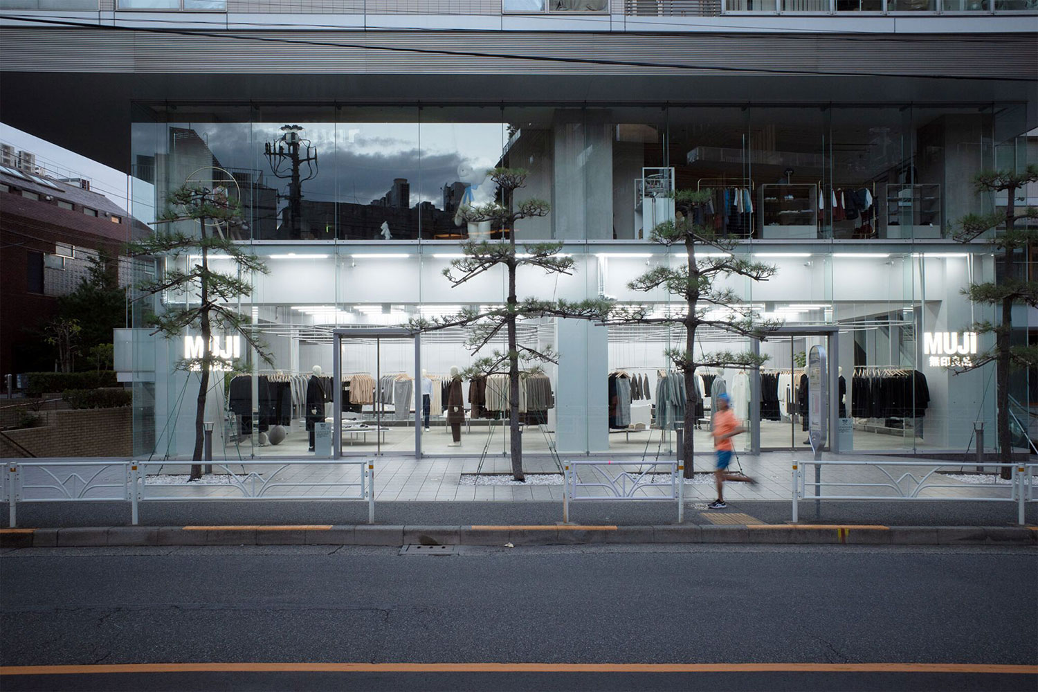
SANAA’s design unfolds across two distinct yet calibrated sections: a clothing store that faces the street directly, and a slightly recessed home goods store behind it. The separation is deliberate. It creates a sense of gradual immersion — a spatial sequence that draws visitors progressively deeper into the MUJI world rather than presenting everything at once.
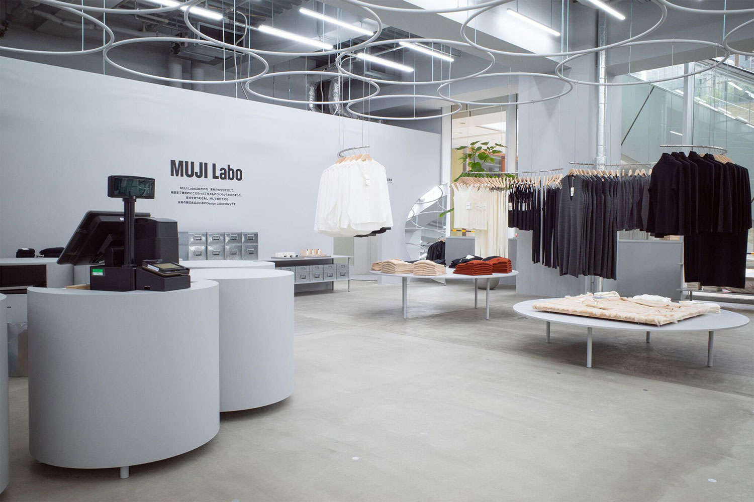
Both areas share a defining architectural gesture: expansive, unobstructed openings that dissolve the boundary between interior and exterior. The glass facades put the merchandise on quiet display for those passing outside, while cultivating an atmosphere of transparency that feels less like a shop window and more like an invitation to observe.
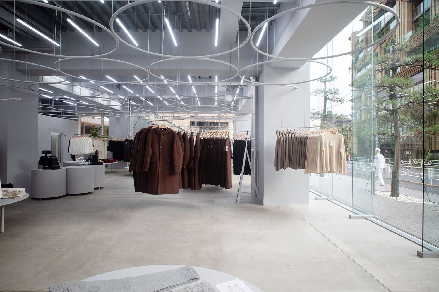
The clothing section breaks from conventional retail logic entirely. Rather than racks or rails, garments are suspended from a ceiling-mounted ring system — floating at varying heights, readable from multiple angles, arranged with the deliberate looseness of an installation. The effect transforms clothing into something closer to sculptural presence, foregrounding texture, silhouette, and material quality over the transactional urgency of a conventional display.
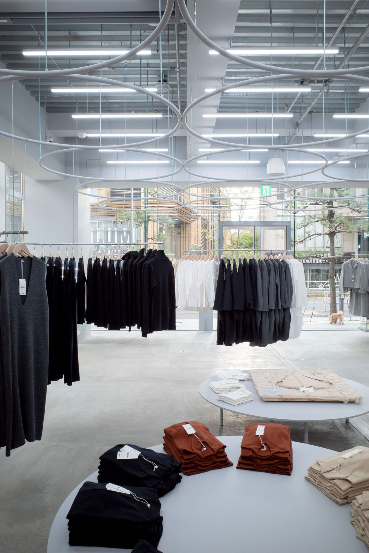
The grid configuration of the ring system carries a practical intelligence beneath its formal elegance. Arrangements can be altered fluidly, keeping the space in a state of controlled variation — familiar enough to reward returning visitors, different enough to remain engaging.
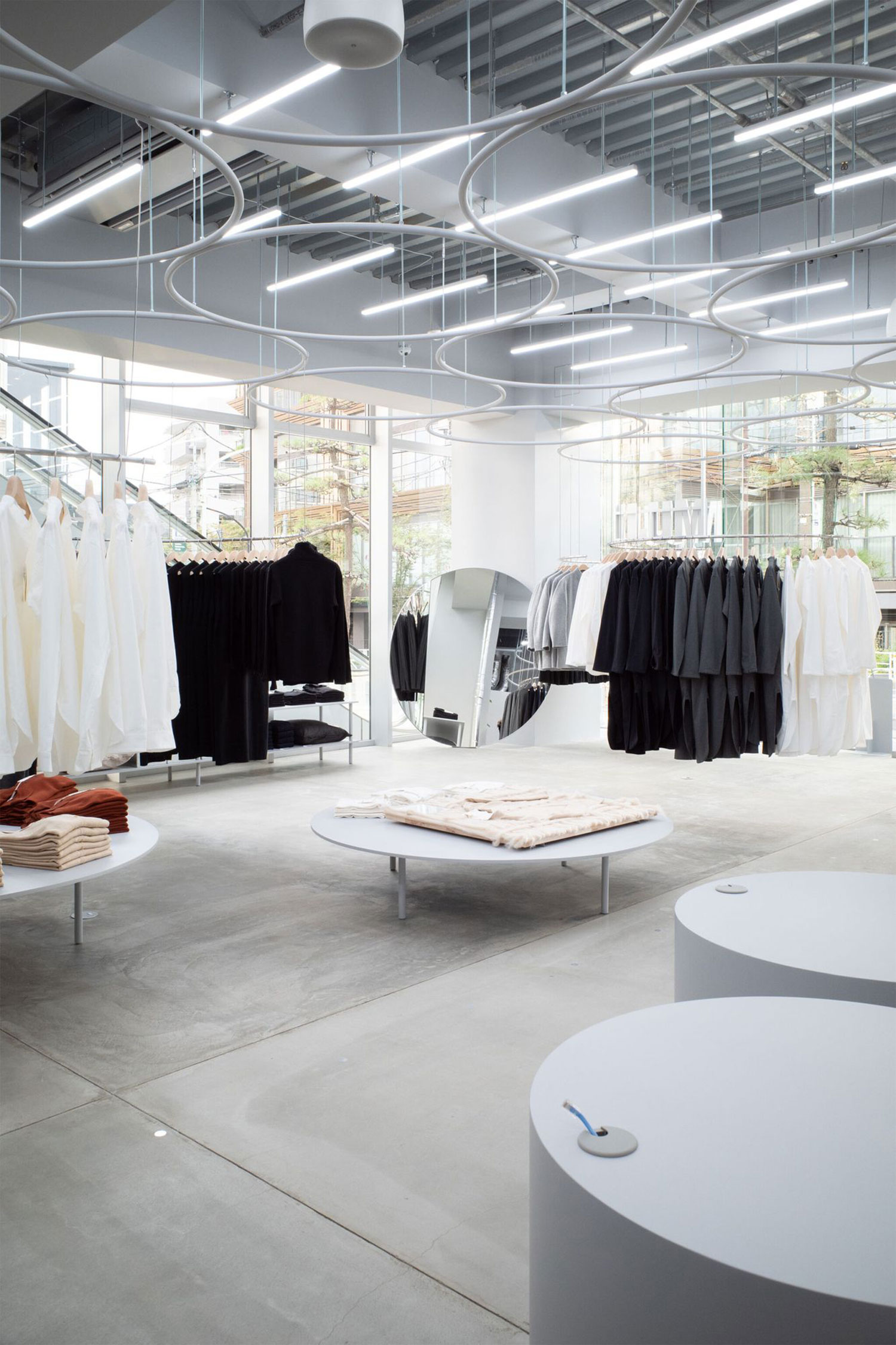
Throughout both sections, the design operates at the intersection of the spatial and the sensory. Light, proportion, and the specific weight of silence in a well-considered room all become part of how the products are experienced. Engagement here is unhurried — the architecture slows the visitor down and asks for attention.
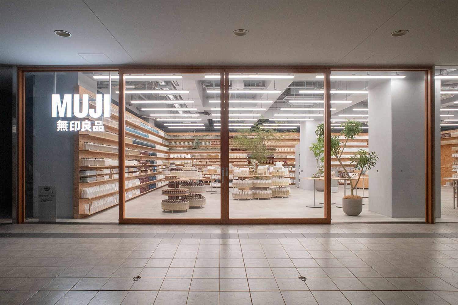
The home goods store takes a denser approach, integrating products directly into the architecture. Floor-to-ceiling shelving lines three walls, organizing an abundance of everyday objects into a visual sequence that is rigorous without being cold. The sheer volume of items does not overwhelm — it accumulates into a coherent argument about the breadth and consistency of the MUJI range.
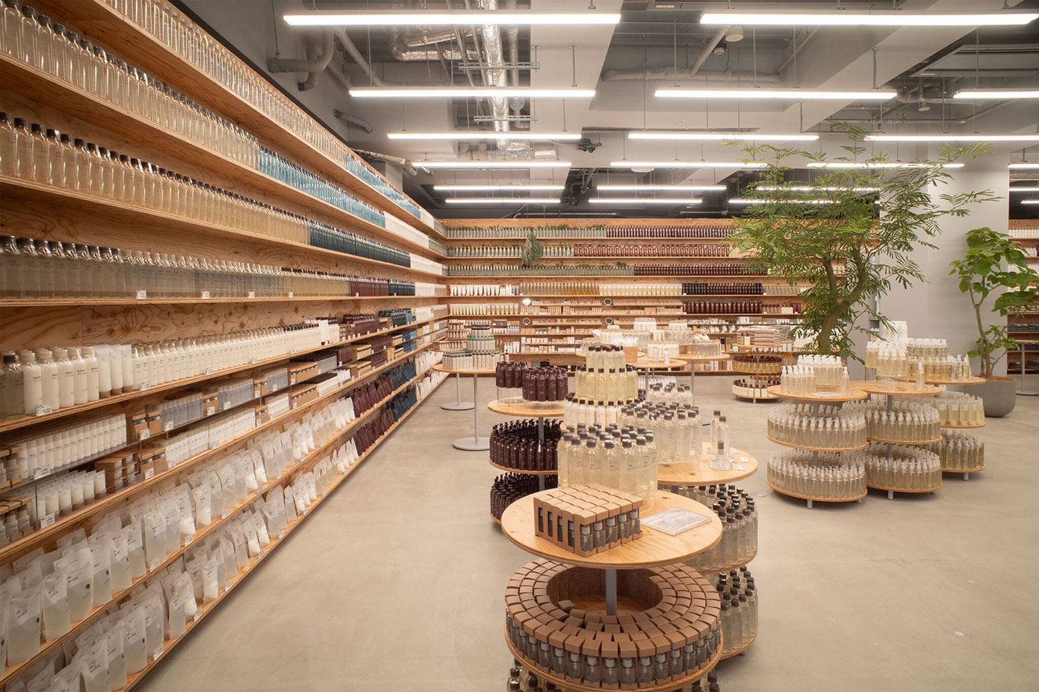
A dedicated central display area within this section isolates selected pieces for closer inspection, creating a focal point that invites pause within the larger rhythm of the shelving. It is a curator’s instinct applied to retail — the difference between showing everything and knowing what to foreground.
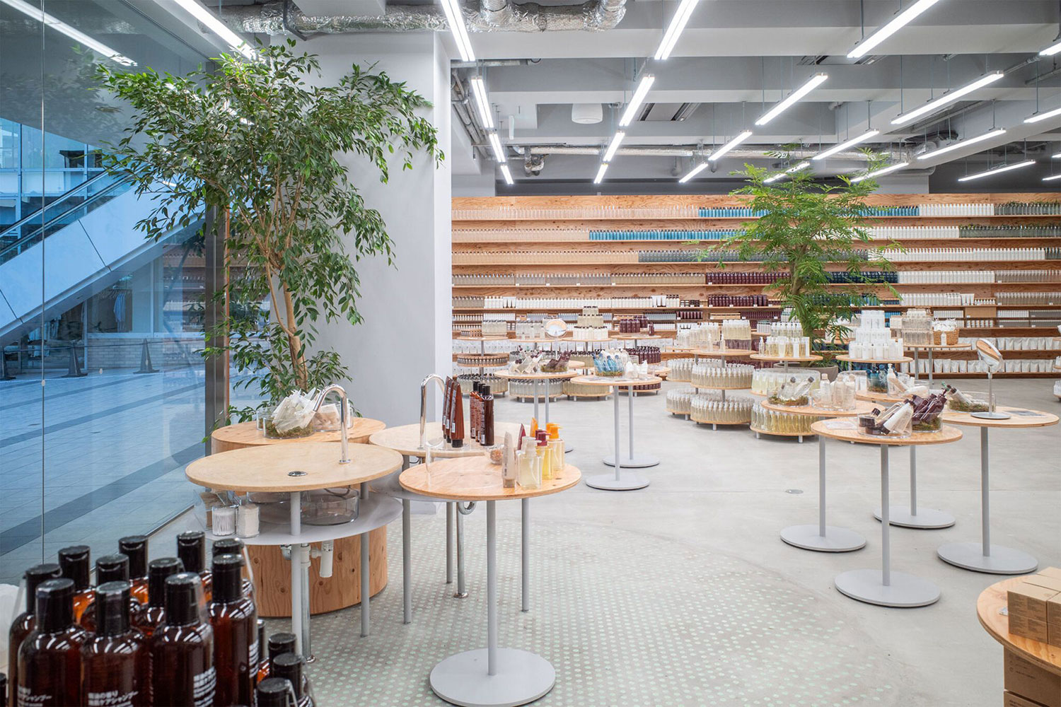
What SANAA has built for MUJI Labo is a space that prioritizes the product by refusing to compete with it. The architecture provides no unnecessary ornament, no strong formal statement, no surface that asks for attention on its own terms. Instead, it offers the rarest thing in contemporary retail design: a genuinely quiet backdrop — one that makes everyday objects feel worth looking at.