



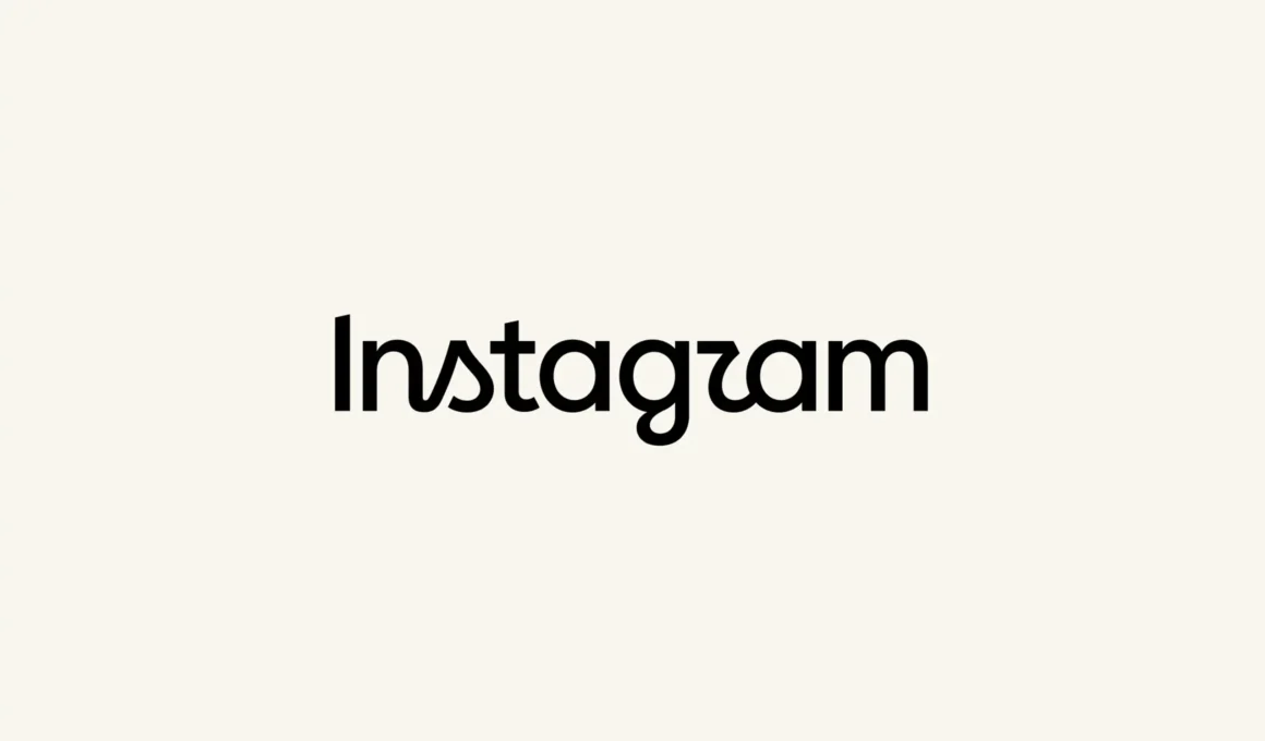
Meta-owned platform Instagram has redesigned its wordmark for the first time in a decade, replacing the cursive script it introduced in 2016 with a hybrid construction that mixes handwritten and print letterforms. The update rolled out quietly last Thursday. What followed over the weekend was less quiet: dozens of unrelated brands redrew their own names using the same visual logic within hours of the announcement.
The previous wordmark had held since 2016, when Instagram first adopted a flowing cursive script to soften the platform’s identity after its early years as a photo-filter app. Meta’s design team has said it explored hundreds of directions for the replacement — including all-caps treatments, camera-shaped concepts and literal handwriting — before returning to what it called the “magic of crafted script” as the concept to build from.

The new construction keeps that cursive base but flattens the serifs and detaches them from neighboring letters, landing somewhere between script and print rather than fully committing to either. “Script reflects individuality, so referencing that felt right,” said Jasmine Probst, Instagram’s director of product design. The result reads as a script-and-print hybrid wordmark, still tied to Instagram’s handwritten history but built with sharper, more structured letterforms than the 2016 version.
Probst has framed that reasoning as extending beyond the letterforms themselves — describing the wordmark as bolder and simpler, with intentional touches of unexpectedness, details meant to cue individual expression and a personal voice rather than function as decoration.
The wordmark sits inside a wider system Meta rolled out alongside it: an updated Instagram Sans typeface, the platform’s primary interface font, refreshed as part of the same identity update rather than left untouched.

Two further typefaces arrived with it — Instagram Pen, a handwritten face, and Instagram Mono, a monospace font — while the platform’s signature gradient now appears more sparingly across motion, layout and UI. “The refreshed brand system puts our community’s creativity and self-expression front and center,” said May Hartono, Meta’s director of brand design.

Reception split almost immediately along one specific fault line: legibility. The tightened spacing between the wordmark’s “r” and “a” left enough readers parsing it as the now-widely-repeated “Instagzam” misreading, a critique that sits alongside the design team’s own stated goal of individual, personal-voice lettering.

That same attention turned outward by the weekend, curdling into an unrelated trend. Brands with no connection to Instagram — Knorr, McDonald’s, KitKat, Wendy’s, Picsart, Semrush and others — began redrawing their own names in the same hybrid style, some straightforwardly, others self-aware about the exercise; Knorr captioned its version “the update no one asked for.” It’s a familiar shape of moment marketing opportunism, the same instinct that turns any widely visible design decision into raw material for a brand’s own feed — not unlike how Google’s Pixel Tag became an instant reference point for scrutinizing a tech giant’s design choices the moment it shipped.
None of those versions are working from the real thing. Instagram’s wordmark is custom-drawn lettering, not a licensed or downloadable typeface, which means every McDonald’s or Knorr redraw circulating this week is an approximation of a construction nobody outside Meta’s design team can actually reproduce — a detail that says more about how far a visual idea can travel once it’s public than about the letterforms Instagram actually shipped.