



In a small apartment the wall is the only element that occupies floor area and gives nothing back, and a run of recent renovations suggests architects have started charging it rent. None of the five projects below arrives at open plan, the twentieth century’s answer to the same problem. They keep the divisions and discard the partitions, replacing them with elements that separate and perform a second job at the same time.

The cellular plan came first, and it remains the default across most of Europe’s twentieth-century housing stock: one function, one room, one door, repeated until the floor area runs out. Open plan living proposed the opposite and overcorrected, deleting not just the partitions but the separation itself, which is why so many people who opened up a flat later wanted somewhere to close a door. What these five projects propose is a third position — division that survives the loss of the wall because it has been transferred into an object that earns its footprint twice.

Urban apartments keep shrinking while the list of things a home is expected to hold keeps growing — a spare bedroom that is also an office, a hallway that is also storage, a bathroom that is also, apparently, a corridor. The five renovations gathered here did not choose this constraint; they inherited it from buildings, blocks and floor plans that predate the problem by decades. What separates them from an ordinary space-saving renovation is that none of them treats the missing square meters as a deficit to disguise. Each one argues, in its own material, that the room was never the unit that mattered.

The most literal transfer happens in Carabanchel, Madrid, where Madrid-based practice Extrarradio Estudio stripped a late-1940s terraced house back to its beams, walls and roof frames, then rebuilt the plan as a single continuous element. At TET House, a green zigzag runs along the perimeter of the ground floor, absorbing a guest toilet, a compact kitchen, the staircase and a small outdoor bathtub into one gesture across 68 square meters (732 square feet). Upstairs, two freestanding volumes holding the bathroom and a secondary bedroom sit inside the shell like oversized furniture and stop short of the ceiling, so the eye travels across the whole underside of the roof — the same instinct behind most attic light strategies, where the gain comes from what is left uninterrupted overhead.

Hardware does the dividing in Athens, where the Kifisia apartment occupies 80 square meters (861 square feet) inside a circular 1970s block. Athens-based studio Georgios Apostolopoulos Architects removed every internal partition first, then reintroduced separation as joinery that can be operated: a full-height unit holding wardrobes and the apartment’s air-conditioning divides the main bedroom from the living area, its pair of doors either closing the room completely or aligning with the depth of the unit until they read as wall rather than opening. The second bedroom does not exist as a room at all — a fold-down bed and a drop-down desk let the space become sleeping, working or dining according to the day. “The aim was to create a more fluid layout,” Apostolopoulos says, describing a flexible apartment layout that is less a plan than a set of positions.

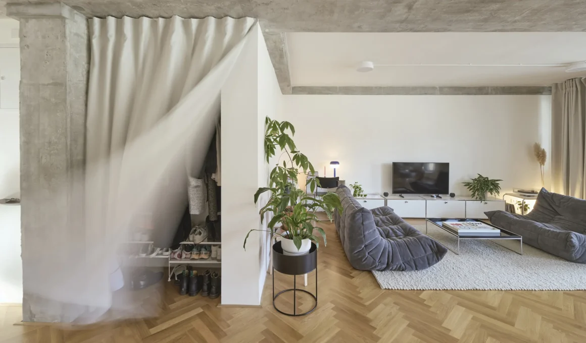
Transparency replaces mass in Prague, where Prague-based studio RDTH architekti confronted the post-war cell-like configuration common to urban European housing blocks. The studio concedes in its own project statement that removing nearly every wall and door from an apartment sounds “foolish, unacceptable, or simply absurd for most people.” What the No-Wall Apartment does instead is make the dividers permeable: a single, slightly rotated central block anchors the plan and channels movement around its perimeter, while translucent glass block partitions carry daylight deep into the floor plan and full-height textile curtains adjust acoustic and visual privacy in seconds. The scars where the old load-bearing walls once met the ceiling were preserved and simply painted over.

Vienna builds nothing at all, staging Chromatic Chambers as color and sightline rather than structure. Austrian practice ASAP-ZT Pitro Sammer turned six disconnected rooms into a circular sequence across 156 square meters (1,679 square feet), and the sharpest move is what happens to the bathroom: positioned between hall and kitchen, it becomes a hinge cutting a shortcut through the circulation instead of the dead-end wet room it is in nearly every other apartment. Pink cabinetry makes the kitchen the plan’s distributor, indigo tile answers it two rooms away, and the walnut salon supplies the one chapter built on material warmth. That the largest apartment here builds the least is worth noting — this is not only a small apartment renovation tactic, as Chromatic Chambers demonstrates at a scale where nobody was forced into it.

The far end of the spectrum sits in Singapore, where Singapore-based interior design collective No Sense Studio treats Nos. 9 as withholding rather than adding, leaving raw plywood, concrete panels, industrial surface conduits and mosaic tile as a frame and handing the rest to the owner’s furniture and pop-art collection. Modular shelving systems read as structure instead of styled furniture, and the platform bed is raw plywood with drawers that slide out from beneath it. The one insistent piece of design is overhead: custom kitchen cabinetry in dark timber with wire glass panels, angled inward at the same degree on every unit, borrowed from mid-century shopfitting display cases and the forward-leaning awnings of traditional Japanese shopfronts. Slanting the units back from vertical opens sightlines underneath them and keeps the eye moving instead of stopping at a flat cabinet face.

None of this is free, and the projects are honest about where the bill lands. Every one of these dividers is a commission: a zigzag fabricated to a specific perimeter, joinery machined to swallow its own doors, a glass block wall built on site. A stud partition costs a fraction of any of them, which means the alternative to the wall is currently more expensive than the wall, and will stay that way until somebody manufactures the device rather than drawing it each time.

A second bill comes due in sound. Curtains and open sightlines solve the visual half of privacy without touching the acoustic half — RDTH’s textile partitions can be drawn shut in seconds, but they do not stop sound the way brick does, and a volume that stops below the ceiling to share light shares noise along with it. None of the five studios pretends otherwise; acoustic separation simply isn’t the problem any of them set out to solve, which is worth knowing before assuming a project like this one solves every problem a wall used to.
The quieter cost is behavioral, and it falls entirely on whoever lives there. All five plans work by keeping open sightlines — across the underside of a roof in Madrid, through a glass block in Prague, along the axis connecting a pink kitchen to an indigo bathroom in Vienna — and a sightline is unforgiving in a way a wall never was. A closed door absolves the room behind it; an unbroken view puts the unmade bed, the drying rack and the pile of paperwork permanently on display. These homes ask their occupants to maintain them at a standard the cellular plan never demanded, and that, more than the cost of the joinery, will decide whether the room survives as the unit of the house.